
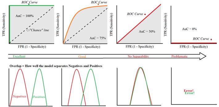
With a ROC curve, you’re trying to find a good model that optimizes the trade off between the False Positive Rate (FPR) and True Positive Rate (TPR). What counts here is how much area is under the curve (Area under the Curve = AuC). The ideal curve in the left image fills in 100%, which means that you’re going to be able to distinguish between negative results and positive results 100% of the time (which is almost impossible in real life). The further you go to the right, the worse the detection. The ROC curve to the far right does a worse job than chance, mixing up the negatives and positives (which means you likely have an error in your setup).
For more concepts explained in one picture, visit this page.
DSC Resources
- Free Book and Resources for DSC Members
- New Perspectives on Statistical Distributions and Deep Learning
- Deep Analytical Thinking and Data Science Wizardry
- Statistical Concepts Explained in Simple English
- Machine Learning Concepts Explained in One Picture
- Comprehensive Repository of Data Science and ML Resources
- Advanced Machine Learning with Basic Excel
- Difference between ML, Data Science, AI, Deep Learning, and Statistics
- Selected Business Analytics, Data Science and ML articles
- Hire a Data Scientist | Search DSC | Find a Job
- Post a Blog | Forum Questions