
Last time we created a beautiful map with a lot of features, see here. This time I will show you how to customize different things. I use the same data.
map1= folium.Map(location=[10,20], zoom_start=2, tiles=’http://tile.stamen.com/toner-lite/{z}/{x}/{y}.png’,attr=”Dr.Katharina Glass”)
Let’s start with marker. Previously we have already used the icon but may want to use the circle. From my perspective the only advantage of a circle is that you can adapt its radius related to some variables. For example, the population of a city show be reflected in the size of circle.
df=pd.read_excel(‘A-cities.xlsx’)
locations = df[[‘lat’, ‘lng’]]
locationlist = locations.values.tolist()
for i in range(0, len(locationlist)):
folium.Circle(
location=[df.iloc[i][‘lat’],df.iloc[i][‘lng’]],
popup=df.iloc[i][‘city’],
radius=1,
color=’blue’,
fill=True,
fill_color=’blue’
).add_to(map1)
The first glance at the data shows that we have some NaN in the population column. So, clean them: df.dropna(subset=[‘population’],inplace=True). The circle marker code is as follows:
for i in range(0, len(locationlist)):
folium.Circle(
location=[df.iloc[i][‘lat’],df.iloc[i][‘lng’]],
popup=df.iloc[i][‘city’],
radius=df.iloc[i][‘population’]/10,
color=’blue’,
fill=True,
fill_color=’blue’
).add_to(map1)
There are a lot of beautiful applications of bubble maps online. I like the gap minders a lot and can recommend considering their examples if you have to visualize with bubbles.
Another popular marker option is icons. There are a lot of customization possibilities. Just google if you need a ship, a factory or a sun, etc. on your marker.
I have here an example of an anchor icon. Apart from the sign, you can customize the colors, both of a sign and the icon itself. Mind that when you combine the sign and background colors, they may look different as you may expect. My hypothesis is that folium uses colors layer over both. Therefore, you may want to choose more or less contrast. Play around with the combinations to get the best one.
icon=folium.Icon(color=’lightgray’,icon_color=’#75972D’,icon=’anchor’,prefix=’fa’)
Now, you have a marker and an icon. Let’s make a pop-up. To customize the pop-up you can apply for the plain text (html):
popup = ‘Customer: {}<br>City: {}<br>Country: {}<br>Site: {}<br>Quantity[t]: {}<br>’.format(df[‘Customer’].iloc[i],df[‘City’].iloc[i],
df[‘country’].iloc[i],df.Site.iloc[i],
df.Quantity.round(1).iloc[i])
Here I added a formatting function to the quatity, to round with value. Round(1) means 1 decimal point.
If you would like to have fancier pop-up, apply html. Firstly, you write a function and then call it on the map line. In the following example I formatted the pop-up as a 2-column-table.
def fancy_html(row):
i = row
Population = df [‘population’].iloc[i]
Country = df[‘country’].iloc[i]
# here you can add as many rows as you need
#colors of the table columns
left_col_colour = “#C9C5C5”
right_col_colour = “#A3A0A0”
html = “””<!DOCTYPE html>
<html>
#format the table
<head>
# this line is the title of the pop-up
<h4 style=”margin-bottom:0″; width=”300px”>{}</h4>”””.format(Country) + “””
</head>
<table style=”height: 100px; width: 350px;”>
<tbody>
<tr>
<td style=”background-color: “””+ left_col_colour +”””;”><span style=”color: #ffffff;”>Population</span></td>
<td style=”width: 200px;background-color: “””+ right_col_colour +”””;”>{}</td>”””.format(Population) + “””
</tr>
<tr>
<td style=”background-color: “””+ left_col_colour +”””;”><span style=”color: #ffffff;”>Whatever [t]</span></td>
<td style=”width: 200px;background-color: “””+ right_col_colour +”””;”>{}</td>”””.format(Whatever) + “””
</tr>
</tbody>
</table>
</html>
“””
return html
Note, if you have numbers in the pop-up table and you have to format them, you can do it like this: Whatever=df[‘whatever’].round(decimals=0).astype(int).iloc[i]. The second part of the sentence round(decimals=0) suppresses decimal points.
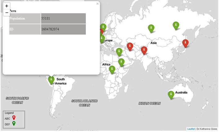
If you want to color your marker following some condition, here is the code, including adding these to the map. In this example I chose to distinguish the cities if the population is above or below the mean. Just enlarge the if function if you need any further criteria. In the row iframe = branca.element. defines the size of the pop-up. For the 2 rows I have in the example data this size is way too big. But you can fix it!
for i in range(0,len(df)):
html = fancy_html(i)
iframe = branca.element.IFrame(html=html,width=400,height=300)
popup = folium.Popup(iframe,parse_html=True)
criterium = df[‘population’].iloc[i]
if criterium > 1.791421e+05:
color = ‘red’
else:
color = ‘green’
folium.Marker([df.iloc[i][‘lat’], df.iloc[i][‘lng’]], popup=popup,icon=folium.Icon(
color=color,icon=’info’,prefix=’fa’)).add_to(map1)
And if you use different colors for the markers, you definitely need a legend:
legend_html = ”’
<div style=”xg-p: fixed;
bottom: 10px; left: 10px; width: 100px; height: 80px;
border:2px solid grey; z-index:9999; font-size:12px;
“> Legend <br>
ABC <i class=”fa fa-map-marker fa-2x” style=”color:#21679E”></i><br>
DEF <i class=”fa fa-map-marker fa-2x” style=”color:#81A930″></i><br>
</div>
”’
m.get_root().html.add_child(folium.Element(legend_html))
Mind to double check the colors of the markers on the map and on the legend. For some reasons they do not match. You can use the hex color numbers in the legend function to adjust.
Here is the output:
Well, I think this is enough for the second part and I am looking forward to share with you further map tricks.