
- Graphs are a great tool to appeal to a wide audience,
- They are often used to deliberately mislead, not inform,
- A few creative ways graphs have been used this year to distort Covid-19 facts.
Good graphs are powerful tools to convey data, but they can be skewed to fit an agenda. The worst graphs typically misuse visual proximity, manipulate data, and omit important details from chart titles and captions [1]. While it’s fairly easy to spot a truncated y-axis or missing label, graph designers are getting smarter about how they mislead. From logarithmic scales to time travel, here are a few of the worst Covid-19 related graphs to come out this year.
An Act of Omission
This graph was posted on Twitter by @Carnage4Life with the caption “You can teach an entire semester of how to lie with statistics with the y-axis of this chart”:
Can you spot the problem?
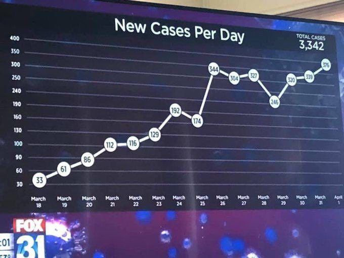
Look carefully at the y-axis and the uneven graph intervals. It gives the graph a flattened look. For perspective, I recreated what the graph should look like with correct intervals on the y-axis (left), compared to a logarithmic scale similar to the one used by the Fox News graphic (right):
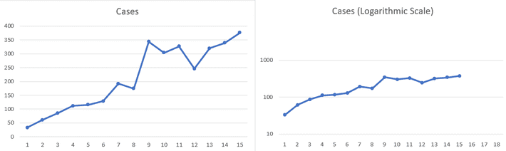
You should only use log scales when there are clear reasons to graph order of magnitude. For example, let’s say you’re comparing mammal weights. Considering the vast differences between, say, mice and elephants, it can be hard to fit 3 ounces and a ton on the same graph. But using a logarithmic scale ensures that your data fits clearly on a single graph, otherwise you’ll have clusters of unreadable small mammal weights near y = 0. Even then, you would want to label the axis with the correct log scale; The Fox News graph failed to divulge they used a quasi -logarithmic scale. They also started the scale ay y = 30, presumably to minimize the 33 cases on March 18.
The “Data” is In…
Some graphs are intended to deliberately mislead; Others are meant to shock. And in some cases, well-meaning graph producers just got it all plain wrong. At first glance, this graph from Jacksonville FL mayor Lenny curry on Twitter (@lennycurry) is typical of many graphs to emerge from the state of Florida this year that aren’t quite what they seem:
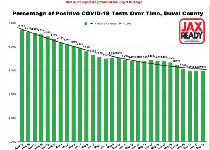
Don’t be surprised if you can’t immediately see what’s wrong with this graph: It’s not the visual that’s the problem, but rather the data behind it. It appears that cases are declining, when we all know now that the opposite was happening. The problem? When testing first began in Florida. people had to meet strict requirements (e.g. symptomatic and visited a hot spot like China) in order to get tested. Testing restrictions loosened mid-April, but testing took a couple of months to become widespread. In addition to the limited testing, there was another another major issue. Of those who were tested:
- Anyone who got a positive test result counted once–as a positive,
- Each and every negative result got counted once. That means if a person tested negative six times, then the negative count got updated by six.
Notice that the graph isn’t counts–it’s percentages. So the fact that negative results were counted multiple times becomes hugely problematic. Whistleblower Rebekah Jones, who was reportedly fired for refusing to manipulate data for the Florida Department of Health [2], maintains her own website with what she reports to be the correct figures [3]. Which set of figures you believe to be the most accurate is unimportant, but the issue highlights the problems with data collection and misleading graphs drawn from problematic data. Different people interpreted the data in entirely different ways. Plus, both sources (Florida Department of Health and an experienced Data Scientist) are, at first glance, reputable, making it even more of a challenge to figure out who is “right”.
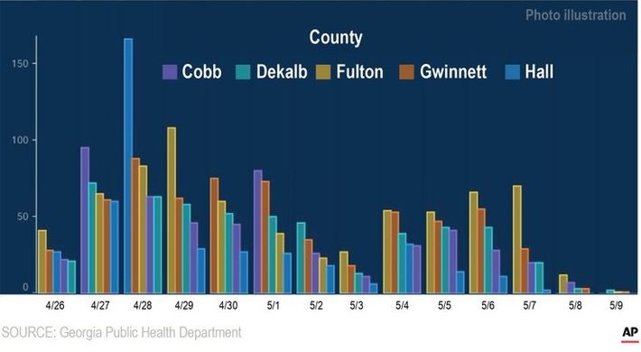
Georgia’s Trends are Just Peachy
The next graph takes misleading axes a step further. Forget about logarithmic scales, missing or truncated data, this graph performs a very special trick: Time travel.
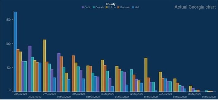
According to the Associated Press [4], The State of Georgia indulged in time travel with date hopping back and forth along the x-axis to produce a “staircase” effect. 27 April comes after 28 April, 1st May comes before 30th April, and the 2nd of May comes after the 6th and 5th of May. The colored bars are also arranged in a different order for each date. Georgia state Rep. Jasmine Clark, a Democrat with a doctorate in microbiology, said the graph was a “prime example of malfeasance…Sadly it feels like there’s been an attempt to make the data fit the narrative, and that’s not how data works.” Here’s AP’s recreation of what the data should look like if ordered correctly, date-wise:
The takeaway from all of this is, unfortunately, take all graphs with a pinch of salt and consult the actual data, not a snapshot before making a decision. If you’re making a graph to convey a message, some best practices include [5]:
- Make sure your vertical scale is the right size,
- Don’t skip numbers,
- Start at zero,
- Include informative labels,
- Use all available data, not some of it.
In summary, make sure to use complete data, create a graph with appropriate labels, and leave the time-traveling to Dr. Who.
References
Fox News Image: https://twitter.com/Carnage4Life/status/1246579721585868800
Lenny Curry’s graph: https://twitter.com/lennycurry/status/1264577936079958022/photo/1
[1] Misrepresenting COVID-19: Lying With Charts During the Second Golde…
[2] FSCJ Data Scientist Says The Way Fla. Presents COVID-19 Numbers Is …
[3] Welcome to Our Covid Action Site
[4] States accused of fudging or bungling COVID-19 testing data