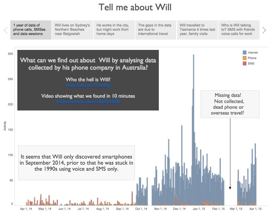
Contributed by Wanda Wang. She is currently in the NYC Data Science Academy 12 week full time Data Science Bootcamp program taking place between April 11th to Jul...
By: Mac Bryla What makes a good data analyst? This is a question I get regularly asked as I help people explore ways to see and understand their ever-growing volume of da...
Summary: The shortage of data scientists is driving a growing number of developers to fully Automated Predictive Analytic platforms. Some of these offer true One-Clic...
These techniques cover most of what data scientists and related practitioners are using in their daily activities, whether they use solutions offered by a vendor, or whet...
“There is no evidence that anybody has been converted by a pie chart.” So said Martin Palmer, secretary general of the Alliance of Religions and Conservation,...
Big Data gets a lot of coverage these days, and it would be easy for anyone to believe that all the innovation is happening in the west, and particularly in Silicon Valle...
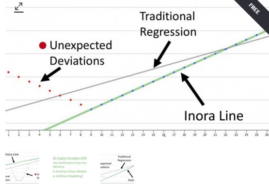
What do you think about Inora, a company that advertises itself as the New Linear Regression Approach – Scalable to Big Data. Our data scientist also developed aut...
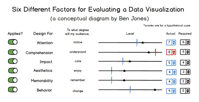
Is there a single “best” way to visualize data in a particular scenario and for a particular audience, or are there multiple “good enough” ways? That’s the deba...
Summary: Management values the self-starting, data-driven, curious, and urgent characteristics that define the Citizen Data Scientist. But the path to encouraging the...
With the wide array of amazing data visualization tools out there – SAP Lumira, Qlik, Domo, Tableau – you would think that the world has moved towards a graph...