
Your hellish commute has never looked so pretty. A new set of animated maps plots the commutes of 3.3 million Bay Area residents commuting to 110,000 destinations.
The maps were made by Alasdair Rae, a geographer and urban planner based at the University of Sheffield. “The data and animations draw attention to something that’s problematic,” Rae says. Anyone who’s spent an hour stuck in bumper to bumper gridlock on the 101 knows what he’s talking about: Too many people are spending too much of their time commuting to and from work.
The maps don’t capture actual commuting routes because that would be too hard to infer from the data, which come from the US Census Bureau’s American Community Survey. So, unlike the poor suckers stuck at the Bay Bridge toll plaza, the dots travel the shortest route between two points, even if it crosses water or goes through buildings.
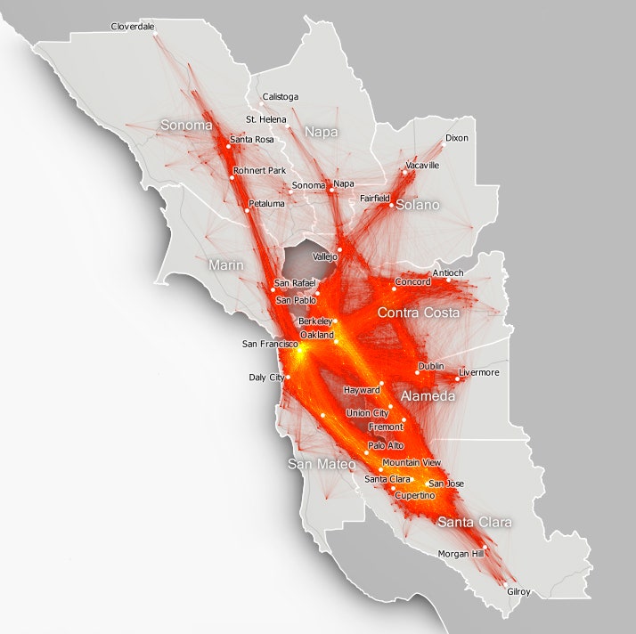
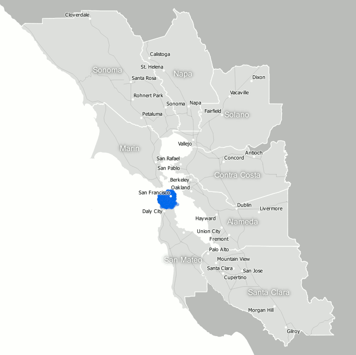
Still, some interesting patterns emerge. One of the most notable features is the blue blob of dots (see the map at the top of this post) that commutes from San Francisco down to the Mountain View area (the Googleplex, perhaps?).
Rae’s map of Bay Area commutes is more like a spider web. At any given node, people are coming and going along multiple paths. In San Francisco, the blue blob may stand out, but other blue dots commute as far north as Cloverdale and as far south as Gilroy. In Contra Costa county (see below), the dots disperse in many directions.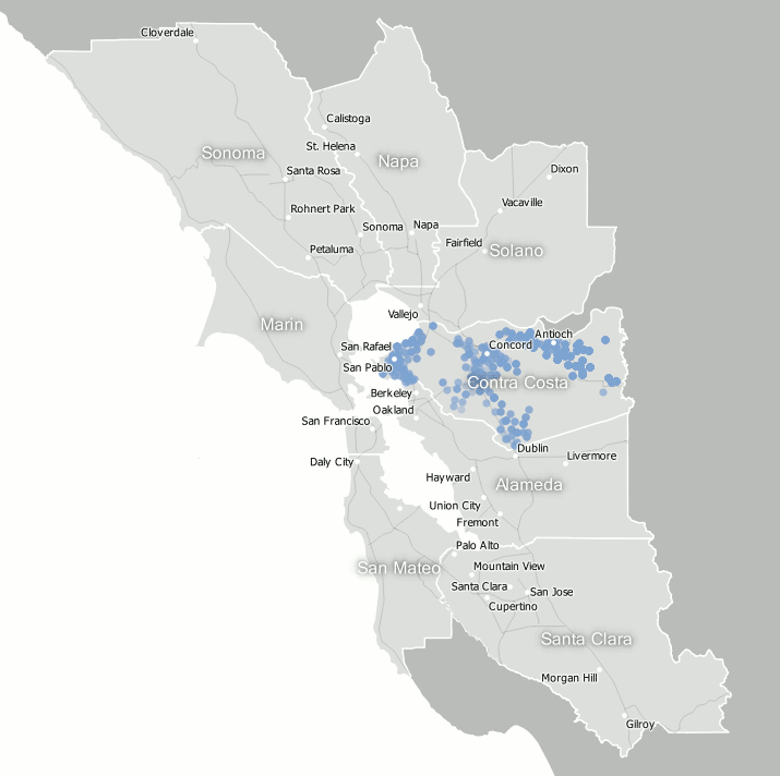
To read the full article click here.
DSC Resources
- Subscribe to our Newsletter
- Comprehensive Repository of Data Science and ML Resources
- Advanced Machine Learning with Basic Excel
- Difference between ML, Data Science, AI, Deep Learning, and Statistics
- Selected Business Analytics, Data Science and ML articles
- Hire a Data Scientist | Search DSC | Classifieds | Find a Job
- Post a Blog | Forum Questions