
If you’ve spent any time with modeling data, you’ll know that there are many pitfalls to be had when it comes to data presentation (I addressed some common pitfalls in Misleading Graphs Part 1). Misleading graphs can be the result of incorrect data collection, ignorance of the basic “rules” of data presentation (like labeling axes), or even deliberate attempts to mislead. A fourth pitfall is more nuanced: despite your best efforts, you can dilute your message with how you present the data.
These examples show how easy it is to muddle a simple message.
That’s a Really Nice Ladder, But…
I wanted to know the answer to the question: How much income do I need to be happy?
I looked to one of my favorite studies of all time, High income improves evaluation of life but not emotional well-being by Nobel Prize-winning economist Angus Deaton and colleague Daniel Kahneman of Princeton University. The team investigated how much money is the “sweet spot” of happiness. Let’s take a look at the graph that accompanied the article. The first thing I noticed was the “Ladder” (after all, it’s the focal point in BOLD):
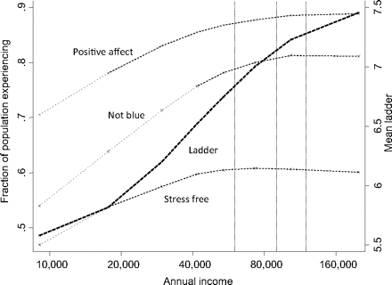
I thought perhaps the ladder (and the “Mean ladder on the right hand y-axis) were related to a corporate ladder (because we are discussing incomes here) but I was completely wrong. According to the authors, the Ladder is actually “…the average reported number on a scale of 0–10, marked on the right-hand scale”. So not only does it not look like a ladder at all, it doesn’t sound like one either (what ladder do you know that’s marked on a scale of 0 to 10)? And while we’re discussing that scale, note that the authors mention 0 to 10 but the scale on the graph goes from 5.5 to 6.5. Why cut the scale off? If you wanted to know where the ladder hits the ground (presumably at an income of a few dollars), you won’t find it on this graph.
But before we ruminate for much longer over that ladder, let’s not forget that we’re here to find out how much money we need to be happy–not to decipher the ladder’s purpose. That ladder was a big distraction to me, and it’s likely to be a big distraction to a big chunk of your audience. The takeaway: don’t put ladders, buckets, horses, or other strong imagery in your graph without fully taking into account what your reader will envisage.
Means, Fractions and Spaghetti
But back to the question at hand. The “happiest income level” is buried on the above graph under fractions and means, plus a spaghetti junction of nine different lines (including two y-axes!). According to The Guardian, one fifth of adults have forgotten how to do fractions and even fewer remember how to calculate the mean. And with the average American reading at an eighth grade level, is the average person in your company going to be able to glean an answer from a graph like this one? Probably not.
If I were to glance at the graph and guess what the magic number might be, I might pick the intersection of “Ladder” and “Positive Effect”: 60,000. And I would be wrong.
Acronyms and Other Gobbledygook
Let’s look at another graph, produced with a similar question in mind.
A second study along the same lines was written by Andrew Jebb, Louis Tay, Ed Diener, and Shigehiro Oishi, titled “Happiness, Income Satiation and Turning Points around the World”.
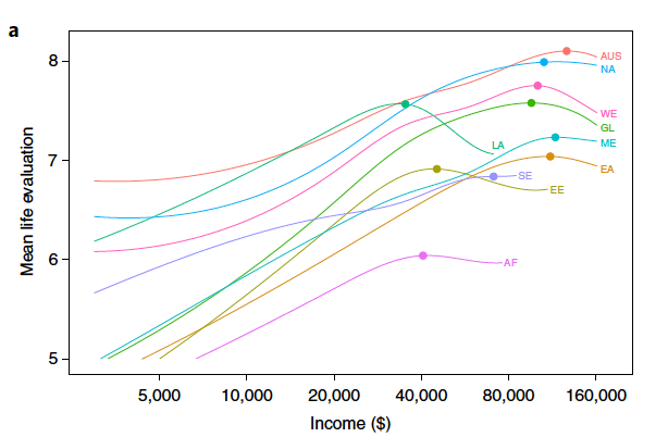
Graph: Courtesy of Richard Carrier
(Sidebar: Perhaps oddly, the first thing I noticed about this graph is that, unlike the first graph in this article, the horizontal axis is labeled correctly (with a $ sign). This is a small, but important note: make sure your axes are labeled!)
I’m still looking for a simple answer to a simple question. And I’m not getting it from this graph.
It suffers from an abundance of acronyms. “AUS” is a clue that it’s a world view, but that’s as far as I got. I had to consult Google to figure out what EE, SE, AF and LA stand for. Eritrea, Singapore, Afghanistan and Louisiana were what sprung to mind. Yes, I know Louisiana isn’t a country but, living very close to Louisiana (I’m in Florida), my brain saw LA and fired up the Louisiana neuron. In case you’re as acronym-challenged as I, the correct answers are Estonia, Sweden, Afghanistan and Laos. I spent more time trying on the wild Google chase of figuring out what those stood for than I spent actually looking for the answer to my question. I’m sure the codes were explained in the study, but they should have put them on the graph.
And Now for a Clear Graph
This next graph, from Slate.com, requires no explanation. 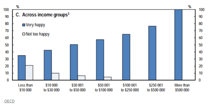
Past 100k, everyone’s happy. A simple graph, for a simple question–and not a wild goose chase in sight. It might not make it into an academic journal, but as a data scientist, that’s probably not your goal.
This example illustrated some of the pitfalls to be had with presenting data. As a data scientist, you are probably going to be relaying information that’s technical, industry-specific, or just plain dull. It’s your job to take those uninteresting details and present them in an interesting,informative way that can be understood by everyone–quickly, and without having to reference other sources to understand your presentation.