
 The chart is a visual representation of data in a clear and simple manner. This type of visualization is often used to increase the level of comprehension, especially in cases of patterns, trends, and interconnections. Building chart is an integral part of data analysis. It helps to decide how to analyze data, how it is distributed, etc. Therefore, it might be high time for you to use charts to your advantage. Let’s dwell on the key concepts you need to know.
Sometimes it is complicated to choose the most suitable and handy chart for your dataset. The infographic below can help you find out what type of chart you should use. All that you need is to have information about your variables. After that, you should answer the given questions. These questions will serve as a framework that will help you to tell a compelling story to the customer. Consequently, we give you pieces of advice about a suitable chart.
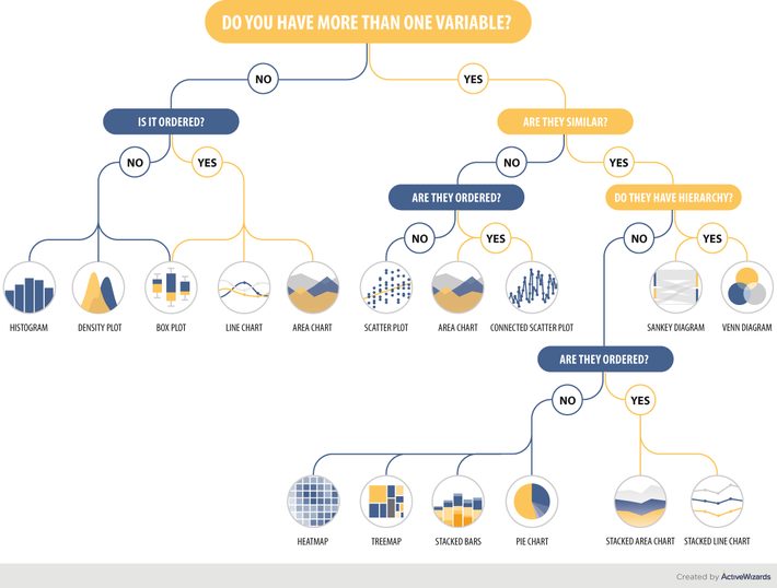
Let’s take a closer look at the charts and define the key navigation rules. The branches of our infographic are built hierarchically, that’s why you should start from the top. Firstly, answer whether you have one or more variables. In case you have only one variable move to the left. Then, decide whether this variable is ordered or not. So, if you have only one variable, you can choose your perfect chart among the following types:
Line chart
Line chart displays the data as a series of points, connected into lines. This type of graph is usually used to show some changes and trends in the data.
Area chart
This type of chart is based on the line chart. Thus their functions are quite similar. An area chart is used to illustrate quantitative data graphically by plotting the data points and connecting them into line segments.
Box plot
Box plot is usually used to depict the groups of numerical data with the help of their quartiles. Box plot often has the whiskers extended vertically to illustrate variability outside the quartiles.
Histogram
The histogram is widely applied as a representation of numerical data distribution. Each bar in the histogram represents the data distributed in a single category, a continuous range of data or frequencies for a specific data point.
Density plot
The density plot is a visualization of data distribution over a continuous period. The peaks of the density plot reflect the concentration of the values over the interval.
In addition, we should mention that the box plot can be used in both cases.
Now, let’s look at the right side. The starting point remains the same – defining the feature of variables. If the features are not similar, then we go left and define whether the variables are ordered data or not. If not, we should use scatter plot; if yes – choose from area chart or connected scatter plot.
Scatter plot
Scatter plot or scattergram is a type of diagram that uses Cartesian coordinates to illustrate values of two common variables for a data set. In this case, the data is represented as a collection of points.
Connected scatter plot
Connected scatter plot is very similar to the previous type mentioned above. The only difference lies in the fact that the points on the diagram are linked to each other.
Now, let’s look closer at the case when the features are similar. The next step is to decide whether the variables have a hierarchy feature. If yes, then there are two options – Sankey diagram and Venn diagram.
Sankey diagram
Sankey diagram belongs to the class of flow diagrams. This type of charts uses arrows to show the flow quantities proportionally.
Venn diagram
Venn diagram is also called primary set or logical diagram. It is used to show all possible logical relations existing between the finite collection of various datasets. The elements are pictured as points in the plane and the sets as regions.
If there is no hierarchy feature, your path goes left to the question about the order. If the variables aren’t ordered, the options are heatmap, treemap, stacked bars, and pie chart. If the variables are ordered then these are stacked area chart and stacked line chart.
Heatmap
Heatmap is such a graphical representation of data where individual values within the matrix are depicted as colors. Larger values are represented by dark pixels, where smaller values are pictured with lighter colors.
Treemap
Treemap pictures the data in the form of rectangles of bigger and smaller sizes. The size of each rectangle shows whether it belongs to set or to one of the subsets.
Stacked bars
In case of stacked bars, parts of the data are adjusted or stacked (horizontal bars, vertical bars or columns) representing the whole amount of data broken down into sub-amounts. Equivalent sections in each bar are colored similarly.
Pie chart
Pie or circle chart is a circular statistical graph, which has sectors or slices representing the proportion of data. The arc length of each sector represents the quantity proportionally.
Conclusion
In this article we presented an infographic which shows the possible chart types you can use depending on the data you have. The variety of different graphs should not confuse you as choosing the right one comes down to answering a few simple questions about your variables.
Hopefully, this article was informative and useful for you. Now you have a better understanding of the types of charts and how to find the best-fitting kind of chart in your case.