
Pictographs are exceptionally good for some types of data. In this post, I show how useful they are for displaying proportions (e.g. rates, percentages, fractions).
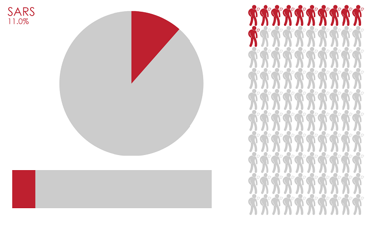
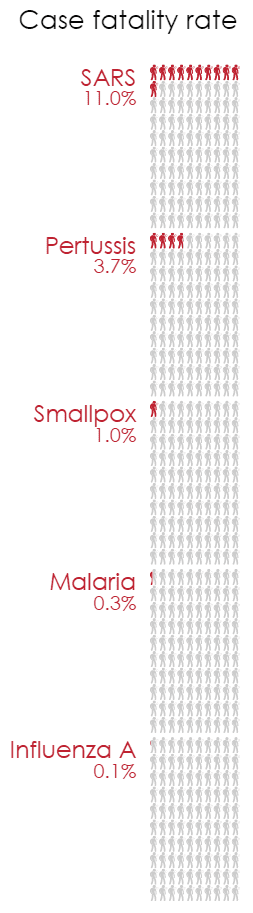
Look at the pictograph example on the right. It shows the case fatality rate using colored stick figure icons. These quantities could be just as appropriately shown using pie or bar charts (see above). However, the pictorial representation makes this statistic intuitive: out of every 100 individuals infected with SARS, you can expect 11 to die.
Pictographs have an intrinsic scale
The icons give the pictograph an intrinsic scale. Compare the pictograph (right) to the barchart (below). Both charts show that SARS is 3 times more deadly than pertussis, but the advantage of using a pictograph can be seen when we compare the other diseases. The pictograph clearly shows that the fatality rate for SARS is an order of magnitude bigger than that for smallpox. By contrast, on the bar chart, all we can see in the absence of any labels is that SARs is much bigger than smallpox.
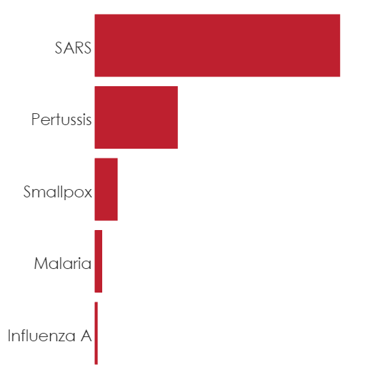
The finer resolution provided by the icons is especially useful for the smaller values. In the bar chart, the much larger fatality rate of SARS makes the variation between the other diseases hard to see. But in the pictograph, it is clear that the smallpox fatality rate is at least double that of malaria.
Pictographs show quantities visually
A well designed pictograph makes quantities easy to read. In the example on the right, the small scale and the large number of icons can potentially cause problems. I avoid this by arranging the icons into 10 by 10 squares. Even without explicitly counting each icon, quantities can be evaluated by comparing the area of the square which is red.
The example on the right shows data labels in order to provide a greater level of detail. However, the main message of the chart – the enormous difference between the severity of different diseases – is effectively conveyed by the icons alone.
You can create your own pictograph or read more content here.
Acknowledgments
Data from https://en.wikipedia.org/wiki/List_of_human_disease_case_fatality_rates
Author: Carmen Chan
Carmen is a member of the Data Science team at Displayr. She enjoys looking for better ways to manipulate and visualize data. Carmen studied statistics and bioinformatics at the University of New South Wales.