
Using Google Mobility Data to Model Covid-19 Case Infection Rates
Paul B. Parker, Ph.D.
Introduction
The question of how and when to open up the economy as Covid-19 rates drop is fraught with great risk on both sides. How the question is answered is likely the most critical public policy decision in the last few decades. Unfortunately, most of the arguments made so far have been based more on philosophy than science. Reliable data has been sparse, but modern technology provides opportunities to make quantitative arguments.
This paper attempts to find relationships between Covid-19 infection rates in the United States and mobility data collected from mobile devices. Google has recently made this Mobility Data publically available for use in research on the Virus. The analysis demonstrates that Google Mobility Data is a reasonable proxy for social interaction that correlates significantly with infection rates.
Google Mobility Data
The Google reports utilize aggregated, anonymized global data from mobile devices to quantify geographic movement trends over time across 6 area categories: retail and recreation, groceries and pharmacies, parks, transit stations, workplaces, and residential areas (1). The numbers are percentages that represent changes above or below the long term trend. The data exist for 131 countries and regions, but I am using only data for the United States in order to compare with relatively consistent Covid-19 epidemiological data. Google’s definitions of the area categories are in Table 1.
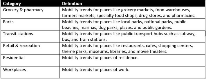
Table 1. Mobility area category definitions
The U.S. aggregates since February 15 are shown below. A couple of interesting things to note: Grocery and Pharmacy spiked up in early March, as people stocked up for the lockdowns and “Social Distancing”. Parks and Retail/recreation did also though to a lesser extent, suggesting people wanted to carry out these activities before lockdowns were put in place. Workplaces and Residential are clearly inversely correlated, as workplaces shut down people spent more time travelling near the home.
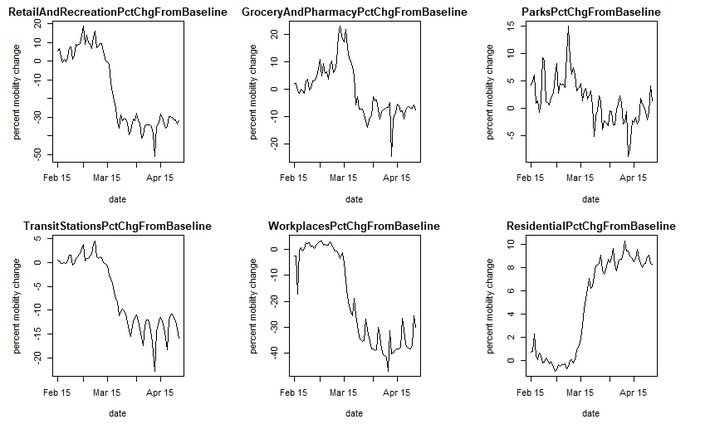
Figure 1. U.S. aggregate mobility by date since Feb. 15 for 6 different area categories.
Epidemiological Data
The New York Times has published State and County level data to github (2). Cases and Deaths are cumulative by Date, going back to Washington State on 1/21/2020. Figure 2 shows cumulative cases for 4 counties, Westchester (NY), Los Angeles (CA), Dallas (TX), and Snohomish (WA). Note that because the cases are cumulative, no new cases are being added when the slope becomes horizontal. Snohomish and Westchester are closer to this than Los Angeles and Dallas, which experienced later onsets of the disease.
The data represent verified cases only. Some recent antibody studies in Germany, Norway, and The United States suggest that as many as 20% of certain populations have already been infected by the virus (3). In that light, the numbers being used here are almost certainly a significant underrepresentation, but they are useful for two reasons:
- They are likely relatively consistent because testing standards were similar across most U.S. States
- They represent the most severe cases and are a measure of medical capacity usage
Death counts are likely far less ambiguous than case counts, and it is possible to do this analysis with them, but the data for deaths is also far more sparse and more truncated, as it is usually 1-2 weeks from diagnosis to mortality. This leads to more numerical problems in regressing the data.
Figure 2. Cumulative Covid-19 cases in 4 representative U.S. counties.
Modeling Considerations
In order to tie the Mobility data to outcomes, we need robust metrics to represent each. A simple dependent variable is simply the percent increase in cases over a specific time period. This is unstable in the early days of the viral spread, when case counts are low in a specific county, but can be regularized by weighting the regression on the number of cases. The choice of a “lookahead window” is somewhat subjective, you need one long enough to capture any changes influenced by mobility, but if it is too long you truncate your data. According to the CDC, people who get symptoms nearly always do so in the first 2-14 days (4), with the 97.5% experiencing symptoms in the first 11.5 days (6), so a 12 day lookahead is probably adequate to compute the percent increase.
Defining the Independent variable is also somewhat subjective. I chose to look at Mobility for the 12 days leading up to the lookahead, but filter it with a 12 period Gaussian (mean = 3, sd = 2.0) (Figure 3). This gives the greatest weight to mobility 7-9 days before the lookahead, and slowly deprecates the effects to nearly zero a couple days before the window.
 Figure 3. Gaussian Filter
Time-Independent Covariates
Combining the datasets above produced 47,847 rows of data, of which 20,609 were removed because of missing mobility values. To this data I added several time-independent covariates from the U.S. Census data (5) which are sometimes associated with variance in epidemiology:
- AvgLatitude (average latitude, a proxy for average regional temperature)
- PopulationDensity (population density of county)
- PctOver65 (percentage of people in county over 65 years of age)
- PctFemale (percentage of females in county)
- PercentAfricanAmerican (percentage of African Americans in county)
- PercentAsian (percentage of Asians in county)
- PercentLatinoHispanic (percentage of Latino/Hispanics in the county)
- PercentForeignBorn (percentage of foreign born in the county)
- PersonsPerHousehold (average persons per household in the county)
- MedianHouseholdIncome (median household income in the county)
Lastly, I added an independent variable measuring the previous 5 days viral growth rate. This allows the model to make more accurate projections of the growth rates 12 days into the future.
Model Results
The regression results are shown in Table 2 below. The model has an R Squared of 0.596, meaning that most of the results are explained by these covariates, although their individual contributions vary significantly.
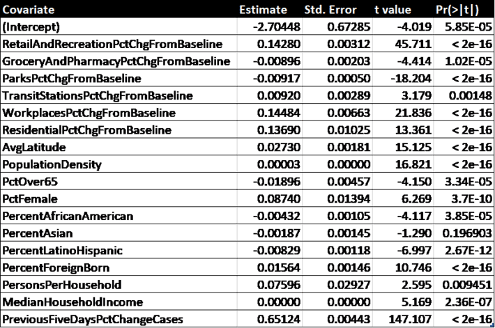 Table 2. Regression results
All of the covariates except for “PctAsian” are significant beyond the 99% confidence level. It is clear that the most predictive is “PreviousFiveDaysPctChangeCases”, which just means the future slope of the curve is related to the current slope for each county.
By changing one variable at a time while holding the others constant, we get an estimate of the influence of the time dependent covariates (Table 3) and the time independent ones (Table 4).
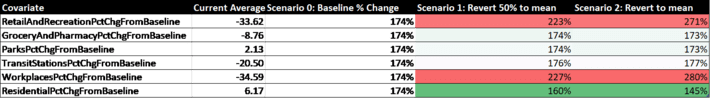
Table 3. Time dependent covariates and their predicted effects on infection rates.
Among the mobility variables, the strongest predictor of increase in infection rate is mobility around the workplace, followed closely by mobility around retail and recreation areas. Curiously, Residential mobility was third, suggesting that lockdowns and “sheltering in place” measures are not as effective as suggested, or are at least are being sabotaged by some amount of interaction with housemates or friends/neighbors. This may explain why Sweden, which did not enforce strict lockdowns, has not had significantly higher rates of infection than other European countries. The model also suggests that greater mobility in the areas of grocery/pharmacy and parks/recreation would not increase infection rates. The one thing that Retail/Recreation (which includes bars, restaurants, concerts, etc.) and Workplaces have in common is close social interaction, which Parks and Grocery stores have less of. This suggests it may be more common to get the virus from respiration rather than touching it.
Most of the time-independent factors seem to have very little influence on rates of infection. The exceptions are Latitude, which might suggest warmer weather has a small effect, as does persons per household (this is not surprising), and the percentage of foreign born in the county (possibly due to more visitors from their native countries). Race does not seem to have a large effect, nor does income. It is widely known that those over 65 are more at risk of death from Covid-19, but as far as infection rates goes it appears that having a large percentage of seniors in the county is a slight deterrent, possibly because they take the social distancing guidelines more seriously.
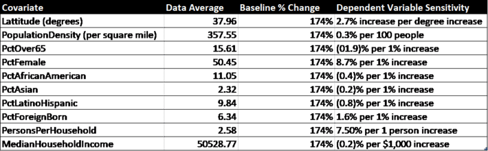
Table 4. Time independent covariates from Census data and their predicted effects on infection rates.
Table 5 contains a county-by-county breakdown of weighted average mobility trends and the projected changes in cumulative infected rates for the Baseline scenario (current status quo), Scenario 1 (returning to 50% of historical mobility), and Scenario 2 (returning to 100% of historical mobility). The most populous 30 counties in the U.S. are shown. A change of 200% in infection rate represents a doubling of cumulative cases over the 12 day lookahead period. Because 2 weeks is roughly the time it takes for an infected patient to either die or recover, a 200% growth rate is roughly keeping a constant rate of infection.
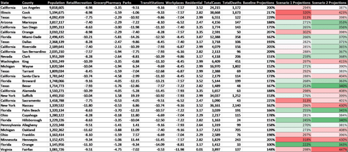
Table 5. Mobility and predicted 12 day infection growth rates (last 3 columns) as of May 1, 2020. The Baseline projections are for 12 days in the future with current mobility and can be compared with Scenario 1 (return 50% to long term mobility) and Scenario 2 (returning 100% to long term mobility).
It should be noted that these projections are based on pre-Covid19 norms of social contact, and do not take into account mitigation like social distancing. For example, it is probably possible to return to historical norms in the workplace without dramatically increasing infection rates if social distancing is used and large meetings are avoided.
Conclusions
Because Mobility can be a proxy for social interaction, it is clearly a significant factor in the transmission of Covid-19. Using Google’s mobility data allows us to see the relationships between mobility in different geographical areas and their corresponding increase in infection rates. Regressing the data suggests that it is possible to achieve previous levels of mobility but doing so must be undertaken with caution and mitigation, especially in the workplace and in retail/entertainment venues. Future work can utilize the Global dataset in order to see correlations by country.