
The opportunity to watch and coach the University of San Francisco (USF) students during our annual Hackathon with our friends at Good Dataprobably taught me as much as it taught the students. The lessons learned I’ll share here will not only benefit future classes, but my customers. It also gives me an opportunity to make special mention of one Hackathon team that really delivered the goods!

This year’s Hackathon focused on analyzing air traffic delays (a subject area with which I unfortunately consider myself an expert). We used data from the Bureau of Transportation Statistics on “Reporting Carrier On-Time Performance (1987-present)” for the competition. The Hackathon exercise not only provides an opportunity to further test and refine the Hypothesis Development Canvas, but an opportunity to see how well the students’ adopted the “Thinking Like A Data Scientist” process.
So download the data and play along, or watch the movie “Planes, Trains and Automobiles” instead to feel the pain and anguish associated with flight delays (and make Del Griffith and Neal Page proud in the process).
Lesson #1: Create Actionable (Predictive) Business Hypothesis
Several of the Business Hypotheses created by the students were too broad and general, but more importantly, they lacked the specificity upon which to make the Business Hypothesis actionable. To make the hypothesis actionable, the hypothesis must seek to predict specific outcomes– about key Business Entities such as airlines, airports, day of week, and time of day – in order to make prescriptive recommendations. The more focused, granular, reasonable and actionable the hypothesis, the better success the data science team had. Some of the teams did a great job of setting up the hypotheses that they wanted to prove:
- One team sought to predict which routes business people should take based upon day of week, which was great for us business travelers!
- Another team sought to understand the impact that climate change was having on airport delays, which was also great (though their selection of airports probably hindered the effectiveness their analysis).
- One team sought to predict flight delays, and I’m going to talk about that team later.
Another thing with which some teams struggled was comprehending the difference between Descriptive Analytics versus Predictive Analyticsas they built out their Hypothesis Development canvas. Again, the Hypothesis should focus on predictions. For example:
- Identifying the worst performing [airlines] or [airports] – that’s Descriptive Analytics about what happened.
- Predicting when [airlines] or [airports] are likely to be at their worst and in what situations – that’s Predictive Analytics because we’re trying to predict what outcomes are likely to happen.
While descriptive analysis is important in trying to identify and understand the trends, patterns and relationships that might be buried in the data, descriptive analysis is not sufficient. Your data science journey can’t stop at descriptive analysis. Ultimately, one has to try to predict specific outcomes (codify the patterns, trends and relationships buried in the data) so that they can make prescriptive recommendations or actions (which ultimately drive monetization or revenue opportunities).
Lesson #2: Importance of Data Prep
Another challenge that the teams ran into was deriving assumptions-based data that had not been normalized. The teams found delay “insights” when comparing airlines, airports, routes, day of week and time of data, but sometimes these “insights” ended up being misleading or even wrong in some cases when the data had not been normalized for comparison and analysis purposes.
Before jumping into the analysis of the data, ensure that one is comparing apples-to-apples through normalization of the data using techniques such as indices, ratios, “% of Total”, “% of Base”, normal curve equivalent (NCE), and Scores.
Another useful data prep technique is data “banding” which is the classification of numeric data into value ranges (or bands). Banding the data into relevant ranges or segments can improve the quality and actionability of the analysis. Banding examples from our flight data include:
- Banding flight delays: Negligible Delays (less than 10 minutes), Annoying Delays (10 to 30 minutes), Critical Delays (30 to 90 minutes), Devastating Delays (over 90 minutes).
- Banding flight route types: Short haul vs Long haul, Direct vs Connected
This banding becomes even more interesting when you start analyzing across the bands. For example, a 45 minute delay can become Devastating if there are tight connections involved on a heavy traffic day (where just catching the next flight might not be an option due to no available seats).
Yes, the dreaded cascading delays problem!
Banding can benefit from working with business stakeholders and subject matter experts to understand logical bands (if you had talked to me I could have shared LOTS of insights about flight delays). And expect that while the bands given to you by the subject matter experts are a great starting point, your analysis may undercover more relevant and insightful data bands.
Lesson #3: Be Careful Working with Averages Because Homer Simpson Lurks!
Maybe the biggest problem the students ran into was the use of averages to make assumptions and decisions.
If you base you analysis on averages, you’re only going to get average results.
As fortunate would have it, we ran into an example of Simpson’s (not Homer Simpson’s)Paradox. Simpson’s Paradox is a probability phenomenon in which a trend appears in granular data groups, but the trend disappears or even reverses when the groups get combined or aggregated. Fortunately, we found a real-life example that pertains to flight delays.
Figure 1 shows real flight on-time performance data for Alaska Airlines and America West (it’s an old and limited data set, but it suffices to support our lesson). What is astounding about the information is that at each airport, Alaska Airlines has a lower (better) “Percentage Delayed” performance than America West, but overall (when aggregated across the 5 airports) America West (10.9%) has a lower (better) “Percentage Delayed” performance than Alaska (13.3%).
How can that be?
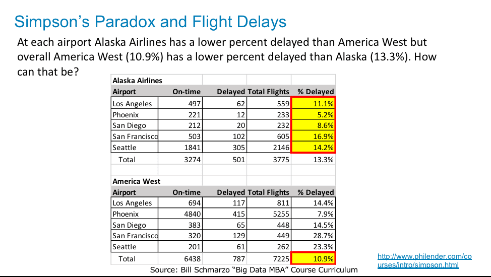
Figure 1: How Can Alaska Airlines out-perform America West at each airport, but have worse overall performance?
Upon careful inspection, we notice that the Flight Delay data in Figure 1 compares “Percentage Delayed” performance on airports arranged in alphabetical order (e.g., Compares Los Angeles to Los Angeles, Compares Phoenix to Phoenix). But the airlines have a widely different number of flights from the different airports, which gets obscured when comparing “% Delayed” averages on an airport by airport basis.
If we reframe the performance analysis to compare the airports based upon relative importance (traffic) per airline, we get a very different picture. That is, the numbers are the same, but we have just taken a different – and more relevant – perspective by ranking the airports by traffic volume per airline versus alphabetical (See Figure 2).
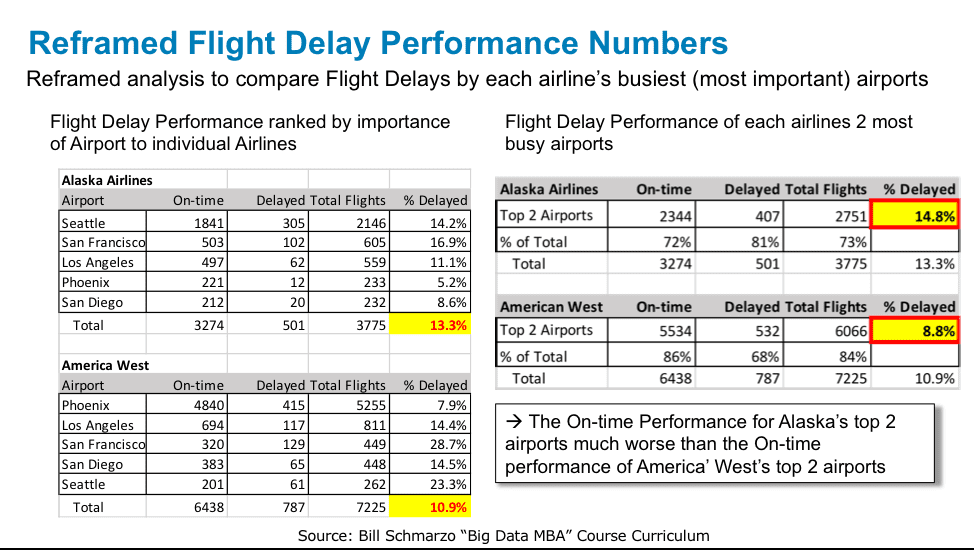
Figure 2: Reframed “% Delayed” Analysis by Airline’s Most Important Airports
Example #1: Seattle is Alaska’s most important airport (it’s a hub airport for Seattle and accounts for 57% of all Alaska flights in our data set), and Alaska has a 14.2% “Percentage Delayed” performance. On the other hand, Phoenix is America West’s most important airport (it’s their hub and accounts for 73% of their flights in our data set), and America West has a 7.9% “Percentage Delayed” performance.
Note that America West’s performance in Seattle also sucks, but its volume of traffic through Seattle is much smaller so it has a lesser impact on America West’s overall “Percentage Delayed” performance.
Bottom-line: Seattle is just an airport to try to avoid!
Example #2: Let’s expand our analysis to examine the performance of Alaska’s and America West’s two most important (busiest) airports. Alaska Airlines’ two most important airports are Seattle and San Francisco, which accounts for 73% of their Total Flights. America West’s two most important airports are Phoenix and Los Angeles, which accounts for 84% of their Total Flights. The On-time Performance for Alaska’s 2 most important airports was much worse (“Percentage Delayed” = 14.8%) than the On-time performance for America’ West’s 2 most important airports ( “Percentage Delayed” = 8.8%).
Bottom line: America West has much better “Percentage Delayed” performance at its Phoenix hub than does Alaska at its Seattle and San Francisco hubs, which is why at the overall aggregate level America West has better “Percentage Delayed” performance than Alaska.
When you reframe the analysis to look at the data from a more relevant perspective (based upon most airport importance or traffic versus alphabetical in our example), the insights from the data analysis become more relevant, more actionable and ultimately more correct.
See “Introduction to Research Design and Statistics” and/or “Simpson’s Paradox and Statistical Urban Legends: Gender Bias at Ber…” for more information about the Simpson’s Paradox.
And the Winner Is…
I wanted to highlight one team in our hackathon that really knocked the ball out of the park. The team was comprised of USF students Chotika Chansereewat and Thuy Tran who were aided by Sheila Jung and Phil Farr of Good Data. Their stated business hypothesis was to “Develop and monetize a new feature in Flight Search Engine that predicts flight cancellation.”
They did all the mandatory descriptive analytics work that lead to the creation of the below predictive model using Linear Regression (See Figure 3).
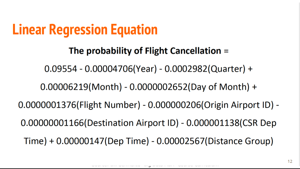
Figure 3: Flight Cancellation Predictive Model
I know that there are some things wrong with the Predictive Model in Figure 3 which they would have fixed if they had more than a couple of hours to build the predictive model. The most important thing is that they created a predictive model! Now they have something against which they could know start testing new data sets, new variables and even new analytic algorithms.
Don’t let perfection get in the way of progress!
But the team didn’t stop with the predictive model – they had an outstanding idea as how to monetize their predictions (see Figure 4)!
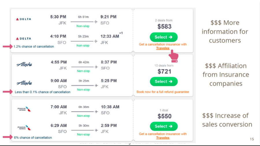
Figure 4: Monetizing Flight Predictions (though Flight Insurance)
Their idea was to integrate their predictive model with an airline booking site or application, and use their predictions about the likelihood of a delay on that flight as an opportunity to sell flight delay insurance. Absolutely brilliant!
Hint employers: Hire this team!!
Thinking Like A Data Scientist Summary
It isn’t enough for organizations just to understand their data and the different analytic techniques. Organizations looking to exploit the potential of advanced analytics (machine learning, deep learning, artificial intelligence) must teach it’s business stakeholders to “Think Like A Data Scientist.”
The importance of getting the entire organization to “Think Like A Data Scientist” are highlighted in this Harvard Business Review article titled “How to Set Up an AI R&D Lab”:
“What leaders tend to miss here is that the scientific progress we’ve made in AI does not automatically render the technology ready for any environment. Each business carries its own unique challenges and requirements, from proprietary data types to operational constraints and compliance requirements, which may require additional customization and scientific progress.”
Our USF class seeks to teach tomorrow’s business leaders important data science operational factors such as understanding the costs of False Positives and False Negatives, which is a business decision and not a technology discussion, and the importance of Critical Thinking(such as the existence of the Simpson’s Paradox) and being skeptical in a world dominated by questionable analytic discipline. And as you saw in this blog, we must ensure that we are teaching our business stakeholders to be skeptical of the initial results, that they are comparing apples-to-apples and the power of critical thinking as they seek to uncover actionable, accurate and truthful customer, product, service and operational insights buried in the data sets.
USF Big Data MBA Summary
Yes, I am sad that the semester is over. I only team one semester a year, so it’ll be nearly 9 months before I get my next class of students with whom I can explore new ideas, and fail and learn.
Special thanks to Professor Mouwafac Sidaoui, who is my co-teacher for the class. He really does all the hard, behind-the-scenes work in the class so that I can lecture, create new exercises and learn. And Dean Elizabeth Davis who is supportive of this unusual teaching arrangement.
And I hope that all of my followers can benefit from these valuable lessons that we get from these creative, open-minded, never-say-die Millennials.
I know that I certainly do!