
The following problems appeared in the programming assignments in the coursera course Applied Social Network Analysis in Python. The descriptions of the problems are taken from the assignments. The analysis is done using NetworkX.
The following theory is going to be used to solve the assignment problems.
1. Creating and Manipulating Graphs
- Eight employees at a small company were asked to choose 3 movies that they would most enjoy watching for the upcoming company movie night. These choices are stored in a text file
Employee_Movie_Choices, the following figure shows the content of the file.
Index Employee Movie 0 Andy Anaconda 1 Andy Mean Girls 2 Andy The Matrix 3 Claude Anaconda 4 Claude Monty Python and the Holy Grail 5 Claude Snakes on a Plane 6 Frida The Matrix 7 Frida The Shawshank Redemption 8 Frida The Social Network 9 Georgia Anaconda 10 Georgia Monty Python and the Holy Grail 11 Georgia Snakes on a Plane 12 Joan Forrest Gump 13 Joan Kung Fu Panda 14 Joan Mean Girls 15 Lee Forrest Gump 16 Lee Kung Fu Panda 17 Lee Mean Girls 18 Pablo The Dark Knight 19 Pablo The Matrix 20 Pablo The Shawshank Redemption 21 Vincent The Godfather 22 Vincent The Shawshank Redemption 23 Vincent The Social Network - A second text file,
Employee_Relationships, has data on the relationships between different coworkers. The relationship score has value of-100(Enemies) to+100(Best Friends). A value of zero means the two employees haven’t interacted or are indifferent. The next figure shows the content of this file.
| Index | Employee1 | Employee2 | Score |
|---|---|---|---|
| 0 | Andy | Claude | 0 |
| 1 | Andy | Frida | 20 |
| 2 | Andy | Georgia | -10 |
| 3 | Andy | Joan | 30 |
| 4 | Andy | Lee | -10 |
| 5 | Andy | Pablo | -10 |
| 6 | Andy | Vincent | 20 |
| 7 | Claude | Frida | 0 |
| 8 | Claude | Georgia | 90 |
| 9 | Claude | Joan | 0 |
| 10 | Claude | Lee | 0 |
| 11 | Claude | Pablo | 10 |
| 12 | Claude | Vincent | 0 |
| 13 | Frida | Georgia | 0 |
| 14 | Frida | Joan | 0 |
| 15 | Frida | Lee | 0 |
| 16 | Frida | Pablo | 50 |
| 17 | Frida | Vincent | 60 |
| 18 | Georgia | Joan | 0 |
| 19 | Georgia | Lee | 10 |
| 20 | Georgia | Pablo | 0 |
| 21 | Georgia | Vincent | 0 |
| 22 | Joan | Lee | 70 |
| 23 | Joan | Pablo | 0 |
| 24 | Joan | Vincent | 10 |
| 25 | Lee | Pablo | 0 |
| 26 | Lee | Vincent | 0 |
| 27 | Pablo | Vincent | -20 |
| 0 | Claude | Andy | 0 |
| 1 | Frida | Andy | 20 |
| 2 | Georgia | Andy | -10 |
| 3 | Joan | Andy | 30 |
| 4 | Lee | Andy | -10 |
| 5 | Pablo | Andy | -10 |
| 6 | Vincent | Andy | 20 |
| 7 | Frida | Claude | 0 |
| 8 | Georgia | Claude | 90 |
| 9 | Joan | Claude | 0 |
| 10 | Lee | Claude | 0 |
| 11 | Pablo | Claude | 10 |
| 12 | Vincent | Claude | 0 |
| 13 | Georgia | Frida | 0 |
| 14 | Joan | Frida | 0 |
| 15 | Lee | Frida | 0 |
| 16 | Pablo | Frida | 50 |
| 17 | Vincent | Frida | 60 |
| 18 | Joan | Georgia | 0 |
| 19 | Lee | Georgia | 10 |
| 20 | Pablo | Georgia | 0 |
| 21 | Vincent | Georgia | 0 |
| 22 | Lee | Joan | 70 |
| 23 | Pablo | Joan | 0 |
| 24 | Vincent | Joan | 10 |
| 25 | Pablo | Lee | 0 |
| 26 | Vincent | Lee | 0 |
| 27 | Vincent | Pablo | -20 |
- First, let’s load the bipartite graph from
Employee_Movie_Choicesfile, the following figure visualizes the graph. The blue nodes represent the employees and the red nodes represent the movies.

- The following figure shows yet another visualization of the same graph, this time with a different layout.

- Now, let’s find a weighted projection of the graph which tells us how many movies different pairs of employees have in common. We need to compute an L-bipartite projection for this, the projected graph is shown in the next figure.
- The following figure shows the same projected graph with another layout and with weights. For example, Lee and Joan has the weight 3 for their connecting edges, since they share 3 movies in common as their movie-choices.


- Next, let’s load the graph from
Employee_Relationshipsfile, the following figure visualizes the graph. The nodes represent the employees and the edge colors and widths (weights) represent the relationships. The green edges denote friendship, the red edges enmity and blue edges neutral relations. Also, the thicker an edge is, the more powerful is a +ve or a -ve relation. - Suppose we like to find out if people that have a high relationship score also like the same types of movies.

- Let’s find the Pearson correlation between employee relationship scores and the number of movies they have in common. If two employees have no movies in common it should be treated as a 0, not a missing value, and should be included in the correlation calculation.
- The following data frame is created from the graphs and will be used to compute the correlation.
Index Employee1 Employee2 Relationship Score Weight in Projected Graph 0 Andy Claude 0 1.0 1 Andy Frida 20 1.0 2 Andy Georgia -10 1.0 3 Andy Joan 30 1.0 4 Andy Lee -10 1.0 5 Andy Pablo -10 1.0 6 Andy Vincent 20 0.0 7 Claude Frida 0 0.0 8 Claude Georgia 90 3.0 9 Claude Joan 0 0.0 10 Claude Lee 0 0.0 11 Claude Pablo 10 0.0 12 Claude Vincent 0 0.0 13 Frida Georgia 0 0.0 14 Frida Joan 0 0.0 15 Frida Lee 0 0.0 16 Frida Pablo 50 2.0 17 Frida Vincent 60 2.0 18 Georgia Joan 0 0.0 19 Georgia Lee 10 0.0 20 Georgia Pablo 0 0.0 21 Georgia Vincent 0 0.0 22 Joan Lee 70 3.0 23 Joan Pablo 0 0.0 24 Joan Vincent 10 0.0 25 Lee Pablo 0 0.0 26 Lee Vincent 0 0.0 27 Pablo Vincent -20 1.0 28 Claude Andy 0 1.0 29 Frida Andy 20 1.0 30 Georgia Andy -10 1.0 31 Joan Andy 30 1.0 32 Lee Andy -10 1.0 33 Pablo Andy -10 1.0 34 Vincent Andy 20 0.0 35 Frida Claude 0 0.0 36 Georgia Claude 90 3.0 37 Joan Claude 0 0.0 38 Lee Claude 0 0.0 39 Pablo Claude 10 0.0 40 Vincent Claude 0 0.0 41 Georgia Frida 0 0.0 42 Joan Frida 0 0.0 43 Lee Frida 0 0.0 44 Pablo Frida 50 2.0 45 Vincent Frida 60 2.0 46 Joan Georgia 0 0.0 47 Lee Georgia 10 0.0 48 Pablo Georgia 0 0.0 49 Vincent Georgia 0 0.0 50 Lee Joan 70 3.0 51 Pablo Joan 0 0.0 52 Vincent Joan 10 0.0 53 Pablo Lee 0 0.0 54 Vincent Lee 0 0.0 55 Vincent Pablo -20 1.0 - The correlation score is 0.788396222173 which is a pretty strong correlation. The following figure shows the association between the two variables with a fitted regression line.

2. Network Connectivity
-
In this assignment we shall go through the process of importing and analyzing an internal email communication network between employees of a mid-sized manufacturing company.
Each node represents an employee and each directed edge between two nodes represents an individual email. The left node represents the sender and the right node represents the recipient, as shown in the next figure.
https://sandipanweb.files.wordpress.com/2017/09/f7.png?w=150&h=117 150w” sizes=”(max-width: 263px) 100vw, 263px” /> - First let’s load the email-network as a directed multigraph and visualize the graph in the next figure. The graph contains 167 nodes (employees) and 82927 edges (emails sent). The size of a node in the figure is proportional to the out-degree of the node.


- The next couple of figures visualize the same network with different layouts.
- Assume that information in this company can only be exchanged through email.When an employee sends an email to another employee, a communication channel has been created, allowing the sender to provide information to the receiver, but not vice versa.Based on the emails sent in the data, is it possible for information to go from every employee to every other employee?
This will only be possible if the graph is strongly connected, but it’s not. The following figure shows 42 strongly-connected components (SCC) of the graph. Each SCC is shown using a distinct color.
As can be seen from the following histogram, only one SCC contains 126 nodes, each of the remaining 41 SCCs contains exactly one node.
- Now assume that a communication channel established by an email allows information to be exchanged both ways.Based on the emails sent in the data, is it possible for information to go from every employee to every other employee?This is possible since the graph is weakly connected.
- The following figure shows the subgraph induced by the largest SCC with 126nodes.
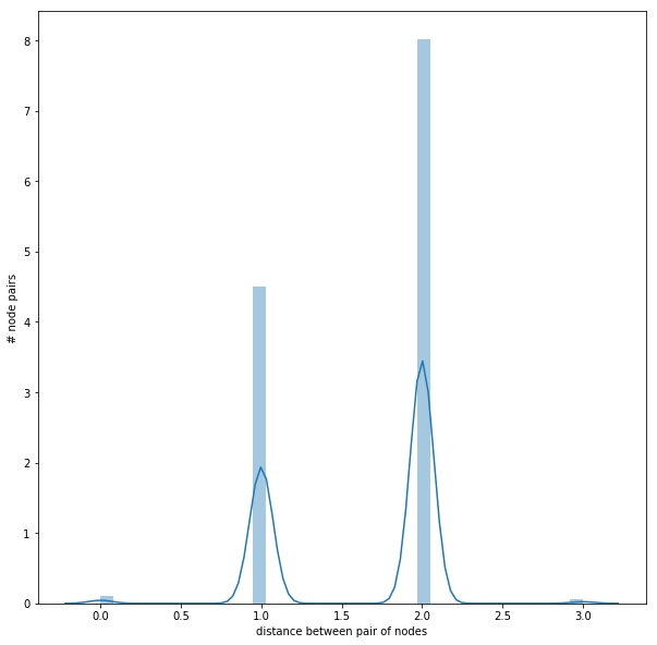
- The next figure shows the distribution of the (shortest-path) distances between the node-pairs in the largest SCC.
As can be seen from above, inside the largest SCC, all the nodes are reachable from one another with at most 3 hops, the average distance between any node pairs belonging to the SCC being 1.6461587301587302.
- Diameter of the largest SCC: The largest possible distance between two employees, which is 3.
- Find the set of nodes in the subgraph with eccentricity equal to the diameter: these are exactly the nodes that are on the periphery. As can be seen from the next figure (the largest component is shown along with few other nodes from some other components in the graph, all the nodes and edges in the graph are not shown to avoid over-crowding), there are exactly 3 nodes on the peripheryof the SCC, namely the node 97, 129 and 134.Each of the following 3 shortest paths shown in the next figure
- 97->14->113->133
- 129->1->38->132 and
- 134->1->38->132
has length equal to the diameter of this SCC.


- Center of the largest SCC: The set of node(s) in the subgraph induced by the largest SCC with eccentricity equal to the radius (which is 1). There is exactly onesuch node (namely, node 38), as shown in the next figure, all the nodes belonging to the largest SCC are distance-1 reachable from the center node 38(again, the largest component is shown along with few other nodes from some other components in the graph, all the nodes and edges in the graph are not shown to avoid over-crowding).
- The following figure shows the distribution of eccentricity in the largest SCC.
- Which node in the largest SCC has the most shortest paths to other nodes whose distance equal the diameter ? How many of these paths are there?As can be seen from the following figure, the desired node is 97 and there are 63 such shortest paths that have length equal to the diameter of the SCC, 5 of such paths (each with length 3) are shown in the next figure, they are:
- 97->14->113->133
- 97->14->113->130
- 97->14->113->136
- 97->14->45->131
- 97->14->45->132
.
- Suppose we want to prevent communication from flowing to the node 97 (the node that has the most shortest paths to other nodes whose distance equal the diameter), from any node in the center of the largest component, what is the smallest number of nodes we would need to remove from the graph (we’re not allowed to remove the node 97 or the center node(s))?
As obvious, the minimum number of nodes required to be removed exactly equals to the size of the min-cut with the source node (center node 38) to the target node (node 97), shown in red in the next figure. The size of the min-cut is 5 and hence 5 nodes (shown in pale-golden-red color) need to be removed, the corresponding node numbers are: 14, 32, 37, 45 and 46. As done in the earlier figures, all the nodes and edges in the email-net graph are not shown to avoid over-crowding.
The min-cut is separately shown in the following figure from source node 38 to target node 97.
- Construct an undirected graph from the subgraph induced by the largest component on the email-net directed multi-graph.
The next figure shows the undirected graph constructed. As before, the node sizeis proportional to the degree of the node.
- What is the transitivity and average clustering coefficient of the undirected graph?The transitivity and average clustering coefficient of the undirected graph are 0.570111160700385 and 0.6975272437231418 respectively.
The following figure shows the distribution of the local clustering coefficients.
The following figure shows the undirected graph, this time the node size being proportional to the local clustering coefficient of the node.
The next figure shows the degree distribution of the undirected graph.
Since there are more nodes with lower degrees than with higher degrees and the transitivity weights the nodes with higher degree more, the undirected graph has lower transitivity and higher average clustering coefficient.


