
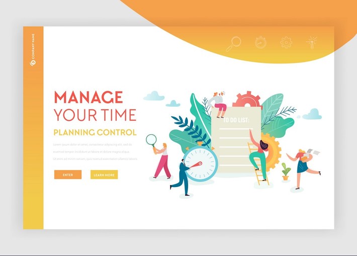
Graphics reveal data. It is a reasonably new invention (compared to say complex mathematical equations) as it was only in the late 1750 to 1800 that the first graphs were invented and referred to as ‘linear arithmetic’. The art and science of data visualization has grown in leaps and bounds since then and is a vital part of informed decision making today in both the business and scientific world. To manage your digital marketing campaigns with insight, it is crucial to understand the basics and the benefits of data visualization.
What is Data Visualization?
Data visualization is the visual representation of large volumes of data in an easy to understand format and presents data and the concepts they represent in a universal manner. It is usually presented in a graphical manner, however, modern development in data visualization presents unlimited opportunities for presentation.
What are Data Visualization Tools?
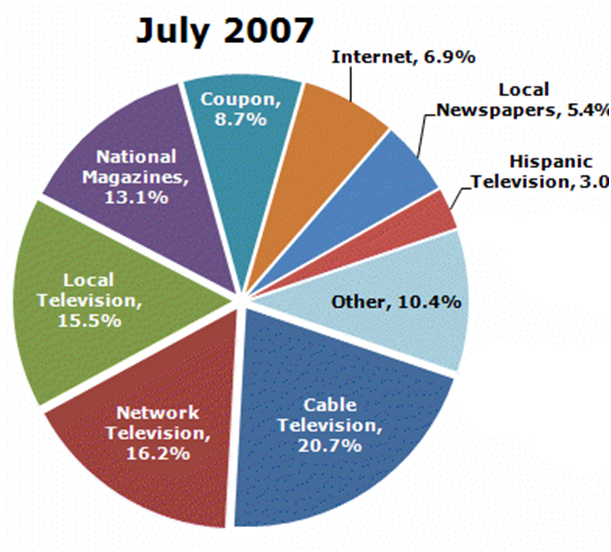
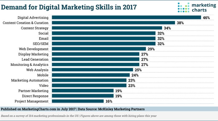
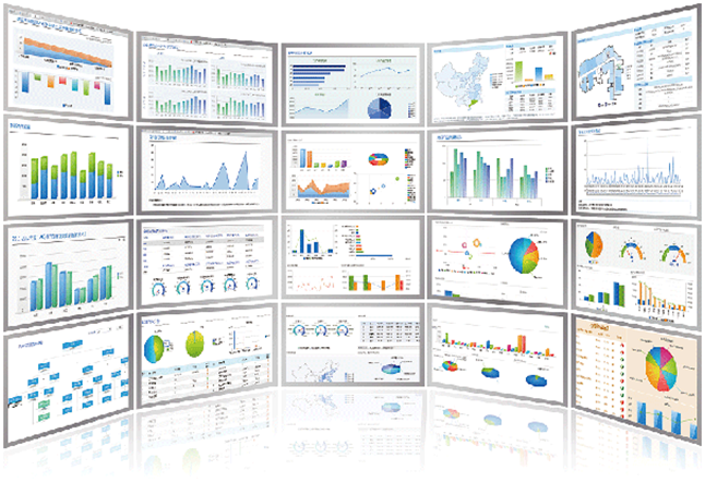
The most basic data visualization tool is a graph or chart, and they come in many forms. If the data points are easy to track it can be drawn by hand, but with digitization today most visualizations are done by computer. Below are some examples of simple charts.
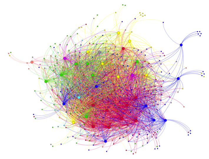
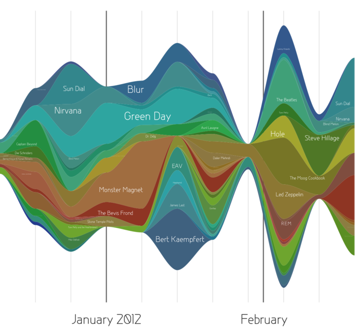
Today, we have much more complex visualizations available with software that will generate dashboards displaying the critical charts in one, with the ability to switch between e.g. areas, groups, etc. Below are examples of Network Analysis, Streamgraph and a dashboard.
In today’s world of Big Data, data visualization tools are essential to analyze huge amounts of data and to enable us to make data-driven decisions.
Sonia Bell, a digital marketing specialist at various sites highlights some benefits of visualization:
- When we analyze measured data, it is much easier using visual representation than to try make sense of spreadsheets and reports.
- Graphics are instruments for reasoning about quantitative information.
- You can run ‘what if’ scenarios by making slight adjustments easily.
- It is perfect for:
- Predicting sales volumes
- Understanding product placement better
- Eliciting the factors that influence customer behavior
- Clarifying areas of concern that requires improvement.
How Does Data Visualization Improve Decision Making?
Performance measures is the process of developing indicators using metrics for driving processes towards the business goals. They:
- drive accountability, visibility and transparency
- provide direction for the organization
- inspire and motivate employees
- encourage alignment from top to bottom to a sound course of action.
Visualization of the Performance Measures allows decision makers to spot outliers – thus it will reveal patterns, conditions and correlations for different aspects of the business. The old adage ‘a picture can speak a thousand words’ is especially true in business decision making – visualization will highlight issues and reveal patterns much quicker than any other format of presentation. It helps business make sense of their data:
- Identify relationships and patterns
- Pinpoint emerging trends
- Understand information quickly
- Communicate the story to others
How can we use Data Visualization in Digital Marketing?
Industry reports (such as Digital Future in Focus Report 2015) cannot determine your company’s strategy, but it can inform on broader trends in consumption and digital marketing and should be considered when determining your content marketing strategy.
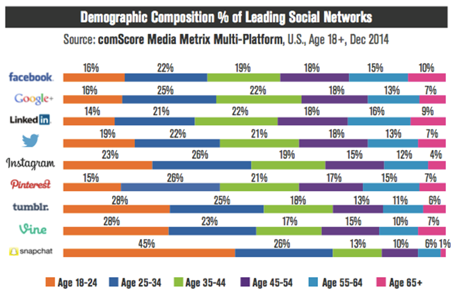
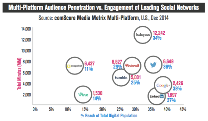
The five most important charts are as follows:
- Social Network Demographics
2. Platform Penetration and Engagement
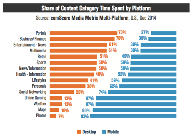
3. Accessing Content Categories
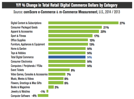
4. What’s Selling, What’s Not
5. Browsing and buying
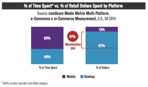
The mobile gap has closed considerably in the last four years, in that more than 60% of sales now gets generated via mobile.
But let us look at what visualizations you should be employing in managing your digital marketing:
You must track your website’s important metrics, for example:
- How well are my SEO’s performing?
- How do customers access and use the site?
- Who are my customers – age, location, devices, interests
- What are my competitors doing?
There are many tools available to help you track your analytics:
- Google Analytics – considered the gold standard, easy to integrate with other platforms, and free to most users (large businesses can purchase an enterprise version).
- Clicky – powerful and flexible – it even lets you search on Twitter. The Big Screen feature is particularly powerful. Free but for advanced features you need to pay
- Chartbeat – great for sites with a lot of content. Paid version only.
- Kissmetrics – very people focused and can track visitors through several visits to your site, something not done by others. Email marketing capability.
- Mixpanel – very similar to Google Analytics with the main feature being event tracking. Easy to set up and free at the basic level.
- Heap – provides a very thorough and granular look at every single click on your website, and simple to use. Free if less than five thousand visitors to your site.
- SEMrush – a complete package of marketing and analytics – standard SEO and PPC tracking but has outstanding keyword research and competitive analysis tools. Helps you find new keywords and will even track which keywords are sending your competitors business.
- Crazy Egg – popular with data enthusiasts for the scroll maps and heat maps, it is a comprehensive tool that is easy to use. It will show you exactly how people are scrolling through your site and where they do click. Will also run A/B tests.
- Optomizely – a great tool for running A/B tests so that you can optimize based on facts.
- Matomo – (previously known as Piwik), a great open source tool hosted on your own platform with your own data, which is great for privacy. They feature great flexibility with around seventy additional plugins. Whilst the tool is free, some plugins are charged for.
Data visualization helps you tell a story. A few people may be able to look at masses of data and find the information or trends they need to find; most people benefit from a picture.
David McCandless said in his TED talk: “By visualizing information, we turn it into a landscape that you can explore with your eyes, a sort of information map. And when you’re lost in information, an information map is kind of useful.”
You’re so awesome! I don’t believe I have read a single thing like that before. So great to find someone with some original thoughts on this topic. Really.. thank you for starting this up. This website is something that is needed on the internet, someone with a little originality!