
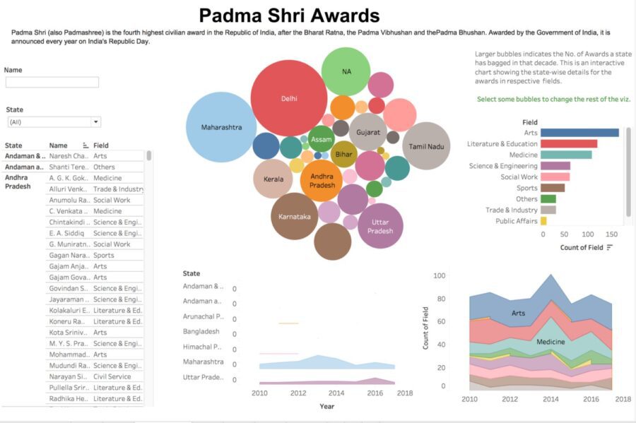
Padma Shri (also Padmashree) is the fourth highest civilian award in the Republic of India, after the Bharat Ratna, the Padma Vibhushan and the Padma Bhushan. Awarded by the Government of India, it is announced every year on India’s Republic Day.
The first time you open up the wikipedia page it’s hard to relate just looking at the HTML Tables that which state has bagged the maximum no. of awards and which field has performed well in a particular year and who are the personalities in a specific field who represent their states or how states perform consistently years over the years.
I was looking at the wikipedia page to collect the data through my eyes to gather the information as much as I can but somehow it didn’t worked out to give an intensive and comprehensive horizon of the information that I was looking for. Then suddenly I thought of why not visualizing this entire data on a dashboard and the next question pops up but How?
Since I have used Tableau earlier on a couple of occasions earlier so thought to give it a try for this entire exercise of developing an information graphics of the Padma Shri Awards.
Next the challenge lies in getting the table from Wikipedia to Tableau, However that was not a uphill task for me since python was in my tool bag. I used Beautiful Soup, which is a python library to pull the data from HTML & XML files. So it wasn’t a time taking task to write a simple python script using Requests & Beautiful Soup to grab the data from Wikipedia to an Excel file.
I uploaded this excel file in Tableau and ready to do the magic but hold-on do I have a plan what I’m looking for and how I’m gonna visualize the entire data set to make it an easy read for anyone to overcome the challenge of what I’m trying to do with my eyes earlier.
DIY StoryTelling with Data
Do your own Research
Ask yourself first, why I’m doing these analytics? it’s all about looking at the information through the medium of numbers and getting a better insight from the data and visualize every corner of the information that your data reveals.
Plan your Story
As learnt in schools every story has a beginning, Middle and an End, Think through to get a clear storyline for your audience. Ensure the take away for your audience is a tangible bit of Information they can use.
Analysis should be short & Informative
Tools are now ubiquitous and they came with a range of visualizations — Bar, Pie, Tables & Line charts. However the focus is on Data exploration and a meaningful insight of your data. so using these tools with utmost intelligence and sharpness is the key for a better visualization of your data and story telling.
So In my case I was interested to know which states has bagged maximum number of awards from 2010–2017 and what are the fields where maximum awards are gained over the years, Also how user can look for the Awardees names in a specific filed for an individual state.
Since I have a clear goal in my mind to plot I have started using the Tableau worksheets to craft my single visualizations before putting them together to create an interactive Dashboard.
Using Tableau is really an easy & efficient way to visualize the data and give your data a fantastic overview in the form of story.
Below is my 1 week of efforts looks like in Tableau Public Forum, here
 To read original post, click here