
Practical guide to understand, build, and execute data quality & cleaning process
In the book ‘Bad Data Handbook’ Q Ethan McCallum has rightly said, “We all say we like data, but it’s not the data but the insights that we derive from it are what we care about.” Yet, a data analyst gets to dedicate only 20% of her time to the art and science of generating insights out of data. The rest of her time is spent in structuring and cleaning the data.
In order to minimize the time investment in data cleaning, there is a need of standardized frameworks and tools that work for the diverse data and business use cases across industries, functions, and domains.
This blog aims to equip you with the knowledge you need to build and execute such standardized data quality frameworks that work for your data and use cases. We will focus on:
- Fundamental concepts of data quality and data cleaning, and how to build a framework based on your data cycle needs.
- Fast tracked execution with the right tools & technology for your data quality and cleaning process.
I/ What is data quality and data cleaning?
Data Quality is the method of assessing the quality of the data by examining for inconsistent, inaccurate, incomplete, or unreasonable data values.
Data Cleaning is the method of correcting the data based on its quality.
Data quality and cleaning methods run in a loop till we get to the desired state of data quality. It is the use case(s) and the data properties that define all the components of this process: such as the number of data metrics or checks to measure, level of automation needed, sophistication of error handling, and more.
For example, the sales data of an organisation powers multiple dashboards for the sales, marketing and growth teams everyday. Each of these teams rely on the underlying data to be accurate. In this scenario, the process should incorporate all possible checks, maintain a data quality report which is shareable, and have run logs to trace back errors. Whereas if we are running a specific analysis with advertising data that will not be used by anyone else apart from us, then the data checks need to be applied only on the relevant columns of the table that are crucial for that analysis.
Data Quality (DQ) Metrics
Data quality and cleaning both function on a common thread that we like to call Data Quality (DQ) Metrics. They lay the ground on which quality is assessed and cleaning measures are defined. Each metric is like a Q&A and each response has an associated action.
For example, the count of missing observations in column X is a DQ metric. The value of this metric helps in assessing the data quality and accordingly constructs the cleaning action, like replacing all missing values in X with the median value of X.
II/ How to build a data quality & cleaning process?
To build your data quality process, it is crucial to understand the following properties of data & associated use cases which determine your entire data quality and cleaning journey.
- Schema: Schema of your data would include data size in terms R*C matrix and data type of columns (string, integer, date, etc).
- Data Source: Import and export source. Eg: database, data warehouse, data lake, API, file from your device, BI tools etc. and file extension like .xlsx, .csv, .shp, .orc, .parquet, .pdf, .tiff etc.
- Data Context: Context of the data in terms of owner of data, original source of data (way it gets collected or enters the system), lineage of data, all necessary columns and their meta- units, expected values or range, relationship with each other, etc. More the merrier.
- Use Case(s): Context of the use case(s) that clean data will power. This is very important but hard and time consuming so be smart about it. Understand from the business stakeholders the primary use case of the data and build your process accordingly.
- Scale: Scale of the data includes size of past, current and future data tables especially when the data updates and the process is repeatable.
- Tech Stack: User preference for tools with respect to code vs no code tools, open source vs paid softwares, level of required automation, existing data tools & softwares, and resource investment.
- Output: Ideal output structure. Eg: Structure of clean data table, data quality report, error tables, logs etc.
- Reusability: Need for the level of reusability of data quality & cleaning code which determines the level of automation required. One can clean a static data table using excel, write quick code to clean multiple similar files, build multi purpose black box libraries or functions in R/python easily usable by the team.
- Repeatability: Repeatability of the entire data quality & cleaning process depends on the frequency of update of same data tables, for eg, sales data of an FMCG company which refreshes daily. This includes selecting tools to build orchestrated data cleaning workflows, data quality profiling or reports, error handling, maintenance of run logs, etc.
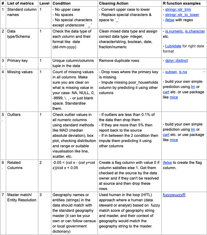
III/ Identifying the list of Data Quality (DQ) metrics
It begins with a simple question: what all can go wrong with this dataset?Schema, Data format, Data Context, Use case(s), and Output: These are the properties of data & use case(s) that will help in answering this question and build your exhaustive list of DQ metrics.
Based on our experience, we have bucketed DQ metrics into three levels:
Level 1: Generic DQ metrics that should be checked irrespective of the type of dataset type or the use case. Few example:
- Data Type/Schema
- Missing values
- Unique Primary key
- Outliers
- Negative values, etc.
Level 2: Contextual checks which vary across different datasets and use cases. For example:
- Column Relationship- Columns should follow their expected relation like, population column value cannot be less than household column value in the census data file.
- Contextual data range- Based on context of the data, test for expected values or range of the values like, if data is from 2014 & onwards then date can’t be before 2013.
Level 3: Comparative checks where we compare the data table with an ideal or master data table.
- Master match/Entity Resolution- Check entities like geographic names, product names, email domains etc. against standard master files to weed out bad names and replace them with correct ones.
IV/ Execution of Data Quality (DQ) metrics
Along with a list of DQ metrics, knowledge around properties such as Reusability, Repeatability, Scale, and the Tech Stack helps in executing the DQ metrics to assess quality and accordingly choose the right set of tools & technology to clean the data
To illustrate this better, we are taking three scenarios, similar to what we’ve encountered in the past, that had different combinations of these characteristics, to demonstrate different execution approaches & methods.
[CASE 1] — Create a one-time dashboard to show the progress of a National electricity scheme
The data of the national electricity scheme was small monthly time series data of all districts in India in an .xlsx format (2 files with less than 25k rows & 15 columns). As it was being created for a one-time use case (for demonstration in a meeting), the tasks involved had no repeatability. However, it is preferable for the process to be reusable/reproducible anyway so as to take in account multiple iterations of data processing before reaching the final desired output.
Solution:
The best suited tool to complete the task can either be a no code open source tool or a script in R (due to our familiarity with the language) that would generate a CSV that would in turn power a R shiny dashboard.
We used R to assess the data quality and generate clean structured files for our R shiny dashboard.
 Alternatively, you could also use:
- MS Excel: The macros functionality with Excel does the job of automating repeatable functions like finding out missing values, de-duplicating the data, etc. and installing additional plugins like fuzzy for geography master match.
- Tableau: Tableau has both visualisation & data cleaning tools — assuming you’re open to use Tableau instead of R shiny. You’d still have to do a geography master match.
- Radiant by R: If you prefer a no-code approach, then this is a great option since it converts UI commands to R code snippets that can be stored and used later.
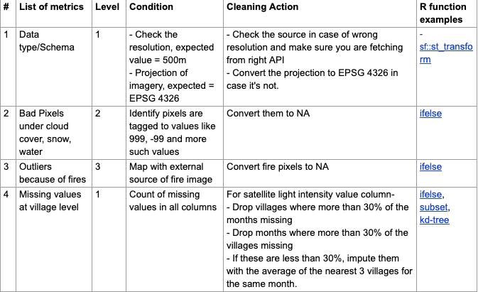
[CASE 2] — Create a dashboard which shows progress metrics as well as enables analysis & validation with external proxy indicators captured through satellite imagery.
In this case, the scheme data is at a village level (6 lakh+ Indian villages) for 5 years along with monthly satellite imagery that is 10x more granular than the villages of India. Hence, the data size is big, input data formats are multiple — CSVs and geo-spatial raster (images), the output dashboard needs a shapefile with data tables to be able to plot maps, and we require the cleaning code to be reusable.
Solution:
In this case, we use R as it can handle CSVs along with spatial vector and raster formats. We also prefer to use QGIS as it’s great for visual validation. Following are some of the additional checks, beyond ones mentioned in case study 1, that we run on satellite imagery and aggregated geo-tagged village data files.
 Alternatively, you could also use:
- Python: In this case, there is no difference in using R or python. It is simply based on the analyst’s preference and skill set.
- ArcGIS: It is a great no-code option for all spatial/ satellite operations and visualisation, but it is a paid license software.
[CASE 3] — Create a live dashboard that updates each month with scheme and satellite imagery data, without any human interference.
In this case, the highlight is the automated ETL workflow that will power the live dashboard. Along with the checks we’ve covered in cases I and II, we also need to make right decisions and execute on the following data and use case properties:
- Fully automated repeatable and reusable process which extract/import data, run transformations (data structuring, DQ metrics, cleaning actions) and load/export data in dashboards (ETL workflow). All of this will be running at different frequencies (weekly, monthly and yearly).
- Handling inputs through APIs (in JSON and XML formats), past data stored across AWS cloud and mysql DB.
- Manage an increasingly large scale of data (~4 million rows x 400 columns per month over 5 years) and DQ metrics. This is because there are more number of schemes and hence, more such DQ metrics to check.
- Outputs required are not just clean data files every month but also error logs, run logs, data quality reports and error tables.
- Change in tech stack to be able achieve all the points mentioned above.
List of additional actions taken to fulfil these properties-
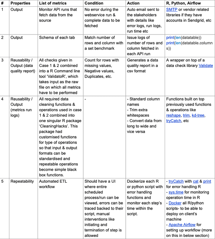
Docker is an open-source tool that helps in making an application or set of scripts, machine-agnostic. Docker introduced the container concept that is a standardized unit of software that allows developers to isolate their app from its environment, solving the “but it works on my machine” headache. And as our ETL process was built on our system but was supposed to be running on client’s system, they needed to be dockerized.
Apache Airflow is the system that supports the auto-run of this data pipeline and provides a UI to the user to view logs, monitor the pipeline, etc. It is an open source workflow management tool that was started by Airbnb in 2008. Each scheme in our case is a separate workflow or a DAG (Direct Acyclic Graph) which is each composed of different nodes. Each node performs one step: fetching the data from API, storing the data, checking it, cleaning and transforming it and finally writing the final output to the specified destination. There can be multiple inputs and outputs coming and going to different sources. For each node we can track how much time it takes to run or how many times the run failed, etc. to evaluate the net time it will take for the data to update on our dashboard.
This setup also helps in an easy handover of the project to the other team who will take care of monitoring and updating of scheme’s data in the future. Also, the logs and alerts are crucial in this setup because they help in troubleshooting and identifying exactly at which step the issue is located. We can use simple, descriptive print statements and other logging libraries in both R and Python like log4r, logging, tryCatch.
Alternatively, today there are some interesting tools available in the market that can help you build a similar process much faster with lesser resources-
- Python: It’s an open source language that can be used to build data quality metrics as well as automate their running process by setting end to end ETL workflow. Though it will work for the case where your data and use cases are not this wide and large in scale, there is no orchestration of resources or deployment of scripts on external machines, and you or your colleague on the project knows python really well — then python can solve for repeatability to some extent.
- Alteryx: In the ETL tools category, Alteryx is an established name in the market. You can set up workflows using a lot of data transformation nodes and quality metrics available for tabular and spatial data with easy-to-use error handling and other workflow management processes. It has some limitations such as: incompatibility with Mac or Linux (only has a Windows compatible desktop application) or challenges with data size, depending on your PC or laptop’s configuration while testing & building workflows. Depending on your budget and needs, you can also check out similar products like Informatica, Talend, Dataiku, etc.
- Atlan: Atlan is a cloud-first modern data quality & management tool. You could do pretty much everything discussed above in terms of building and maintaining data workflows — all without any need to know docker or apache airflow or needing the help of an engineer. You can test data quality by using its data quality & cleaning suggestions based on your data as well as define your own custom data checks using its metrics library or build your own metrics with SQL, regex, etc. though building data quality checks on image data is not available on the product yet. There are no operating system compatibility issues since Atlan is deployed as a web application. Disclaimer: Both Ankita and I currently work at Atlan so do question our bias.
V/ Conclusion
In this blog we have tried to demystify what data cleaning and quality actually entails so that you can make the most optimal use of your time. The exercise to list down data quality metrics and their associated data cleaning actions can help preempt data issues & optimise the cleaning effort before starting the analysis or modeling part. The knowledge of available tools & products helps you learn & pick the right ones compatible to your skillset and tech stack of your team.
Data, no matter how big, can only produce useful insights if it’s of good quality. Else, it simply amounts to garbage in, garbage out.
Post data cleaning and quality comes the most awaited part, the data analysis. Our next blog ‘Enroute to ML — Taking Statistics & Mathematics to the Next Level’ will cover the journey of statistics & mathematics to Machine Learning.
This is the second article in the series of “Data Science for analytical minds”. For more context to the series, please read through its introduction.
Interesting resources to check out-
Data cleaning concept-
- http://www.unofficialgoogledatascience.com/2016/10/practical-advice…
- http://2.droppdf.com/files/GU2nI/bad-data-handbook.pdf
- https://www.reddit.com/r/datascience/comments/fzweaf/my_giant_data_quality_checklist/?utm_source=share&utm_medium=ios_app&utm_name=iossmf Data Cleaning in R-
- https://cran.r-project.org/doc/contrib/de_Jonge+van_der_Loo-Introdu…
- Data Quality with dlookr package in R
- Favourite R packages for summarising data & r-packages-for-summarising-data-part-2
Error handling in R-
About us:
My co-author Ankita mathur and I have spent 6+ years collectively working on data projects ranging from social schemes and tracking dashboards to location intelligence and building alternative data APIs for international philanthropies, NGOs, state & central government bodies, and various corporate businesses.
Through these years, we discovered patterns in data quality and cleaning processes which helped us build frameworks & tools to minimise our data processing & cleaning time, and run these massive projects at SocialCops.
It was in early 2018 when we realised that these tools and frameworks can be used by data teams across the world. That’s when we started our journey with Atlan — building tools to help data teams reduce their time investment in data quality, cleaning, setting up ETL processes and spending more time in finding meaningful insights out of their data.
As part of our community efforts, we have helped the data teams around the world to build their data quality & cleaning process through blogs, courses, seminars, and hands-on workshops.
And special thanks to our brilliant editor on this series- Aishwarya Bedekar (with a promise to never start a sentence with “and” again)