
Author: Gaurav Jha.
The way a message is communicated is almost as important as the message itself. Our world is moving towards a more data-oriented approach to decision making in every walk of life. Packaging the analysis in a way that’s easy to digest can increase its reach and effectiveness. Humans have evolved to develop a very acute sense of pattern recognition. Using storytelling by representing your data through various graphical and pictorial tools gives the audience an intuitive grasp of the matter, enabling them to easily process and digest the information.
6 Important Rules in Data Storytelling
Before we explore the tools and practices that can come to our aid, let’s step back and consider the purpose of data storytelling in the first place.
On its own, data means nothing. Tying the data together with a good, coherent story makes for a compelling narrative. It imprints the information on the minds of your audience in a way that’s precise and indelible.
Let’s look at six key factors that you must keep in mind while telling a good story with data.
1. Set the Context
Why has this exercise been undertaken? What is the data that you are dealing with? What information are you trying to uncover? Being clear with the answers to these questions is crucial before you even begin processing the data and creating the storyline that you want to project.
2. Define Your Framework
Specifying your goals and operating procedure can help you anchor your process to an ideal and direct your actions whenever you’re faced with doubt in the entire cycle of data collection, interpretation and packaging. Spending time and thought at this stage can be tremendously effective in minimizing confusion as you move ahead.
3. Guard Against Bias
Analytical work with even the slightest degree of human involvement cannot be completely free of bias. Even if much of the work is being performed by computer models, there are hundreds of assumptions that need to be made along the way. Though bias cannot be entirely weeded out, staying on guard can help you identify and balance these tendencies.
4. Acknowledge Uncertainty
Statistical analysis of complex data sets in a social or economic setting often yields results with a certain degree of uncertainty that can have major implications on decision making. The users of your analysis have a right to know about it. Acknowledging uncertainty can make you seem less confident than those who may claim to be a hundred percent correct but, in the long run, maintaining a policy of full disclosure is the most responsible thing to do. Not bringing up the known unknowns and lulling your audience into a false sense of confidence could be catastrophic.
5. Add Value to Your Narrative
Anybody with an excel sheet can draw up a string of numbers and make some charts. But what does this information mean in the larger scheme of things? Add that something extra that only a human touch can bring to the table. Create a compelling narrative and put your analysis in perspective.
People don’t simply want to see numbers; they want to know what the numbers mean, they want to know the story behind them.
6. Know Your Audience
Tailoring your analysis to suit the preferences and expertise of your audience is a critical step in establishing its depth and breadth. Structuring the presentation around what the listeners know, don’t know, need to know and don’t need to know is a good way to begin. A talk about the genetic diversity in the Amazon rainforests would look very different when you’re speaking to a group of senior biologists rather than students in secondary school having their first taste of the subject.
Following these six simple steps will help you package your analysis effectively and create an impact with your story.
6 Visualizations for Data Storytelling
Now, we’ll have a look at ways in which you can support your story with strong, relevant illustrations that make the analysis clear and drive home your message loud and clear.
Let’s explore some techniques for using data to tell a story to understand when and how you can make the best use of each.
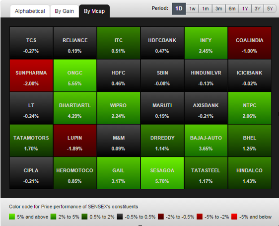
1) Tables
Some times, data just needs to be shown the way it is. However, long expansive sheets can be drab to view and difficult to comprehend. In this case, consider using arrangements, colours and conditional formatting to highlight categories and trends. Doing this will make life a lot easier for users looking to derive meaning from the data at a glance.
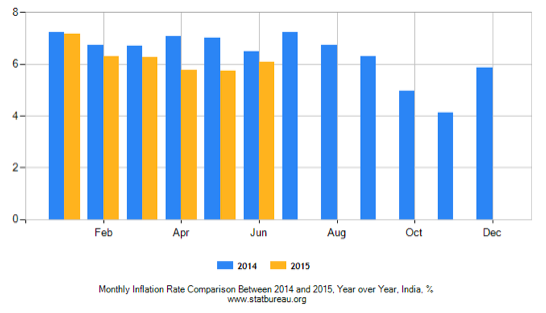
2) Bar Charts
These charts are a very simple form of graphical representation that helps users grasp relative magnitude. They are especially useful while comparing two quantities over a period of time.
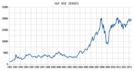
3) Line Charts
When you need to show trends and highlight changes that have occurred over time, line graphs are the most suitable form of representation, as exemplified by the ubiquitous stock market charts.
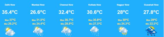
4) Pictures
When numbers and absolutes may not convey the complete meaning of the data very effectively, supplement the information with a symbolic pictorial representation that can be thought of as a condensed answer to your audience needs. Weather forecasts would be a good place to look at for reference.
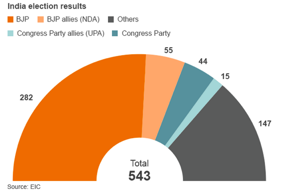
5) Pie Charts
When you want to show how different parts of a whole contribute to form the bigger picture, pie charts do the job better than anything else. That said, the chart doesn’t strictly need to be completely circular, as seen below.
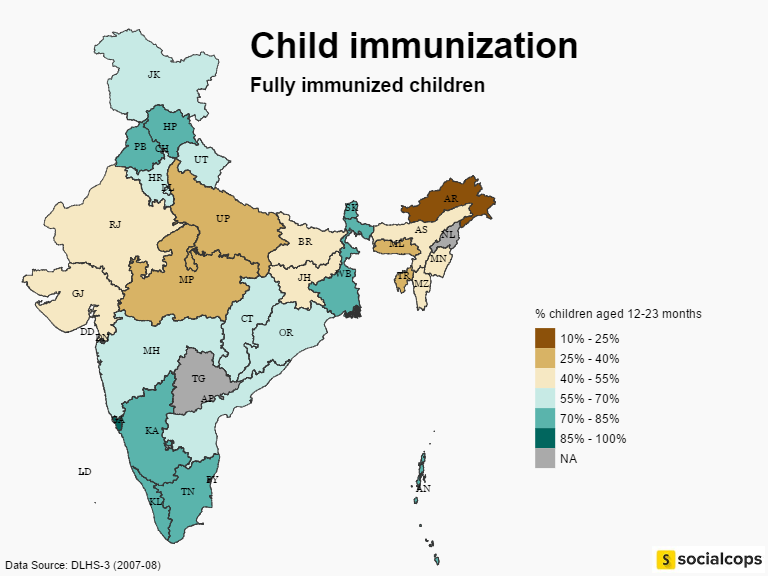
6) Chloropleth Maps
A choropleth map is a thematic map in which areas are shaded or patterned in proportion to the measurement of the statistical variable being displayed on the map.
Originally published in : http://blog.socialcops.com/best-practices/data-storytelling-tell-co…