

I explain here how to do it in Excel. But the principle is general. You can produce this type of visualization with other tools. There are many features in Excel that allow you to generate marketing-style pictures. I never really used them, as the result can be cheesy. If overused, you end up with material that looks like advertising from a Casino, or like the “old world wide web”, where blinking fonts and documents with neon colors were popular. But I recently decided to give it a try again, using extreme moderation. I believe my experiment was successful. I will leave it to the reader to have a final say about it.
Previous Attempt
Before showing what I believe is a good use of the Excel “cheesy features”, let me show you my first attempt, several years ago. It backfired: some readers complained about the unnecessary bells and whistles. And it is true that in this case (see Figure 1), it serves no purpose. I haven’t used this type of style (or lack of) ever since.
In the next section, I discuss a different example (Figure 2), very recent, where the “glow” feature, used in moderation, serves a real, useful purpose and helps understand the chart.
A Good Example
In this case, the chart (see Figure 2) exhibits four clusters. The context is related to supervised learning. The purpose is to illustrate the new concept of dual confidence region. I describe it in my previous article, here, and in details in my new book, available here. In this article, I focus on the visual aspect only. I could have used contour maps instead. But it works best if you use a different color for each cluster.
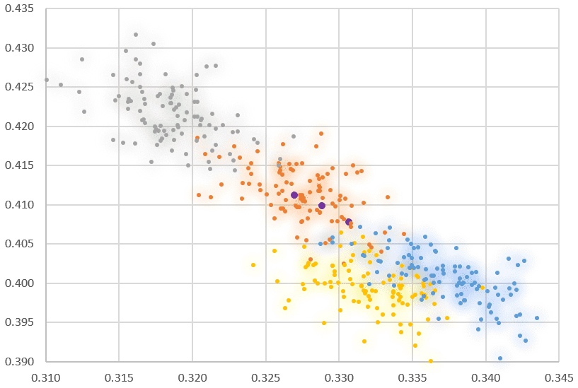
The “glow” effect immediately gives you an idea of what a 90% confidence region is. Each cluster has 100 points, obtained by simulation. The blue is darker close to the center of the blue cluster (same for all colors). The cluster overlap is well rendered. There is a somewhat greenish area where yellow and blue overlap. Indeed, yellow + blue = green.
You could produce 100 versions of Figure 2, using a larger and larger circle around each dot, and embed them into a video. It would illustrate how supervise clustering works, in a way very similar to my previous video, featured here.
How to Do it?
In Excel, right-click on one of the four clusters in the chart — the one you want to edit. Then select “Format data series” in the drop down menu that pops up.
Select the option “glow” highlighted in blue, in Figure 3. Play with the parameters.
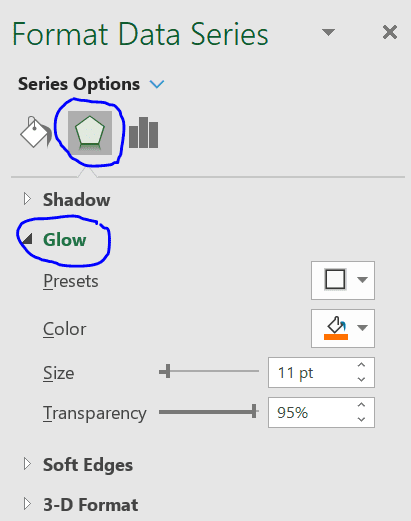
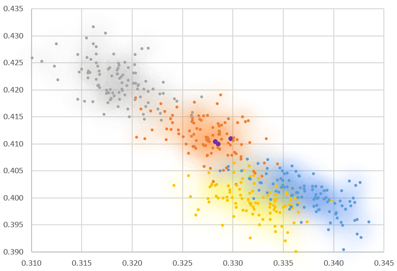
In Figure 2, I used size = 11 pt, and transparency is set to 95%. In Figure 4, the only difference is the size parameter, now set to 30 pt. It determines the size of the circles around each point, in the glow effect. Keep transparency close to 95%. If you try 10% for the transparency, now you are going to have a truly very cheesy plot!
About the Author

Vincent Granville is a pioneering data scientist and machine learning expert, founder of MLTechniques.com and co-founder of Data Science Central (acquired by TechTarget in 2020), former VC-funded executive, author and patent owner. Vincent’s past corporate experience includes Visa, Wells Fargo, eBay, NBC, Microsoft, CNET, InfoSpace. Vincent is also a former post-doc at Cambridge University, and the National Institute of Statistical Sciences (NISS).
Vincent published in Journal of Number Theory, Journal of the Royal Statistical Society (Series B), and IEEE Transactions on Pattern Analysis and Machine Intelligence. He is also the author of multiple books, available here. He lives in Washington state, and enjoys doing research on stochastic processes, dynamical systems, experimental math and probabilistic number theory.