

Is diabetes linked to wealth? Is it the new rich mans disease? Would work from home contribute to the rise in people with diabetes given the sedentary lifestyle amidst lockdowns? This analysis aims to dispel some common myths in the understanding distribution of diabetes among the common populace. It takes a partly economic and partly demographic approach towards finding important geographical centers for diabetes in terms of the total count, racial profile and income status, and its impact on diabetes count by counties in the USA.
The objective of the analysis
To analyze the relationship between different variables (income, racial profile by county) to diabetes in the USA and identify factors that most contribute to diabetes. Apart from that, developing a linear regression model can be used as a forecasting tool for predicting diabetes count given the income, population profile as an input variable. For performing the analysis, we have considered the following datasets.
Dataset used (share links):
1) Zip to county (FIPS) data (2019)
2) County wise diabetes data (Diagnosed Diabetes; Total (Total); Adults Aged 20+ Years; Crude Number; U.S. Counties; 2017)
3) Gross income by zip code (2017)
4) County wise population data by race and total population (2017)
Data Analysis Methodology
The data is initially processed using standard python-based techniques. We use the tried and tested panda library for this purpose. Once we have the final data set, we visualize the data on a map and use a sklearn statistical library to construct linear regression models.
Getting the data
Before we dive deep into the analysis, we first need the data. For this purpose, we used the US census database extensively for gathering the population data. Apart from that, websites such as Data.World provided ample data sets on income by zip codes converted to county-level income averages by aggregation. Finally, the county’s critical data on diabetes count is obtained from the Centers for Disease Control and Prevention website.
Plotting the data
Once we have the data, we use a python-based visualizer to plot the data in a heatmap. The plot below shows a county-wise heatmap of the different data that we have in our kitty.
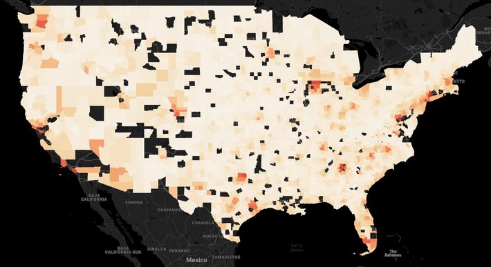
County-wise Population
The darker shades of orange and red show areas with higher population count by county. We can see that the main population centers are in the West and East Coast, i.e., California, Florida, New York, Seattle and Los Angeles, and a few other areas around Texas.
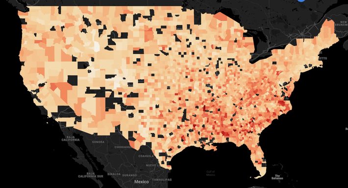
Gross income by county
As expected, urban areas show higher gross income concentrations than suburban areas. In addition, East Coast and the west coast have more counties with gross income.
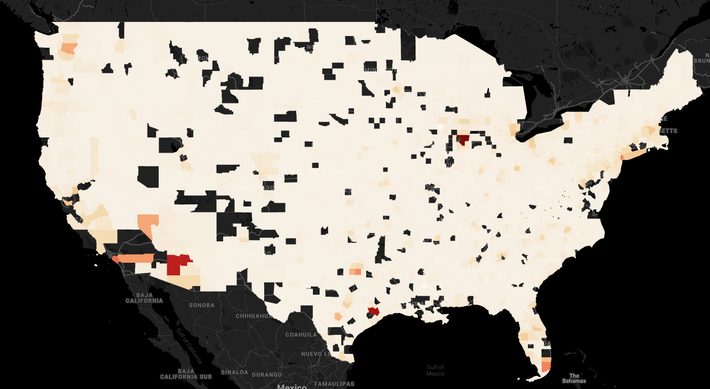
Diabetes count by counties
Urban areas show a higher degree of diabetes count than suburban areas. However, the raw count could be exacerbated by the sheer level of a higher population in urban areas. Therefore it is important to normalize the raw diabetes count before drawing any conclusions.
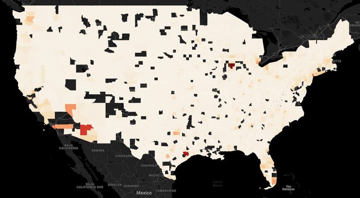
Number of diabetes cases per 1000
Overall, the visual on diabetes is not very informative. A scatter plot on diabetes per 1000 and income might reveal some pattern. As expected, as gross income increases, diabetes per 1000 people increases in tandem. Although not completely linear in a relationship, still a positive relationship exists between the two.
Diabetes per 1000 vs. Gross income
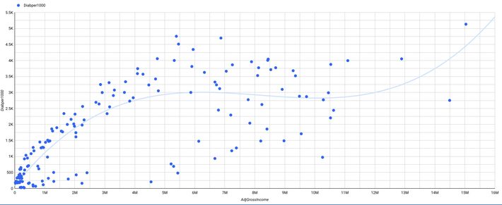
A rough run on the correlation between these two variables (i.e., Absolute diabetes count and Gross income by county) reveals a positive correlation of 0.6. But this could be influenced by a third variable, that is, population. Counties with a higher population tend to have higher gross income and also higher diabetes count. Therefore, we also look at the correlation between diabetes per 1000 and gross revenue. The correlation of -0.08 shows almost no relation between the two variables, so it may not be necessary to use it further.
Model building phase:
We used the sklearn package and k fold (3fold) cross-validation of training data to train the model. The model.fit method takes care of the training part, while the model.score method basically calculates the R square.
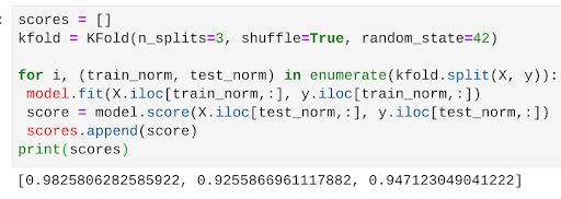
The score of 0.9 shows a high degree of model fit. The R square range is between [0,1] in most of the cases. 0.9 means the model explains 90% of the variation in the data. There is a possibility of overfitting in such cases. But the model still serves the purpose of the analysis.
Coming to the final step of the analysis, we can use the model to know the coefficient of each independent variable and determine the features that are more important than the other towards predicting the diabetes count.
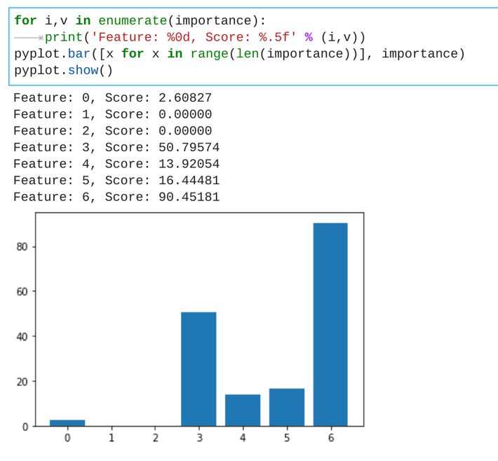
Two_or_more_races_population plays a vital role in diabetes count, followed by Asian population count.
Summary of findings
- Two_or_more_races_population plays a vital role in diabetes count, followed by Asian population count.
- Gross income by county does not have much predictive power towards finding diabetes count.
Possible next steps
As a next step, we can analyze the county’s average or median age group to assess the impact of diabetes. We can also take the growth rate of diabetes by the county into account, and high growth areas can be analyzed in isolation to know more.
Code
Want to know the codes we used– https://github.com/Mindtrades-Consulting/Diabetes-and-income-conundrum