
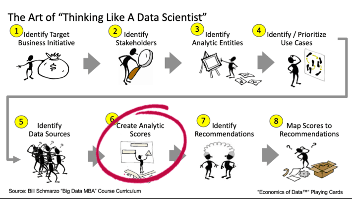
Figure 1: The Art of Thinking Like a Data Scientist
I love teaching because the onus is on me to clearly and concisely communicate my concepts to my students. As I told my students, if I am describing a concept and you don’t understand it, then that’s on me and not you. But I do expect them to be like Tom Hanks in the movie “Big” and raise their hands and (politely) say “I don’t get it.” If they don’t do that, then I’ll never learn how to improve my ability to convey important data, analytics, transformational and team empowerment concepts.
And that’s exactly what happened as I walked my Menlo College undergrad class through a “Thinking Like a Data Scientist” workshop. One of steps in the methodology calls out the importance of creating “analytic scores” that managers and front-line employees can use to make informed operational and policy decisions (see Figure 1).
While folks who have credit scores understand the basic concept of how scores are used to augment decision making, if you’re an undergrad student, credit scores may not be something that has popped up on your radar yet. So, in order to make the “Creating Analytic Scores” step of the methodology come to life, I decided that we would do a group exercise on creating a “COVID At-Risk Death” score – a score that measures your relative likelihood of dying if you catch COVID19.
Understanding the Importance of Analytic Scores
Analytic Scores are a dynamic rating or grade normalized to aid in performance tracking and decision-making. Scores predict the likelihood of certain actions or outcomes and are typically normalized on a 0 to 100 scale (where 0 = bad outcome and 100 = good outcome).
Note: Analytic Scores are NOT probabilities. A score of 90 does not mean that there is a 90% probability of that outcome. Analytic Scores measure the relative likelihood of an outcome versus a population. Consequently, a score of 90 simply means that one is highly likely to experience that outcome versus others in the population even if the probability of that outcome occurring is, for example, only 2%.
Sample scores can be seen in Figure 2.

Figure 2: Sample Scores by Industry
The true beauty of an Analytic Score is its ability to convert a wide range of variables and metrics, all weighted, valued and correlated differently depending upon what’s being predicted, into a single number that can be used to guide or augment decision-making. FICO (developed by the Fair, Isaac and Company) may be the best example of a score that is used to predict certain behaviors, in this case, the likelihood of an individual borrower to repay a loan or another form of credit. The FICO model ingests a wide range of consumer transactional data to create and update these individualized scores. Yes, each FICO score is a unique measurement of your predicted ability to repay a loan as compared to the general population (see Figure 3).
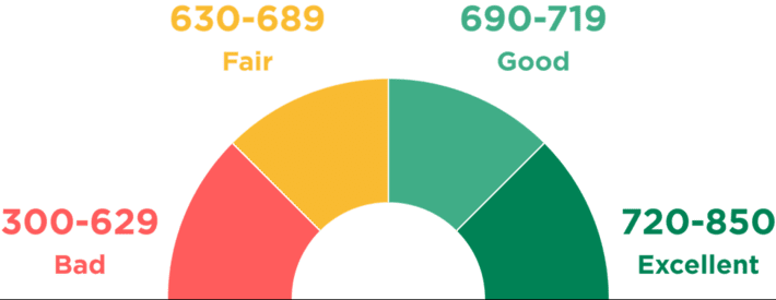
Figure 3: Source: “What Is a Credit Score, and What Are the Credit Score Ranges?”
Everyone has an individual credit score. The score isn’t just based upon generalized categories like age, income level, job history, education level or some other descriptive category of data. Instead, the FICO credit score analyzes a wide variety of transactional data such as payment history, credit utilization, length of credit history, new credit applications, and credit mix across a wide variety of credit vehicles. From this transactional data, FICO is able to uncover and codify individual behavioral characteristics that are indicative of a person’s ability to repay a loan.
But what makes Analytic Scores particularly powerful is when you integrate the individualized scores into an Analytic Profile. Analytic Profiles capture and codify the propensities, patterns, trends and relationships (codified by Analytic Scores in many cases) for the organization’s key human and device assets at the individual human or device level (see Figure 4).
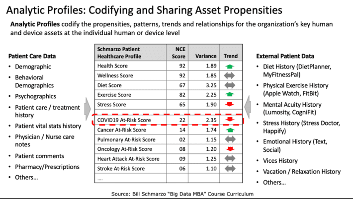
Figure 4: Analytic Profiles: The Key to Data Monetization
Analytic Scores and Analytic Profiles power Nanoeconomics, which is the economic theory of identifying, codifying, and attaining new sources of customer, product, and operational value based upon individual human and device insights (or predictive propensities). It is Nanoeconomics which enables organizations to transform their economic value curve so that they can “do more with less”, exactly the situation in which the world finds itself in the mass effort to vaccinate people and transform the healthcare industry (see Figure 5).
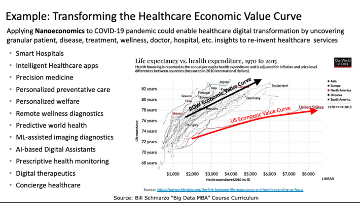
Figure 5: Transforming the Healthcare Economic Value Curve
My students and I decided to embark on a class exercise to see if we could create a simple score that measured the relative risk of any individual dying from catching COVID19. We then discussed how we could use this score to prioritize who got COVID19 shots versus the overly-generalized method of prioritization that it being used today. Here is the process that we used in the class.
Creating a “COVID19 At-Risk of Death” Score Exercise
Step 1: Identify Variables that Might Predict COVID19 Death. I asked the class to research three variables that might be indicative or predictive of death if one caught COVID19. We settled on the following three variables: Obesity, Age and Gender. There were others from which to select (e.g., pre-existing conditions, vitamin D exposure, exercise, diet), but I settled on these three because they required different data transformations to be useful.
Step 2: Find Data Sources and Determine Variable Values. Our research uncovered data sources that we could use for each of the three variables in Figure 6.
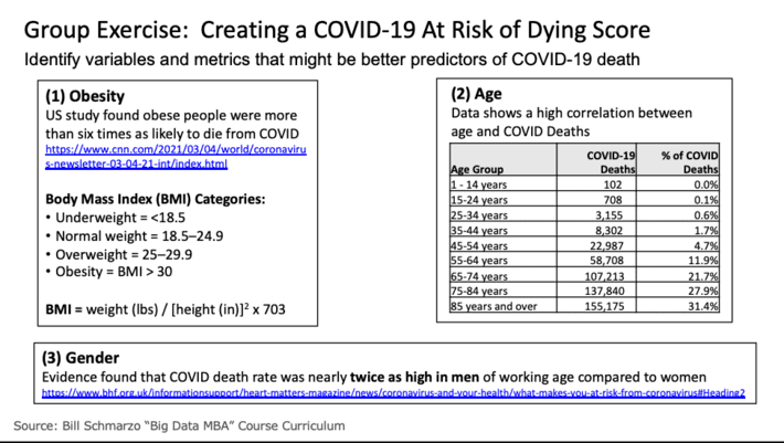
Figure 6: Step 2: Find Data Sources and Transform into Usable Metrics
To measure Obesity, we used the Body Mass Index (BMI) where we input the individual’s height and weight and then calculate that individuals’ BMI and BMI classification (underweight, normal, overweight and obese). To measure Age, we used the percentage of deaths by age brackets. And for Gender, we used Male = yes or no.
Step 3: Calculate “Percentage Increased Risk Adjustment” per Variable. Next, we adjusted the variables for increased COVID19 risks. For example, we added a risk adjustment coefficient to BMI categories of overweight (BMI * 2) and Obese (BMI * 6) to reflect that it isn’t a linear increase in risk as one was more overweight. We did the same thing with age, increasing the risk bias as one got into the older brackets. Note: this is an area where we could have used some machine learning algorithms (such as clustering, linear regression, k-nearest neighbor, and Random Forests) to have created more precise Increased Risk adjustments.
Step 4: Input Relative Variable Importance. Since not all variables are of equal weight in determining COVID19 At-Risk of Death, we allowed the students to assign relative weights to the different variables. This provided an excellent opportunity to explain how a neural network could be used to optimize the variable weights, and discussed neural network “learning and adjusting” concepts like Stochastic Gradient Descent and Backpropagation
Step 5: Normalize Input Variables. I could have simplified the spreadsheet if I made the students entered percentages that totaled to 100%, but it was just easier to let them enter relative weights (between 1 to 100) and then to have the spreadsheet normalize the input variables to 100%. Yea, I’m so kind-hearted.
Step 6: Calculate Population At-risk Scores per Variable. Next, we calculated a population score (using maximum values) for each of the three variables in order to provide a baseline against which to judge the level of the individual’s at-risk variables.
Step 7: Calculate Individual At-risk Scores per Variable. We then calculate the score for each of the three variables for the individual based upon their inputted data: height, weight, age and gender.
Step 8: Normalize Individual At-Fisk Scores against Population At-Risk Scores. Finally, we normalized the individual’s score against the population score to create a single number between 0 to 100 (where a score of 100 is highly at-risk and a score near 0 is very low at-risk).
The process and final spreadsheet is captured in Figure 7.
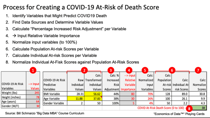
Figure 7: COVID19 At-Risk of Death Score Process and Spreadsheet
Now that the data and transformations are in the spreadsheet, the students could play with the different transformational variables like increasing the Risk factor for Obesity, the relative weights of the different variables, and even the input variables. And while most of the variables are not adjustable (your height, age and gender are hard to change…but I guess it is possible…), weight was certainly a variable that we could adjust and used this as an opportunity to see its impact on an individual’s at-risk score (yea I know, I need to lose weight…).
Summary: The Power of Scores
Analytic Scores are a powerful yet simple concept for how data science can integrate a wide variety of metrics, transform those metrics into more insightful and predictive metrics, create a weighting method that gives the most relevant weights to the most relevant metrics, and then munges all of those weighted and transformed metrics into a single number that can be used to guide and augment decision making. Plus, one can iteratively build out the Analytic Score by starting small with some simple metrics and analytics, and then continuously-learn and fine-tune the Analytic Score with new metrics, variables and analytics that might yield better predictors of performance. Very powerful stuff!
One final point about Analytic Scores. One cannot make critical policy and operational decisions based upon the readings of a single score. To really leverage Analytic Profiles and Analytic scores to make more informed, granular policy and operational decisions (and activate the power of Nanoeconomics to do more with less), we would want to couple the “COVD19 At-Risk Death Score” with a “COVID19 At-Rick of Contracting Score” that measures the likelihood of someone catching COVID19. Why prioritize someone high based upon the “Death” score if their likelihood of catching COVID19 is low (i.e., live in a remote, sparsely populated location, work from home and are adamant about wearing a high-quality, N95 mask and practicing social distancing when in public). Heck, one might even want to create a “COVID19 At-Risk of Transmission” to measure someone’s likelihood to transmit the virus.
If you are interested in the resulting spreadsheet, please contact me via LinkedIn and I will send the spreadsheet to you. You brainiacs out there will likely uncover better data sources and better variable transformations that could improve the accuracy of the COVID19 At-Risk spreadsheet. And if you create a better formula than the one that we created (which won’t be hard), please share the spreadsheet with me so that I can incorporate it into my next class. Hey, we are learning together!