
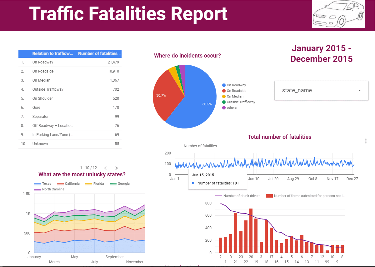
Google Data Studio is a new data visualization tool allowing you to transform your clear and dry data into visually appealing and understandable reports and to be shared then with your colleagues and clients. Using the bar graphs, geographical maps, charts, line charts, etc. you can represent your data and – the most important – make sense of it. It’s free, and you can create and share as many reports as you want. If you think that reporting isn’t fun and exciting, read this 10 minutes tutorial and learn how to easily create informative and dynamic reports with Google Data Studio. We will create a report about traffic fatalities that will look like this:
The original report can be found here.
But let’s go step-by-step and see how we got there.
Connecting and preparing data
Logging in and starting
All you need to start working in Google Data Studio is an active Google account. Moreover, you can manage Data Studio with other Google product like Google Analytics or Adwords, and quickly connect to any Google data source.
Now let’s take a look at the homepage. You can see some sample reports that will get you acquainted with the basic visualizations that you can incorporate in your report. You can sort the reports in a way that is the most convenient for you, and there is also a search bar helping to find a specific report. Finally, you can check out an interactive tutorial called “Welcome to Data Studio! (Start here)”.
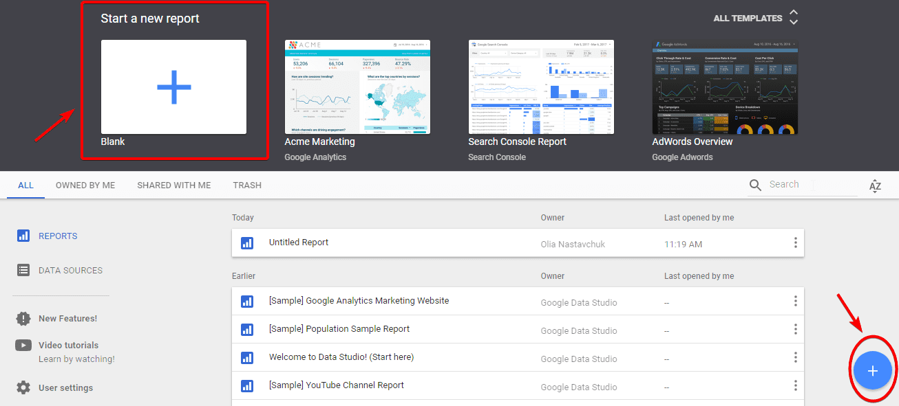
Now it’s time to create a new report! You can start by either clicking on the plus (+) icon at the bottom right corner or the blank plus page and after that accept the terms and conditions.
Connecting a data source
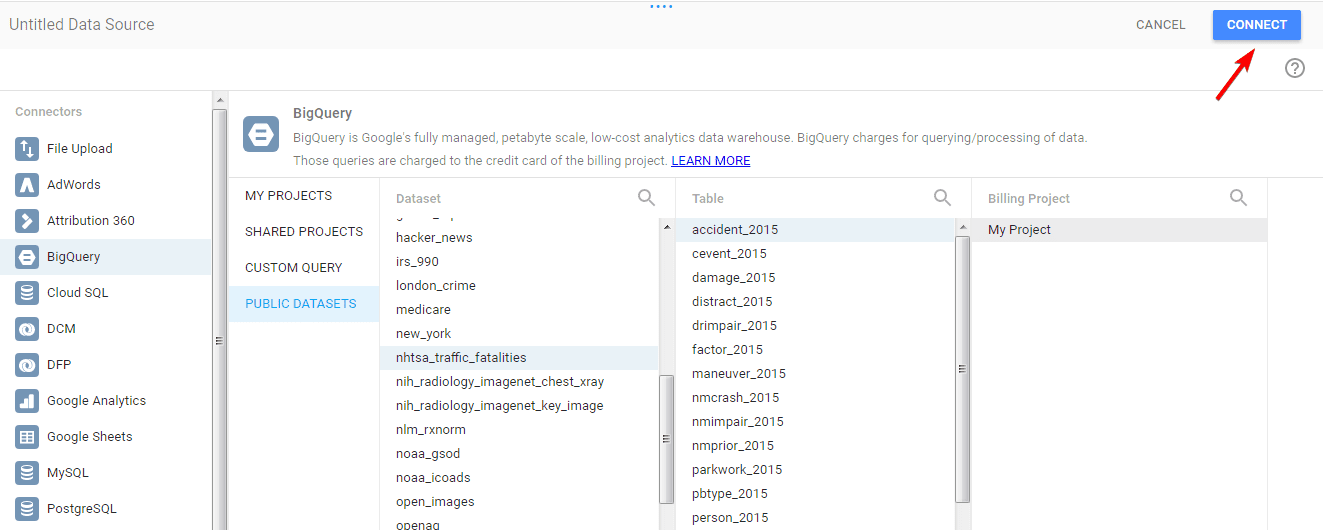
You may see some already existing data sources, or you can click the button at the bottom right corner and create a new data source.
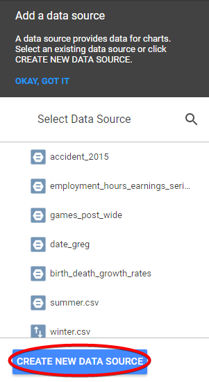
There are multiple options for you to obtain the data: AdWords, Google Analytics, Google Sheets, YouTube Analytics, etc. For this example, we picked the BigQuery public data set on traffic fatalities. Once you’ve chosen the dataset, table, and billing project, click “Connect”.
Preparing data
Now, there’s a table helping you to prepare your data. Let’s take a closer look.
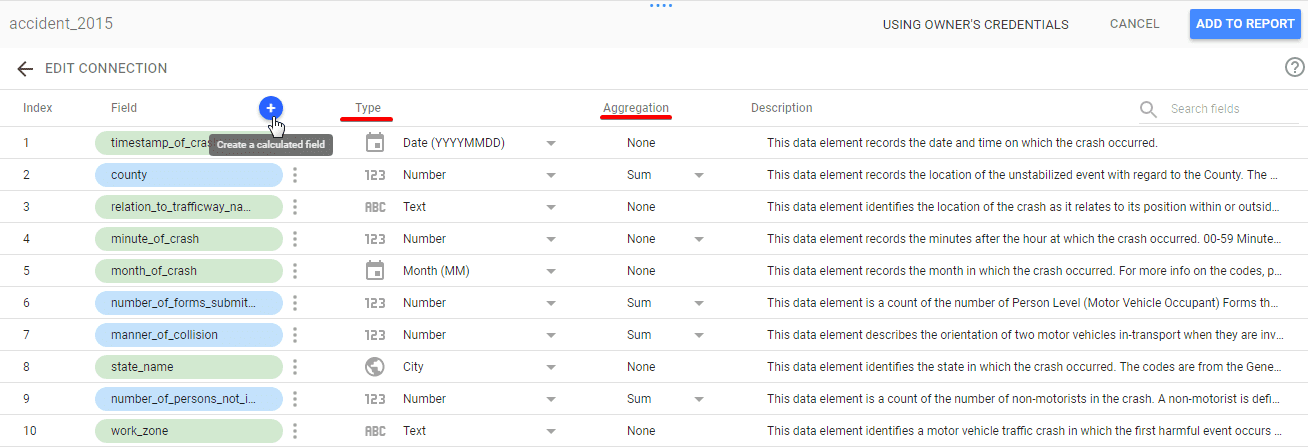
The fields in blue are metrics – fields that can be counted, and in green are dimensions – usually text fields. Field type allows you to select the type of your metrics. There are numeric, text, date & time, boolean and geo types. Be careful to select the correct formats! Then you can choose the aggregation for your metric: sum, average, minimum, maximum and of course none if you don’t need any. Finally, you can create a calculated field that calculates new metrics by using a formula transforming some existing metrics. If you have prepared your data, click “Add to report” and let’s get moving and start visualizing!
Creating a report
Toolbar
At the top of the page you can see a toolbar where you can find different options for creating a report.
Pages, names
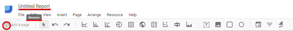
First of all, your report needs a title. You can simply name it at the top left corner and the changes will be automatically saved.
Then you can add multiple pages to the report which you can also name and easily switch between them.
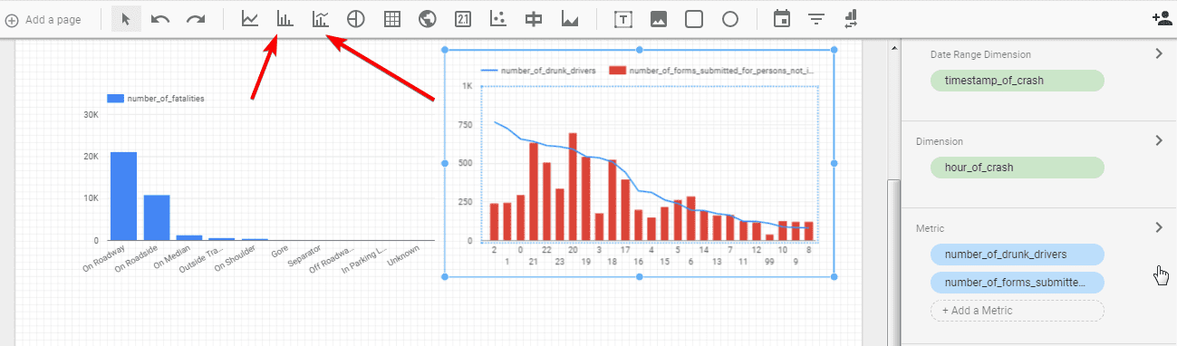
Types of data visualization
The next part of the toolbar is the data visualization tools. Let’s quickly look through them.

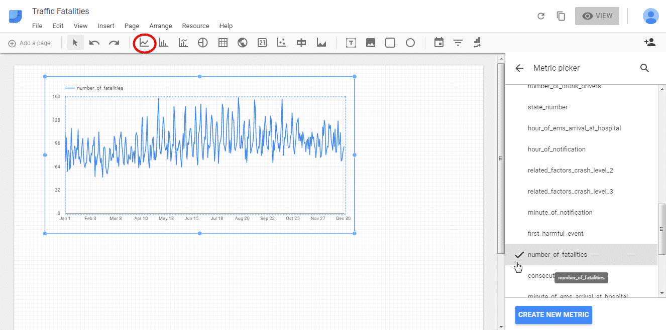
The first one is Time series. If your data includes date&time metrics to choose as a dimension you can build time series with different metrics. The time series properties menu allows you to choose dimension, metric, filter, and style for your graph. Note that if you need to, it is possible to add additional metrics.
Bar and combo charts display your data in a convenient way and the last one allows you to compare different metrics on the same chart.
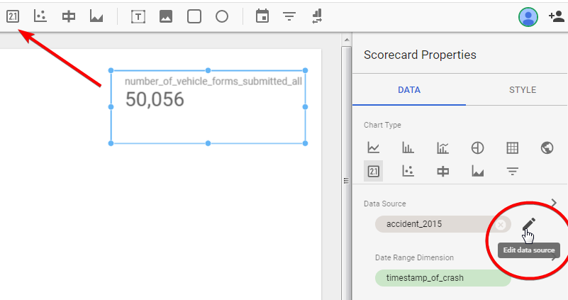
Remember that you can edit data source in the data tab and work with multiple datasets in the same report.
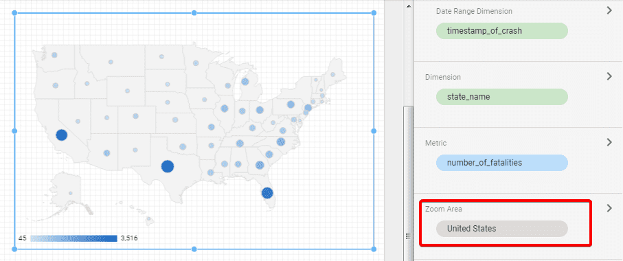
Another important visualization is a geo map. You can experiment with zoom area and choose world map, continents or specific countries.
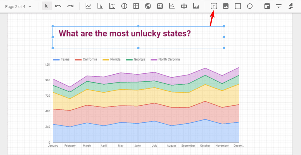
Inserting text and images
You can insert text, images, rectangles, and circles to the report depending on your purpose. For example, in such a way you can name your charts.
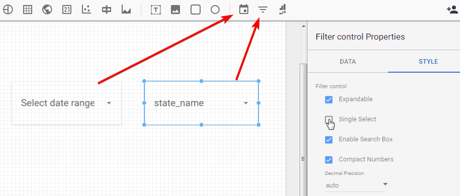
Date range, filter control
Data filtering helps you to organize reporting. You can do this by selecting date range or using filter control. Make sure to check the properties of these tools as they give you some additional opportunities.
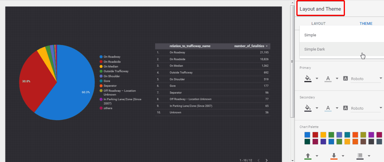
Selecting layout and theme
Layout and theme give you the possibility to play with the style of your report. You can change the background, colors, text styles, and display options and create a unique style that can represent the style of your company.
Styling and controlling menu
Finally, styling and controlling menu is a great help in the process of creating a report. You can select the chart type, experiment with metrics and dimensions, change data sources, apply a filter, etc.
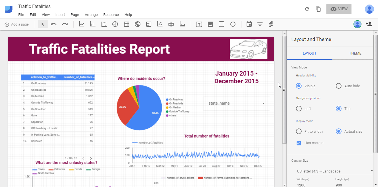
Now let’s switch between view and edit mode to see how our sample report looks like:
Sharing
With the icon at the top right corner you can easily share your report.
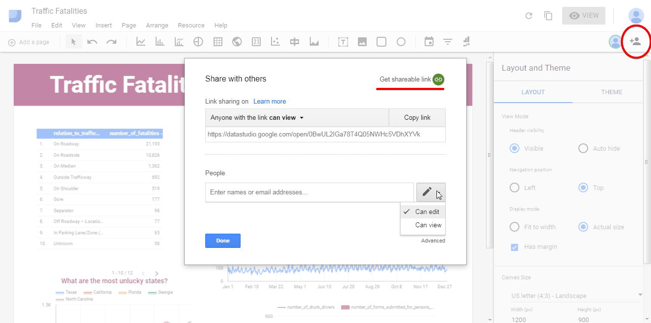
You can get a shareable link and enter the email addresses of people to share the report with and, moreover, you can choose who can edit your report and who can just view it.
Conclusion
In this step-by-step tutorial, we have demonstrated how to work with Google Data Studio and how to create some basic visualizations. This is a great tool for creating data reports, as it allows you to mix data from different sources, play with multiple charts, work with metrics and add calculated fields, create excellent and easy to read reports and share them quickly and easily.
Now it’s your turn! Enjoy!