
In the “Ecology of Metrics,” I wrote about “alignment” being a type of metric; alignment can measure the extent to which an organization’s supply or capacity is matched against the demands or needs of the market. For instance, in a call centre, it would be highly desirable to have agents available to respond to calls at “precisely” the same time that clients are making calls. If alignment is off even by only 15 to 30 seconds, impatient clients might hang up and never call again. Similarly in relation to a public transit system, the flow of riders changes over the course of the day. If trains and buses are unavailable when people need them most, riders might start thinking of taking alternatives in the future – such as driving the car. Business is therefore – at least from a day-to-day operational standpoint – sometimes much about alignment; and I suggest that alignment is a bit about music. There has to be an awareness of placement and movement. It is not a dry topic defined by preset methodologies but rather a “living math” that belongs to the narrative of those affected – to the clients.
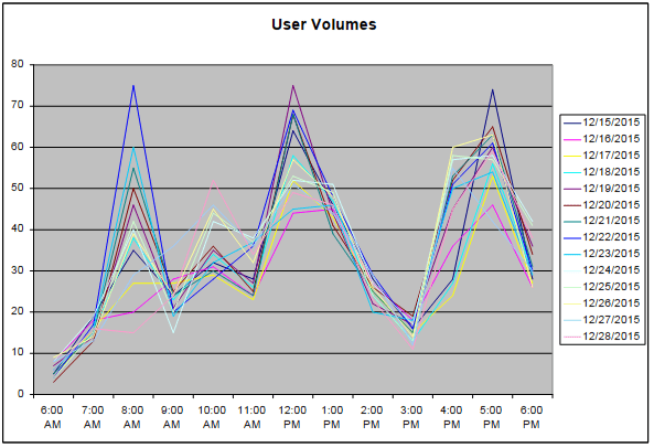
To monitor the market for temporal alignment, it is necessary to partition the data by time intervals: e.g. by 15 minute, 30 minute, or 60 minute intervals. It is then possible to determine the placement of flows. (Sometimes having intervals that are too short can distort the analysis.) Below I present a chart showing user volumes. The time intervals along the bottom indicate that this fictitious company is busiest during three periods of the day. Before readers get too carried away with the value of this type of analysis, actually I would say that user volume information is of limited value if there is a service problem. I will elaborate in a moment.
Although I have discussed the distribution of metrics, the question of what exactly is being distributed remains to be addressed – i.e. what metric constitutes alignment? Personally, my primary objective is to focus on failure rather than service (a failure minimization goal); once failure has been minimized, I then turn to expanding the level service (a service maximization goal). My initial impulse is therefore to study not alignment but rather misalignment, impairment, or incapacity. Since the market represents an opportunity, a loss in opportunity represents incapacity. In relation to a call centre, this means that I would be less concerned about how many agents are available and more about the number of clients that agents are unable to serve. On the other hand, once nearly all of the clients are served, then there is the question of making that service better. Really, once a company decides that it is willing not to serve maybe 20 percent of its potential clients – focusing on serving only 80 percent of them well – this is like forcing these individuals to go to the competition. So my initial focus is failure. Unfortunately, incapacity provides much less coherent charts.
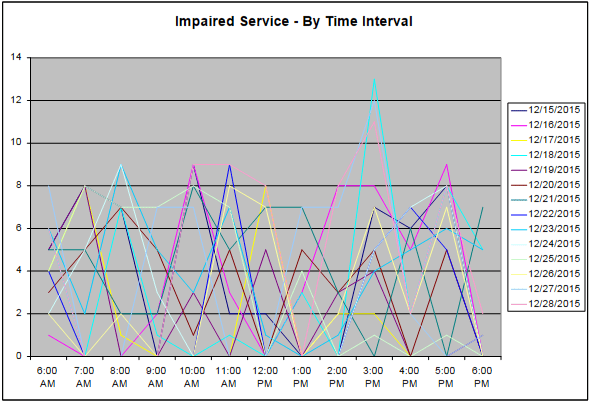
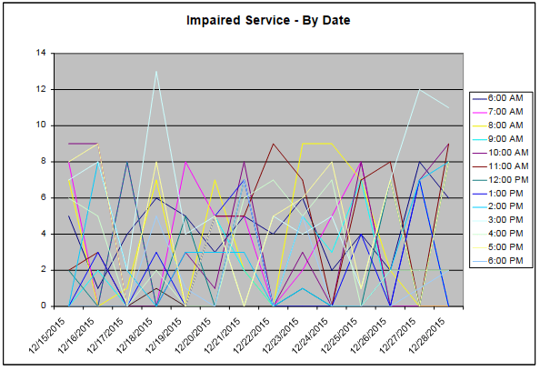
The problem is that incapacity – unlike load – doesn’t necessarily have fixed time periods. For example, incapacity might not occur simply because people decide to take the bus at 7 AM; but rather, on a particular day but not every day, there might not be enough drivers to pick up people at particular routes at 7 AM. Perhaps in 75 percent of the time in 75 percent of the circumstances, staffing levels are adequate. But both operations and the market exhibit some level of non-predictability. There might be surges and disruptions. Incapacity is a moving target that emerges from an interaction of supply and demand. Conceptually, it serves no useful purpose for the time intervals to be fixed along the bottom. I provide an alternative format below although I agree it is perhaps equally perplexing; at least it makes sense from a conceptual standpoint.
When data is distributed over time intervals, it should be apparent that this does not adequately support prediction. In “Technical Deconstruction,” I mentioned the technique of deconstructing technical data by day of the week. I suggest that time intervals gathered on Monday are best compared to other Mondays. Tuesdays after a holiday should be compared to other Tuesdays following a holiday. The underlying point is days sharing similarities should be compared. Within this scheme of deconstruction by time interval and day period, it is possible to evaluate each “track” of data (each time interval considered over many days) to determine if it conforms to rules that might be addressed through human judgment, traditional statistics, or a rudimentary algorithm. If the pattern behind the data seems evasive, perhaps a formal process of pattern recognition would be worthwhile. With pattern recognition, I have found – depending on the exact algorithm used – better than an 80 percent success rate accurately predicting the “direction” of the market. (I have considerably less success predicting the exact future amount.)
If I had to compare what it is like to interpret tracks of time interval data, I would guess that it is like following stock market activity. Although I have never been a stock market technician, I consider the analytical setting comparable. This should tell everyone that I currently make use of “human judgment” in my analysis of operational impairment. Why? Well, it makes the job seem a bit sexy. I realize that at some point some kind of automated analytical environment might do the job. However, I appreciate the music the way a machine cannot. It is the deeper music – the rhythm of the world in motion. Music provides a good analogy because this type of data contains seasonality, percussive flows, and changes in tempo. Each track or time interval represents a line on the chart. As the previous chart indicates, there can be a dozen or more lines, which can be difficult to interpret – if we examine the chart in a purely analytical context. Taken as music, it makes perfect sense for there to be “movements.” Rather than an air of desperation, there can be an aria of desperation.
Once impairment is less or no longer an issue, this leaves the possibly convective volume data distributed over time intervals. While it is true that the moving target has a flow over the course of a day, I still believe in using tracks to study flows through each time interval over many days. This type of analysis is probably useful to assess operational “capacity”: e.g. assuming everything is operating properly, how much load can the system still handle? This is a question that an analyst might ask. But not many other people in the company would ask it. Instead, the people on the floor would wonder when certain critical resources need to be replenished or serviced. What should the cleaning schedule be on Friday at a particular retail outlet? When would be a good time to restock the shelves in isle 4? Ideally, there should be merchandise on the shelves when people wish to purchase them. In a study of volume and time intervals, it is possible to obtain the operational boundaries – that is to say, the highs and lows. So it is possible to find efficiencies within these boundaries. Replenishment (dealing with a state of capacity) relates to volume or traffic. Inadequacy (leading to a condition of incapacity) deals with systems failure. There is no efficiency within a framework of failure. There has to be corrective action.
So the music of the people provides lots of operational guidance. The organization makes it possible for clients to articulate themselves by becoming sensitive to their tracks of data. Not like the 8-track of data, of course. Companies can enable client articulation by moving the narrative focus away from the managers and quants and closer to clients. Following clients in this manner and helping to mitigate alignment problems is rewarding and intellectually challenging. I genuinely believe that every company that cares about clients should be sensitive to flows partitioned by time intervals.