
Recently (6/8/2018), I saw a post about a new R package “naniar”, which according to the package documentation, “provides data structures and functions that facilitate the plotting of missing values and examination of imputations. This allows missing data dependencies to be explored with minimal deviation from the common work patterns of ‘ggplot2’ and tidy data.” naniar is authored by Nicholas Tierney, Di Cook, Miles McBain, Colin Fay, Jim Hester, and Luke Smith.
In addition to the user manual, there is a github repo with an excellent readme and links to really good vignettes and tutorials. I decided to try naniar out on the Titanic dataset on Kaggle, as a way to look at missing values. The code for this article is on github, and includes many other examples not detailed here. The main feature of naniar is the creation of “shadow matrices” which generate columns with binary values describing if there are missing data in the original data.frame. However, there are many other nice features, some of which I’ll highlight here.
naniar’s handling of missing data can start right from reading a file. Using the pipe notation, it looks like this:
train_data <- read.csv(“train.csv”, header = TRUE, stringsAsFactors = FALSE) %>%
replace_with_na_all(condition = ~.x == “”)
The replace_with_na_all function allows you to replace any number of specific values, including blanks, with NA when you read the file. Thus, if you have data that has blanks and NAs, you can clean that up in one operation. Likewise, if there are values like -99 etc. you want to convert, you can do that there too. Having had headaches where some data read in as blanks, and others NA, I really like this addition. There are other variants of the replace_with_na available as well.
Let’s start by looking at a simple, not prettified, ggplot of the age data in the dataset. Note that in my code, I have put the test and train data into a list, hence the list notation below.
i <- 1
ggplot(data = data_list[[i]],
aes(x = PassengerId, y = Age)) +
geom_point() +
labs(title = paste0(“ages for all passengers\n”,
“for “, names(data_list)[i], ” data”)) +
theme(plot.title = element_text(size = 12, hjust = 0.5)) +
theme(legend.title = element_blank())
which produces this plot:
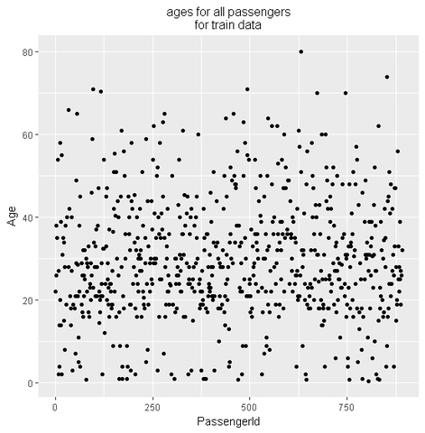
ggplot does not represent the missing values, so this chart is actually misleading. Here’s where naniar can help. naniar provides functions that mirror some ggplot functions, but explicitly handle missing values. In this case, we’ll replace geom_point with geom_miss_point:
i <- 1
ggplot(data = data_list[[i]],
aes(x = PassengerId, y = Age)) +
geom_miss_point() +
labs(title = paste0(“ages for all passengers\n”,
“for “, names(data_list)[i], ” data”)) +
scale_color_manual(labels = c(“Missing”, “Has Age”),
values = c(“coral2”, “aquamarine3”)) +
theme(plot.title = element_text(size = 12, hjust = 0.5)) +
theme(legend.title = element_blank())
which produces this:
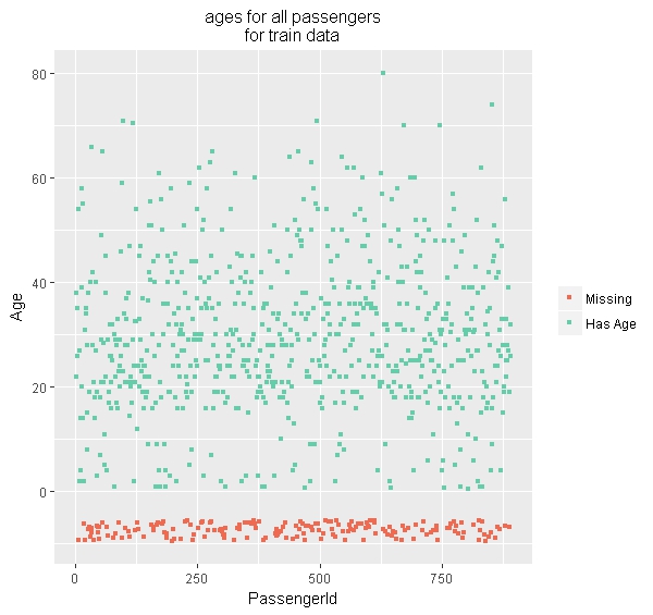
Much nicer! What naniar geom_miss_point does in this case, is separate the missing values, then offset them from the other data (in this case, by putting them below 0). The naniar functions work nicely with the ggplot enhancements, such as facets:
i <- 1
ggplot(data = data_list[[i]],
aes(x = PassengerId, y = Age)) +
geom_miss_point() +
facet_wrap(~Pclass, ncol = 2) +
theme(legend.position = “bottom”) +
labs(title = paste0(“ages for all passengers\n”,
“for “, names(data_list)[i], ” data\n”,
“by passenger class”)) +
scale_color_manual(labels = c(“Missing”, “Has Age”),
values = c(“coral2”, “aquamarine3”)) +
theme(plot.title = element_text(size = 12, hjust = 0.5)) +
theme(legend.title = element_blank())
producing:
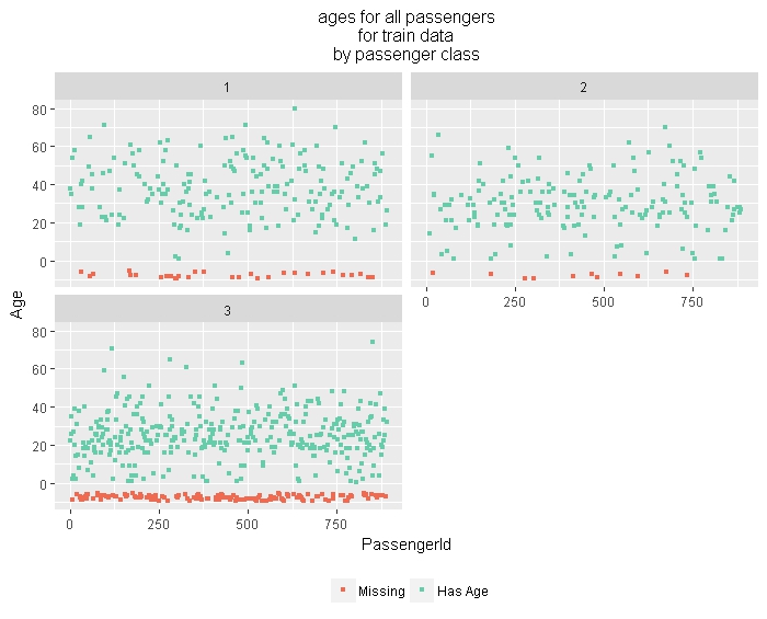
So we can quickly and easily see that there are more missing ages for the third class passengers. Age is an important feature in the Titanic data set, so understanding its missingness informs what do do about it.
A nice feature of the shador matrix is that it comes along for the ride in other operations. Here, we impute the ages for the train data using the impute_lm function from package simputation (authored by Mark van der Loo). Note that for the train we can leverage the Survived label which we cannot do for the test data.
i <- 1
data_list[[i]] %>%
bind_shadow() %>%
impute_lm(Age ~ Fare + Survived + Pclass + Sex + Embarked) %>%
ggplot(aes(x = PassengerId,
y = Age,
color = Age_NA)) +
geom_point() +
labs(title = paste0(“ages for all passengers\n”,
“for “, names(data_list)[i], ” data\n”,
“with missing values imputed”)) +
scale_color_manual(labels = c(“Has Age”, “Missing”),
values = c(“aquamarine3”, “coral2”)) +
theme(plot.title = element_text(size = 12, hjust = 0.5)) +
theme(legend.title = element_blank())
generating this:
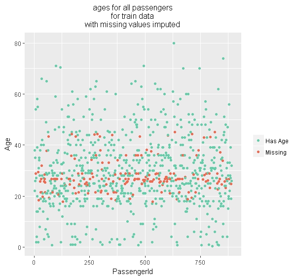
In the above, the bind_shadow() function generates and attaches the shadow matrix to the original data.frame.
Another function in the naniar package is as_shadow_upset, which works with the UpSetR package to generate plots showing permutations of the missing values.
i <- 1
data_list[[i]] %>%
as_shadow_upset() %>%
upset(main.bar.color = “aquamarine3”,
matrix.color = “red”,
text.scale = 1.5,
nsets = 3)
Which produces this great visualization:
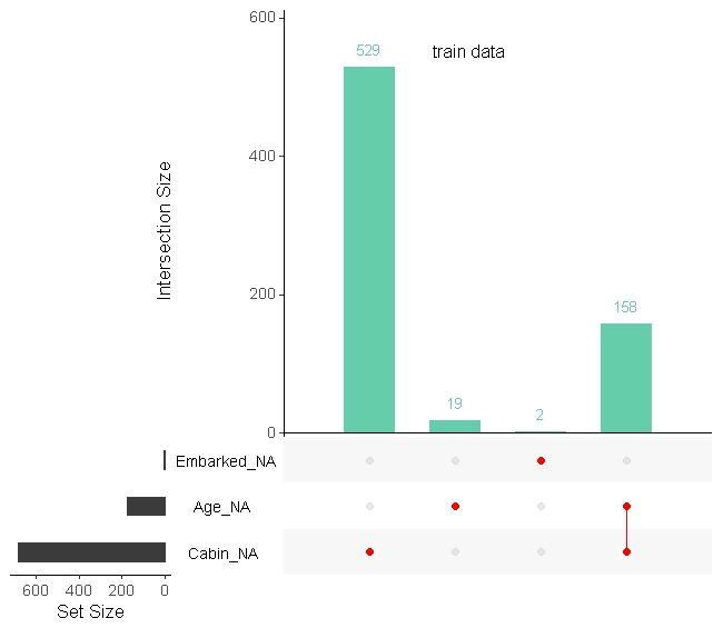
The upset() function comes from UpSetR, and the combination of these two shows us missing values, combination of missing values, and the number in each case in two dimensions. I had not used UpSetR before seeing it in the naniar vignettes, so props to its authors Jake Conway, and Nils Gehlenborg.
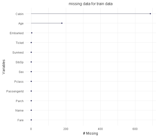
As a last example, naniar provides gg_mis_var() to generate basic plots of missingness:
i <- 1
gg_miss_var(data_list[[i]]) +
labs(title = paste0(“missing data for “,
names(data_list)[i], ” data”)) +
theme(plot.title = element_text(size = 12, hjust = 0.5))
producing this:
There is much more you can do with naniar, and I would recommend you read the excellent tutorials and other information they have provided. I think the value will really come through for more complex data sets and enhance may EDA workflows.