
No matter the job, most professionals do some level of analysis on their computer. There are always some data sets that live outside the walls. Or, some analyses that we know could be performed better in a not-easily-sharable tool such as excel, R, python, SPSS, SAS and so on.
So how do you share your personal analysis with others? Often times people export the graphs and tables to add into a presentation file. One of the largest downfalls to this approach is that it can cause versioning and updating nightmares.
What if I told you that we could avoid all of this with dashboards? Some of you may say, “Yes, obviously, Laura. But I don’t have a licensed BI tool or BI experts at my disposal! It’s not a realistic scenario for me.” Now in the past, I might’ve agreed with you. If you don’t have a paid BI tool, it can be tricky. Free BI tool versions usually require the owner to host the software, or they limit the number of charts, viewers or users using the tool.
However, earlier this year,Google removed a number of restrictions to their free hosted dashboarding software called Google Data Studio. Because of this, I decided to give the software a test drive and see how accessible it is to the non-BI expert.
Below I will take you through a tutorial that I wrote which should allow anyone to create a Google Data Studio dashboard about US Home Prices. It should take about 1/2 an hour of your time. It really is that easy. So please, have a try and let me know how it goes!
The Tutorial Description
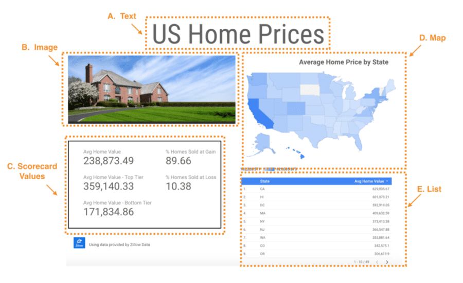
For this tutorial I wanted to use some sample data to make a basic one page dashboard. It will feature some common dashboard elements such as: text, images, summary metrics, summary tables and maps. To do so I searched out free data sets and found out that Zillow offers summary data collected through their real estate business.
Side note: Thank you Zillow, I love when companies share their data!
I downloaded a number of the data sets that I thought would be interesting to display and did a little data processing to make dashboard creation easier. From there I set out to make a dashboard without reading any instructions to see how usable it really is. I have to say, it was easy! There are some odd beta style behaviors that I outline below, but all in all it is a great solution.
The Tutorial Steps
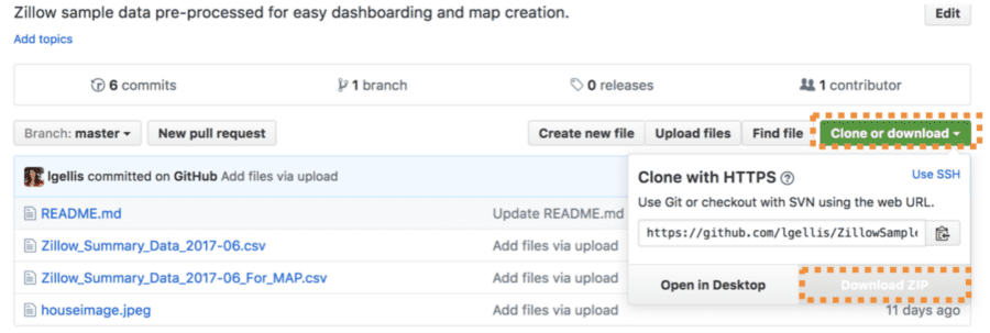
1.Download the sampledata setneeded to create the sample.
Note: if you have trouble downloading the file from github, go to the main page and select “Clone or Download” and then “Download Zip” as per the picture below.
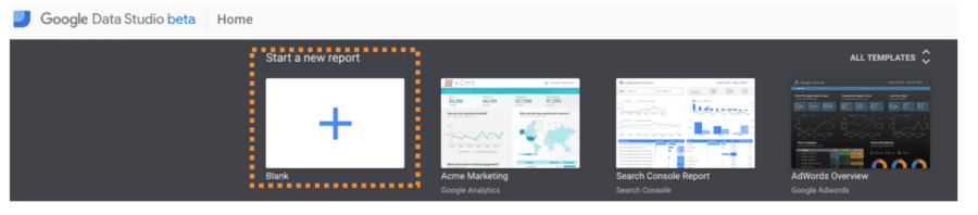
2. Sign up forGoogle Data Studio
3. Click “Start a New Report”
4. In the new report, add the file “Zillow_Summary_Data_2017-06.csv” downloaded as part of the zip file from thedata setin step 1.
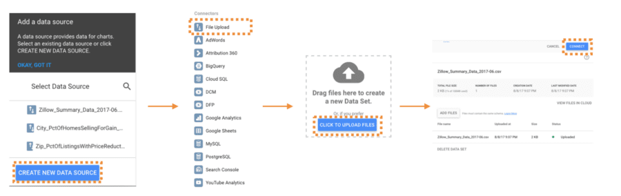
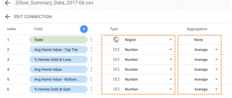
5. Modify the columns of the data set to ensure that “State” is of type “Geo”>”Region” with no aggregation and the remaining columns are type “Numeric” >”Number” with “Average” as the aggregation.
6. Click “Add to Report”. This will make the data source accessible to your new report.
Now we are ready to start building the report piece by piece. To make it easier, I have broken up the dashboard content into 5 pieces that can be added. We will tackle these one by one.
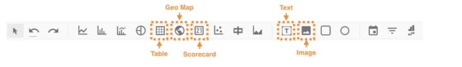
To add each of the components above, you will need to use the Google Data Studio Toolbar on the top navigation. The image below highlights each of the toolbar items that we will be using.
7. “A. Text”- Easy street. Let’s add some text to the dashboard. Start by clicking the “Text” button highlighted in the toolbar above. Next, take the cross-hair and drag it over the space you want the text to occupy. Enter your text: “US Home Prices”. In the “Text Properties” select the size and type. I’m using size 72 and type “Roboto Condensed”.
8. “B. Image”- Easy street part 2. Now we are simply a pretty picture to the dashboard. Start by clicking the “Image” button highlighted in the toolbar above. Take the cross-hair and drag it over the space you want the image to occupy. Select the image “houseimage.jpg” that you downloaded from the GH repo.
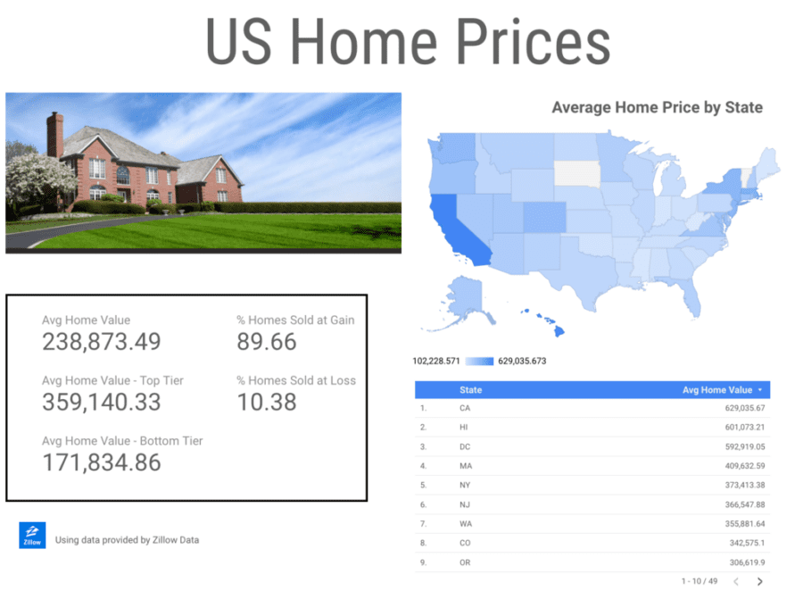
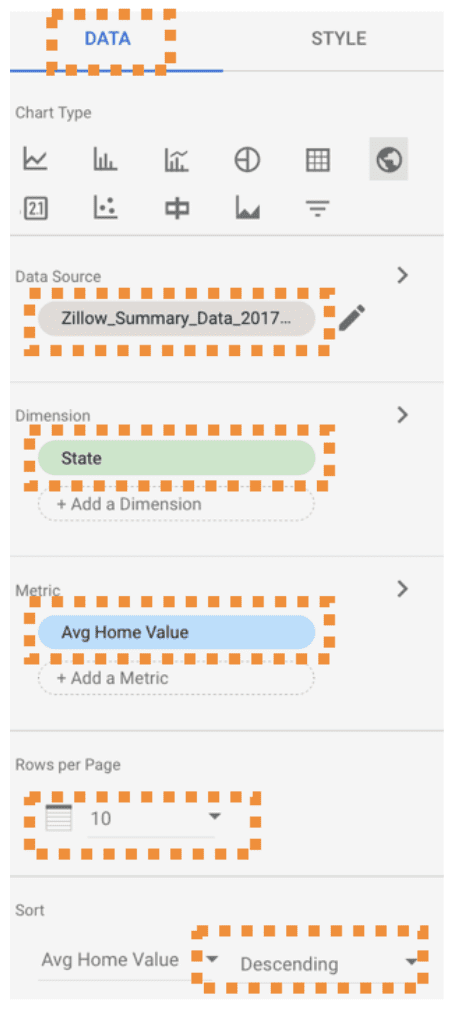
9. “C. Scorecard Values”- Now we get into the real dashboarding exercises through metrics and calculations. Start by clicking the “Scorecard” button highlighted in the toolbar above. Take the cross-hair and drag it over the space you want the first scorecard value to occupy. In the “data” tab, Select the data set and appropriate metric. Start with the values in the image above In the “style” tab select size 36 with the type “Roboto”.
Repeat this for every metric in the “C. Scorecard Values” section.
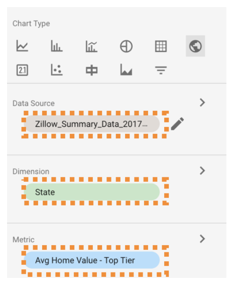
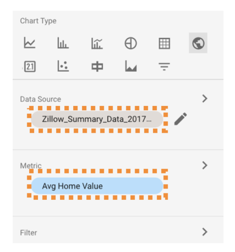
10. “D. Map” – In this step we get more impressive, but not more difficult. We implement a map! Start by clicking the “Geo Map” button highlighted in the toolbar above. Take the cross-hair and drag it over the space you want the map to occupy. Select the data set and appropriate metric as per the values in the image above.
11. “E. List”- Now we are going to list out all values in the Geo Map above ordered by their metric “Average Home Value”. Start by clicking the “Table” button highlighted in the toolbar above. Take the cross-hair and drag it over the space you want the list to occupy. Select the data set and appropriate metric as per the values in the image above.
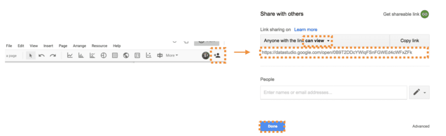
12. Make the Report External and Share. Click the person + icon in the top right of your screen. Select “Anyone with the link can view”. Copy the external URL and click done. Now take that external URL and send to all your friends and family with the subject “Prepare to be amazed”.
And there you have it, your dashboard is created and you can share away!
Some Criticisms
As I’m sure was obvious from above, I’m impressed with their offering. But I do feel it is my duty to outline some oddities I came across. For example: when you set up your data source, you need to specify ahead of time for each column what type of summary you plan on doing with that value. If you want to use a chart to display averages, you cannot select this within the chart dynamically, it has to be at the data source. I find this odd and limiting. Additionally, the csv import has a 200 column limit and there are some formatting annoyances.
More Details
Google has recently released the ability to embed dashboards!See the step by step here.
Final Note
I’m happy that I tried out Google Dash Studio. While it does not meet my current needs at the enterprise level, I am very impressed at it’s applicability and accessibility to the personal user. I truly believe that anyone could make a dashboard with this tool. So give it a try, impress your colleagues and mobilize your analysis with Google Dash Studio!
Original document onlittlemissdata.com
Written by Laura Ellis