
The last few years have seen an explosion of digital mapping on the web, but for some reason the cartogram has been largely left out. And it’s too bad because in many cases they are a far superior way of representing information than maps that use color alone.
To illustrate this point, here is a comparison between two maps that display similar information. One is a cartogram, a map in which some variable (population, GDP, etc) has been substituted for land area. The other one is a choropleth, a more common type of map that encodes information using color.
Cartogram vs choropleth
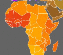
 This first example is a choropleth displaying the 2050 population projection of each country. It is from the website of the Population Reference Bureau (an organization I have a lot of respect for).
By looking at the map, it’s clear which countries are the most populous. However, the map does not convey a sense of magnitude. The legend shows the values that correspond to each color, but how much do those values actually contribute to what you glean from the map?
Choropleths are great for conveying simple comparisons (“does area A have more or less population than area B?“), but they don’t do a great job of answering the question, “by how much?” They may also conceal the importance of small regions, which may not be clearly noticeable.
By looking at the map above, would you know that in 2050, the 3rd most populous country in world is projected to be Nigeria?
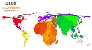 This next map is a cartogram that displays similar information, the 2100 population projection of each country.
Here, there is no mistaking that India and China will remain the two largest populations. Based on their relative sizes, it is also clear that Nigeria is expected to have roughly the same population as the United States.
The problem with cartograms is that the distortion can make the different regions look unfamiliar and harder to identify.
This is where animation can be helpful.
Animation can help solve cartograms’ biggest shortfall
A cartogram is useless if the map is distorted beyond recognition. Animation can help put the pieces in context, and make them recognizable again.
This animated cartogram shows the total residential property value of every county in the U.S. If it were just the static cartogram, without the animation, it would likely not even be clear you were looking at the United States. 
How to make a cartogram – first, the prep work
This is not going to make much sense without a basic understanding of GIS (GIS basics).
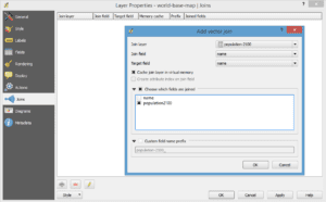
There are many methods for creating cartograms, but I’ve found the best tool to be Scapetoad. But before using it, there is some necessary prep work. First, you need to make sure your mapping variable (for this example, the mapping variable is 2100 population projections) is included in your map’s attributes. In QGIS, you can accomplish this with a table join.
Join the mapping variable to the map using QGIS
 Load your boundary file into QGIS (download world borders shapefile or geojson)
- Load the mapping data into Excel (download U.N. 2100 population projections in csv)
- Make sure the names of the countries in the mapping data match the names used in the boundary file (e.g. “United States” vs “United States of America”)
- Save the mapping data in CSV format, and load it into QGIS via the menu: Layer >> Add Layer >> Add Delimited Text Layer
- Make sure QGIS recognized your mapping variable as a number. To do so, open the CSV’s attribute table. If the numbers are aligned to the left, QGIS thinks they are strings, and you may have to reload the CSV file along with a CSVT file that specifies the data types.
- Open the boundary file’s Layer Properties dialogue, and join the CSV file. The Join Field and Target Field are your “join ID’s,” the fields that you want QGIS to match-up (in this case, they should both be the name of the country).
- There is one more important step that is easy to overlook. Save the file in shapefile format, using the same CRS that you plan to use for displaying the map. Otherwise, the cartogram will not have the correct proportions (how different map projections can distort relative sizes).
 Load your boundary file into QGIS (download world borders
 The file should look something like this (download map with mapping variable shapefile) Now, you’re ready to make the cartogram.
Create a static cartogram using Scapetoad
Scapetoad is very easy to use. Just load the shapefile and follow the instructions.

The only wrinkle is that sometimes the sizes do not come out accurate. I ran into this problem while making the residential property value map shown above. Manhattan is so small and its property value is so big that the Scapetoad algorithm was not able to “grow” it to the proper size. So, look carefully over the error statistics after the file finishes running Usually I have been able to reduce the error by playing with the settings, but other times I have had to adjust the shapefile manually, spreading things out, before handing it off to Scapetoad.
To display your map using D3, it needs to be in geojson (or topojson) format. Scapetoad outputs the map in shapefile format. It is easy to convert from shapefile to geojson using QGIS, but I prefer to use Mapshaper. It is simpler to use and it also makes it easy to simplify the map, reducing the size of the file while retaining most of the quality.
Challenges with animating cartograms
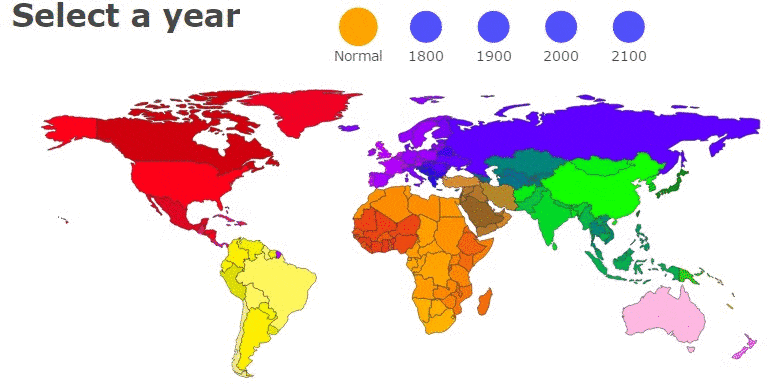 World population in 1800,1900, 2000, and 2100
If you are not familiar with D3, it is definitely worth the time investment. I recommend this series of tutorials, which require only a very basic understanding of HTML, CSS, and Javascript.
 From start to finish, animating this circle involves only 4 logical lines of code. Click to view the page with source code.
In theory, transitioning between two polygons should be almost as easy as these circle transitions. The method is essentially the same. However, it only comes out looking right if the polygons are properly lined up with each other. If they are not, there will be discontinuities and the transition will appear to “break.”
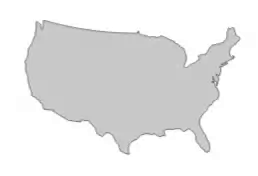
For example, here is a simple attempt to transition between the USA and a cartogram-deformed USA.
View the page with source code
The transition breaks down because D3 does not know how to line up the two polygons. In this case, you can see it associates the bottom of the first polygon with the top of the deformed polygon.
Even if you were to line up the polygons properly, it is unlikely they would have the same number of points, which can cause discontinuities in the transition. For a clean example of a shape transition see: transition between California and a circle.
In the case of the USA transition, you could fix the transition by manually rotating the borders to line them up, and by adding a few extra points where they are needed. But that is not ideal if you are working with a world map with over 100 countries, since you would have to repeat this process for each one.
Also, even if you were to line all the polygons up properly, there will likely still be some sections of the map that appear to rotate. When you are transitioning many countries at the same time, this may lead to the borders not lining up, causing gaps between the polygons.
For this map, I spent a lot of time manually adjusting the polygons to avoid this problem. But if you look, you can see gaps between the countries as they are transitioning.
To truly make the animation smooth, we have to throw out the cartogram from Scapetoad and go back to the drawing board.
Back to the drawing board – create a deformation grid
This time, the output we want from Scapetoad is not the cartogram itself, but a deformation grid, which we can use to make the cartogram ourselves.
The process for creating the deformation grid is the same as the one described above for creating a static cartogram. The only difference is that in the process of creating the cartogram, you have to simultaneously transform a lattice of grid points (see images below).
 The grid on the left is just a 100 x 100 grid of points that uniformly cover the world map (with the standard WGS 84 coordinate reference system). Download example grid in shapefile or csv. To deform the grid, you can run a simultaneous transformation in Scapetoad.

Build the deformation grid
- Add two layers to Scapetoad: your map and the layer of grid points
- Create your cartogram, being sure to add the grid points as a simultaneous transformation
- When Scapetoad finishes running, it will produce two outputs: the cartogram map and the deformed grid. You probably want to save them both, but the grid is the only one that is needed.
- Convert the grid from shapefile to csv. You can convert it in QGIS using the MMQGIS plugin. It will look something like this (download deformed grid in csv).
- Bring the deformed grid and the original grid into Excel. Now, if you match up the points between the two files, you can calculate the offsets for each point. Save these offsets as a new file, which will look like this (download final deformation grid).
Use the deformation grid to create the cartogram yourself
The next step is to deform the map yourself, point-by-point, using the deformation grid. Since the points in the map will not lineup exactly with the points in the deformation grid, the code below uses bilinear interpolation. This cartogram should look like the one created by Scapetoad. However, it is better suited for animation via D3 because its points match up one-to-one with the points in the base map.
Animated cartogram – click the circles to transition between maps
View in separate window with source code
The example above takes as input only the base map (download basemap as geojson) and the deformation grid created above (download deformation grid as csv).
One final note. To make sure the transitions function smoothly, it is best to convert the polygons from geographic coordinates to SVG coordinates before displaying them. Otherwise, D3 will resample the points on its own, and the two maps may no longer line up properly. Here is the code for the conversion from geographic to SVG coordinates (line 167 in the source code).
while (k++ < (countries – 1)) { polygon.features[k].geometry.coordinates[0] = polygon.features[k].geometry.coordinates[0].map(projection);
polygon2.features[k].geometry.coordinates[0] = polygon2.features[k].geometry.coordinates[0].map(projection); }
This post originally appeared on Metrocosm