

- The main topic of the article is about backcasting a time series
- The article is explaining the mathematical structure and making a case study based on the R language.
- The original article can be found here.
A couple of months ago, Turkey’s Health Minister announced that the positive cases showing no signs of illness were not included in the statistics. This statement made an earthquake effect in Turkey, and unfortunately, the articles about covid-19 I have wrote before came to nothing.
The reason for this statement was the pressure of the Istanbul Metropolitan Mayor. He has said that according to data released by the cemetery administration, a municipal agency, the daily number of infected deaths were nearly that two times the daily number of the death tolls explained by the ministry.
So, I decided to check the mayor’s claims. To do that, I have to do some predictions; but, not for the future, for the past. Fortunately, there is a method for this that is called Backcasting. Let’s take a vector of time series  and estimate
  .
.
- One-step estimation for backcasting:
 with .
 with
with ") .
.- One- step estimation for forecasting, with
 with
with ")
As you can see above, the backcasting coefficients are the same as the forecasting coefficients( ). For instance, in this case, the model for new cases is ARIMA(0, 1, 2) with drift:
- For forecasting:
- For backcasting:


#Function to reverse the time seriesreverse_ts <- function(y){ y %>% rev() %>% ts(start=tsp(y)[1L], frequency=frequency(y))}#Function to reverse the forecastreverse_forecast <- function(object){ h <- object[["mean"]] %>% length() f <- object[["mean"]] %>% frequency() object[["x"]] <- object[["x"]] %>% reverse_ts() object[["mean"]] <- object[["mean"]] %>% rev() %>% ts(end=tsp(object[["x"]])[1L]-1/f, frequency=f) object[["lower"]] <- object[["lower"]][h:1L,] object[["upper"]] <- object[["upper"]][h:1L,] return(object)} |
We would first reverse the time series and then make predictions and again reverse the forecast results. The data that we are going to model is the number of daily new cases and daily new deaths, between the day the health minister’s explanation was held and the day the vaccine process in Turkey has begun. We will try to predict the ten days before the date 26-11-2020.
#Creating datasetsdf <- read_excel("datasource/covid-19_dataset.xlsx")df$date <- as.Date(df$date)#The data after the date 25-11-2020:Train setdf_after<- df[df$date > "2020-11-25",]#The data between 15-11-2020 and 26-11-2020:Test setdf_before <- df[ df$date > "2020-11-15" & df$date /code> #Creating dataframes for daily cases and deathsdf_cases <- bc_cases %>% data.frame()df_deaths <- bc_deaths %>% data.frame()#Converting the numeric row names to date objectoptions(digits = 9)date <- df_cases %>% rownames() %>% as.numeric() %>% date_decimal() %>% as.Date()#Adding date object created above to the data framesdf_cases <- date %>% cbind(df_cases) %>% as.data.frame()colnames(df_cases)[1] <- "date"df_deaths <- date %>% cbind(df_deaths) %>% as.data.frame()colnames(df_deaths)[1] <- "date"#Convert date to numeric to use in ts functionn <- as.numeric(as.Date("2020-11-26")-as.Date("2020-01-01")) + 1#Creating time series variablests_cases <- df_after$new_cases %>% ts(start = c(2020, n),frequency = 365 )ts_deaths <- df_after$new_deaths %>% ts(start = c(2020, n),frequency = 365 )#Backcast variablests_cases %>% reverse_ts() %>% auto.arima() %>% forecast(h=10) %>% reverse_forecast() -> bc_casests_deaths %>% reverse_ts() %>% auto.arima() %>% forecast(h=10) %>% reverse_forecast() -> bc_deaths |
It might be very useful to make a function to plot the comparison for backcast values and observed data.
#Plot function for comparisonplot_fun <- function(data,column){ ggplot(data = data,aes(x=date,y=Point.Forecast))+ geom_line(aes(color="blue"))+ geom_line(data = df_before,aes(x=date,y=.data[[column]],color="red"))+ geom_line(data = df_after,aes(x=date,y=.data[[column]],color="black"))+ geom_ribbon(aes(ymin=Lo.95, ymax=Hi.95), linetype=2,alpha=0.1,fill="blue")+ geom_ribbon(aes(ymin=Lo.80, ymax=Hi.80), linetype=2, alpha=0.1,fill="blue")+ scale_color_identity(name = "Lines", breaks = c("black", "red", "blue"), labels = c("After", "Real", "Backcast"), guide = "legend")+ ylab(str_replace(column,"_"," "))+ theme_light()} |
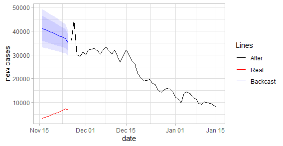
plot_fun(df_cases, "new_cases") |
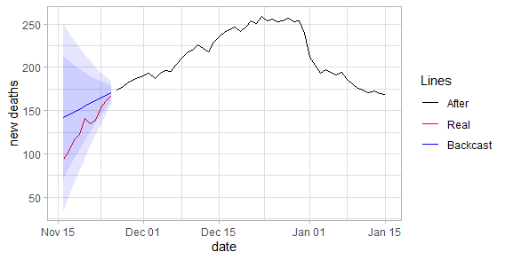
plot_fun(df_deaths, "new_deaths") |
Conclusion
When we examine the graph, the difference in death toll seems relatively close. However, the levels of daily cases are significantly different from each other. Although this estimate only covers ten days, it suggests that there is inconsistency in the numbers given.
References
- Forecasting: Principles and Practice, Rob J Hyndman and George Athanasopoulos
- Joan Bruna, Stat 153: Introduction to Time Series
- Our World in Data