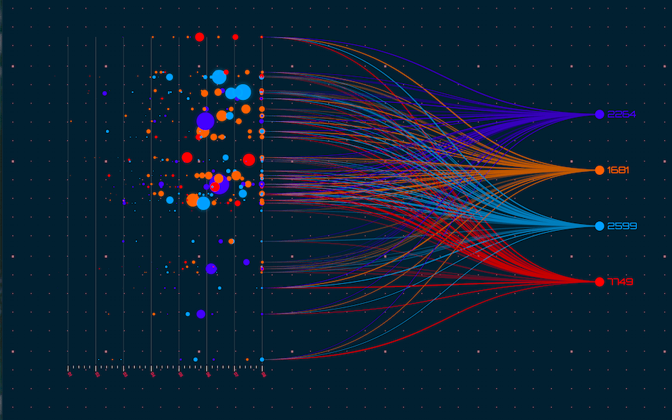
Colors not only make things beautiful around us, but they are also an effective method for describing something. People find psychological associations with color. For example, it is said that red signifies power, love, and anger. Blue denotes calmness and logic. Other shades of primary colors convey different meanings and emotions. When two or more colors are mixed to create a complementary color, it profoundly affects the audience!
In data visualization, color is important to set the tone and send a meaningful message through visual display. It creates a specific environment to transform visualization into an emotional story.
The role of color in data visualization
Data visualization has many design elements, such as the topic, analysis, comparisons, etc., that use colors to speak to the audience. These hues speak louder than words and communicate efficaciously. The power of color allows businesses to communicate the message in a more engaging way and connect with the audience.
Data visualization is critical for all businesses today. It ensures more visible and clearer patterns. It can also allow you to tell a story and set the stage!
Learn More: The Power of Color Psyсhology in Data Visualization
Evokes emotions
While some colors evoke positivity, some testify to confidence and strength. Some colors foster the idea of friendship, while some communicate anxiety and fear. Because colors connect emotions, it is imperative to be wary of using colors to display information.
Many companies invest in research and development activities to discover the impact of color and the emotion it ignites. Then, they create a visualization using different colors and their connotations. While greens and yellows are kept for innovation, red and purple or other darker and muted colors show negative results in data visualizations.
For example, in 2017-18 in the United States, Justin Davis displayed the worst flu season using dark purple. The title ‘PANDEMIC’ was added in white against the purple background to add more impact. The audience associates some topics and brands with color. These associations attract easier, more memorable, and more accessible information.
Build connections
Colors help to connect with the audience through a host of emotions. The color pattern can create instant recognition and immediate binding with the audience. One of the finest examples of colors creating connection can be seen in how Germans dominated the Luge at the Olympics. Klaus Schulte visualized data by coloring the various categories in the colors of the German flag.
Creates a story
Using color in data analytics allows you to tell a story and engage the audience. You can instantaneously evoke their emotions and attract their attention. Companies must explore different ways of using color in their data visualization techniques and build a powerful story. However, it is important to choose relevant colors. Well-selected colors create a better insight for your viewers and become a more appropriate method to convey your message timely and conveniently. According to Neil Patel, 52% of the time, a bad color choice can lead to the users exiting the website and never returning. So, in data visualization, choosing the right colors is very important. Choose your colors based on various factors, aesthetics, science, etc.
Makes you stand out
The variety of colors eliminates dullness and boredom. Through color, data science professionals can highlight the most important part of your brand message and make your graphs more understandable. Also, when you use contrast colors, you can easily compare two data sets, simplify data, and help the viewers grasp a complex picture.
Influence and give depth
When you want your audience to feel what you want them to feel about your brand, use colors in data visualization. Colors can give depth to your message and often allow the viewers to feel cheerful. You can choose from the three data visualization color palettes: qualitative palettes, sequential palettes, and diverging palettes. The qualitative colors are for categorical variables and not inherently ordered values. A sequential palette is for numeric and inherently ordered values. You can use a diverging palette if there is a numeric variable with a meaningful central value.
Wrapping up
Using color strategically can help you connect with your audience and allow them to understand the meaning behind your message. Colors can evoke feelings of creativity, tranquility, comfort, etc. Also, the importance of choosing the right colors for your data visualization should not be undermined. You cannot throw colors here and there because it will distract your viewers and not evoke the feelings you want. So, use color cautiously to get your message to the point.
Color is an important aspect of data science, but you must also know that you use color only where appropriate. Do not unnecessarily stuff colors in the chart you create. Add color when you want to emphasize a particular finding!
