
In this post, we will be visualizing survey data for the top survey question types. I’m Tyler Lubben, founder of VizualSurvey, a survey data cleaning tool that cleans your survey data from any survey software so you can visualize it in any of our Tableau, Power BI, Spotfire or Qlik Sense prebuilt dashboard templates. Let’s go ahead and start!
Lets start off with an overview, depending on where you get your survey popups data from the structure of your data export will be different. This has been a huge pain point when trying to add this data to a BI or data visualization tool. The main thing is each question type is structured differently and someone in a not optimal layout. So for each of our survey charts will be based on the survey question type, that will drive which visualization we are going to show. In this post, we are going to be visualizing survey data using Tableau due to it being, in my opinion, the best survey data visualization tool for visualizing survey data. We are going to over going what’s the best survey charts for analyzing survey data from the top survey question types.
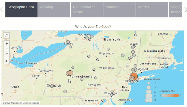
Geographic Question Type
The first survey question type we are going to look at is geographical data. I always recommend asking for a zip code when creating a survey because you can always get a free geographic file on the internet to bring in City, County, State, etc. When someone answers the zipcode question in your survey, they only have to enter five digits, which they are a lot less likely to mess up compared to the spelling of a City or State. If you look below, I have created a map in Tableau using the zip code from the survey results. The size and color of the circles are dependent on the distinct count of response id. If we joined in a geographic file, we could have brought in State or City and mapped those as well.
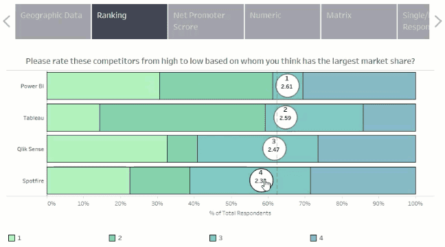
Ranking Question Type
The next survey question type we are going to look at is the ranking question type. The ranking question type is a little more complicated. The example below is ranking competitors from high to low, based on who they think has the largest market share. They are ranked one to four based on whoever has the highest average score. The colors that split up the bars show you the distribution of the answers for each choice. This is a great way to visualize ranking question types because you see the overall rank, the average score, and the distribution.
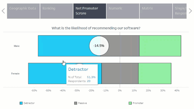
NPS Question Type
The next question type is the Net Promoter Score question type. The NPS score is based on three buckets detractors, passive, and promoters. In the chart below, you can see how many are in each bucket and the NPS score for each one. This chart is split out by gender, but we could have it be in total as well. This gives a distribution in the background again, just like the ranking question, but also gives us our NPS score.
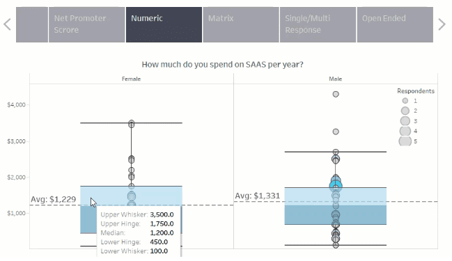
Numeric Question Type
The next one is the numeric question type. The visualization you see below is a little different then what you are probably used to. You usually see an average, but here you can see the average, distribution, outliers, and a lot more. All of these circles are all independent answers from our respondents, the larger the circle, the more people selected that exact number. This visualization is known as a box whisker plot. You can see what the upper and lower hinges and whiskers are, median, averages, and any outliers. So this gives you a lot of information outside of just the average, which is only half the story.
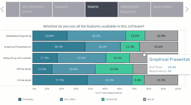
Likert Question Type
The matrix question type, also known as Likert, is visualized in a stacked bar chart. In the visualization below, we have the different selection options going down our rows, and the color is based on the answer options for each. If you hover over it, you can see what the percent of total is as well as the total number of respondents. This is a very common chart type for this question type, which is why you see it so often. It’s simple yet effective.
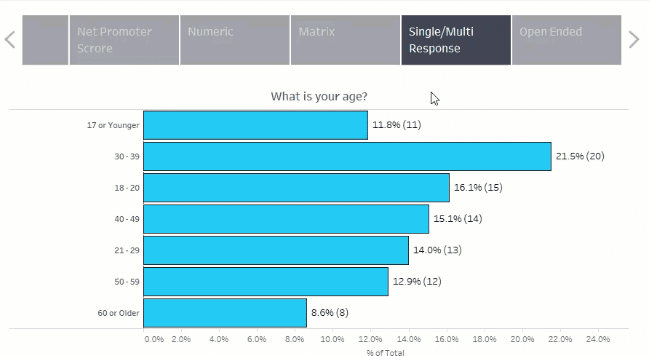
Multiple Choice Question Type
Here we have a basic bar chart to show multiple select and single response survey question types. This one is straightforward but practical as well. It is effortless to create; you just have to watch out when you do the multiple choice question type because you have to make sure you are counting distinct respondents instead of just counting rows since a respondent can answer more than one answer. In this chart, we are showing a percent of the total and the actual number of respondents.
Open Ended Question Type
Everybody kind of hates trying to visualize open-ended question types. You can’t do much with it, to be honest. Here we created a word cloud but it doesn’t do great if you have a whole bunch of long sentences or just a lot of different answers. You could do some grouping beforehand to make it look better but will take some manual work. Open ended is a very hard one, so I keep it simple here.

So those are all of the popular survey question types and how I would visualize the survey results. Now usually, no matter where you get your survey data from, you will have to spend hours cleaning your survey data to get it into a suitable format before you can even think of creating these charts. All of these charts that you saw today are from VizualSurvey’ s Tableau dashboard survey template, which you can connect your survey data to the templates for free using our free trial.
Originally posted here