
Exploratory Data Analysis or EDA is that stage of Data Handling where the Data is intensely studied and the myriad limits are explored. EDA literally helps to unfold the mystery behind such data which might not make sense at first glance. However, with detailed analysis, we can use the same data to provide miraculous results which can help boost large scale business decisions with excellent accuracy. This not only helps business conglomerations to evade likely pitfalls in the future but also helps them to leverage from the best possible schemes that might emerge in the near future.
EDA employs three primary statistical techniques to go about this exploration:
- Univariate Analysis
- Bivariate Analysis
- Multivariate Analysis
Univariate, as the name suggests, means ‘one variable’ and studies one variable at a time to help us formulate conclusions such as follows:
- Outlier detection
- Concentrated points
- Pattern recognition
- Required transformations
In order to understand these points, we will take up the iris dataset which is furnished by fundamental python libraries like scikit-learn.
The iris dataset is a very simple dataset and consists of just 4 specifications of iris flowers: sepal length and width, petal length and width (all in centimeters). The objective of this dataset is to identify the type of iris plant a flower belongs to. There are three such categories: Iris Setosa, Iris Versicolour, Iris Virginica).
So let’s dig right in then!
1. Description Based Analysis
The purpose of this stage is to get an initial idea about each variable independently. This helps to identify the irregularities and probable patterns in the variables. Python’s inbuilt panda’s library helps to execute this task with extreme ease by literally using just one line of code.
Code:
data = datasets.load_iris()
The iris dataset is in dictionary format and thus, needs to be changed to data frame format so that the panda’s library can be leveraged.
We will store the independent variables in ‘X’. ‘data’ will be extracted and converted as follows:
X = data[‘data’] #extract
X = pd.DataFrame(X) #convert
On conversion to the required format, we just need to run the following code to get the desired information:
X.describe() #One simple line to get the entire description for every column
Output:
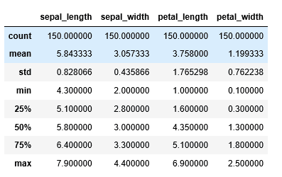
- Count refers to the number of records under each column.
- Mean gives the average of all the samples combined. Also, it is important to note that the mean gets highly affected by outliers and skewed data and we will soon be seeing how to detect skewed data just with the help of the above information.
- Std or Standard Deviation is the measure of the “spread” of data in simple terms. With the help of std we can understand if a variable has values populated closely around the mean or if they are distributed over a wide range.
- Min and Max give the minimum and maximum values of the columns across all records/samples.
25%, 50%, and 75% constitute the most interesting bit of the description. The percentiles refer to the respective percentage of records which behave a certain way. It can be interpreted in the following way:
- 25% of the flowers have sepal length equal to or less than 5.1 cm.
- 50% of the flowers have a sepal width equal to or less than 3.0 cm and so on.
50% is also interpreted as the median of the variable. It represents the data present centrally in the variable. For example, if a variable has values in the range 1 and 100 and its median is 80, it would mean that a lot of data points are inclined towards a higher value. In simpler terms, 50% or half of the data points have values greater than or equal to 80.
Now that the performance of mean and median is demonstrated, from the behavior of these numbers, one can conclude if the data is skewed. If the difference is high, it suggests that the distribution is skewed and if it is almost negligible, it is indicative of a normal distribution.
These options work well with continuous variables like the ones mentioned above. However, for categorical variables which have distinct values, such a description seldom makes any sense. For instance, the mean of a categorical variable would barely be of any value.
For such cases, we use yet another pandas operation called ‘value_counts()’. The usability of this function can be demonstrated through our target variable ‘y’. y was extracted in the following manner:
y = data[‘target’] #extract
This is done since the iris dataset is in dictionary format and stores the target variable in a list corresponding to the key named as ‘target’. After the extraction is completed, convert the data into a pandas Series. This must be done as the function value_counts() is only applicable to pandas Series.
y = pd.Series(y) #convert
y.value_counts()
On applying the function, we get the following result:
Output:
2 50
1 50
0 50
dtype: int64
This means that the categories, ‘0’, ‘1’ and ‘2’ have an equal number of counts which is 50. The equal representation means that there will be minimum bias during training. For example, if data tends to have more records representing one particular category ‘A’, the training model used will tend to learn that the category ‘A’ is the most recurrent and will have the tendency to predict a record as record ‘A’. When unequal representations are found, any one of the following must be followed:
- Gather more data
- Generate samples
- Eliminate samples
Now let us move on to visual techniques to analyze the same data, but reveal further hidden patterns!
2. Visualization Based Analysis
Even though a descriptive analysis is highly informative, it does not quite furnish details with regard to the pattern that might arise in the variable. With the difference between the mean and median we may be able to figure out the presence of skewed data, but will not be able to pinpoint the exact reason owing to this skewness. This is where visualizations come into the picture and aid us to formulate solutions for the myriad patterns that might arise in the variables independently.
Lets start with observing the frequency distribution of sepal width in our dataset.
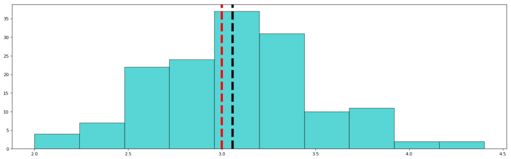
Std: 0.435
Mean: 3.057
Median (50%): 3.000
The red dashed line represents the median and the black dashed line represents the mean. As you must have observed, the standard deviation in this variable is the least. Also, the difference between the mean and the median is not significant. This means that the data points are concentrated towards the median, and the distribution is not skewed. In other words, it is a nearly Gaussian (or normal) distribution. This is how a Gaussian distribution looks like:
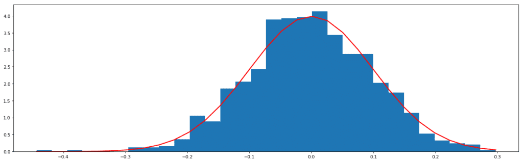
Normal Distribution generated from random data
The data of the above distribution is generated through the random. The normal function of the numpy library (one of the python libraries to handle arrays and lists).
It must always be one’s aim to achieve a Gaussian distribution before applying modeling algorithms. This is because, as has been studied, the most recurrent distribution in real life scenarios is the Gaussian curve. This has led to the designing of algorithms over the years in such a way that they mostly cater to this distribution and assume beforehand that the data will follow a Gaussian trend. The solution to handle this is to transform the distribution accordingly.
Let us visualize the other variables and understand what the distributions mean.
Sepal Length:
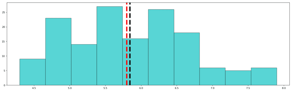
Std: 0.828
Mean: 5.843
Median: 5.80
As is visible, the distribution of Sepal Length is over a wide range of values (4.3cm to 7.9cm) and thus, the standard deviation for sepal length is higher than that of sepal width. Also, the mean and median have almost an insignificant difference between them. This clarifies that the data is not skewed. However, here visualization comes to great use because we can clearly see that distribution is not perfectly Gaussian since the tails of the distribution have ample data. In Gaussian distribution, approximately 5% of the data is present in the tailing regions. From this visualization, however, we can be sure that the data is not skewed.
Petal Length:
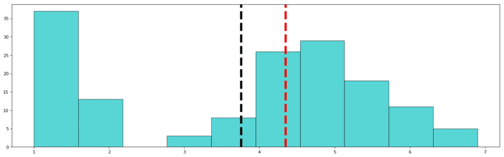
Std: 1.765
Mean: 3.758
Median: 4.350
This is a very interesting graph since we found an unexpected gap in the distribution. This can either mean that the data is missing or the feature does not apply to that missing value. In other words, the petal lengths of iris plants never have the length in the range 2 to 3! The mean is thus, justifiably inclined towards the left and the median shows the centralized value of the variable which is towards the right since most of the data points are concentrated in a Gaussian curve towards the right. If you move on to the next visual and observe the pattern of petal width, you will come across an even more interesting revelation.
Petal Width:
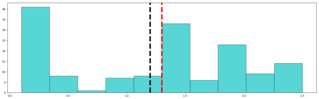
std: 0.762
mean: 1.122
median: 1.3
In the case of Petal Width, most of the values in the same region as in the petal length diagram, relative to the frequency distribution, are missing. Here the values in the range 0.5 cm to 1.0 cm are almost absent (but not completely absent). A repetitive low value simultaneously in the same area corresponding to two different frequency distributions is indicative of the fact that the data is missing and also confirmatory of the fact that petals of the size of the missing values are present in nature, but went unrecorded.
This conclusion can be followed with further data gathering or one can simply continue to work with the limited data present since it is not always possible to gather data representing every element of a given subject.
Conclusively, using histograms we came to know about the following:
- Data distribution/pattern
- Skewed distribution or not
- Missing data
Now with the help of another univariate analysis tool, we can find out if our data is inlaid with anomalies or outliers. Outliers are data points which do not follow the usual pattern and have unpredictable behavior. Let us find out how to find outliers with the help of simple visualizations!
We will use a plot called the Box plot to identify the features/columns which are inlaid with outliers.
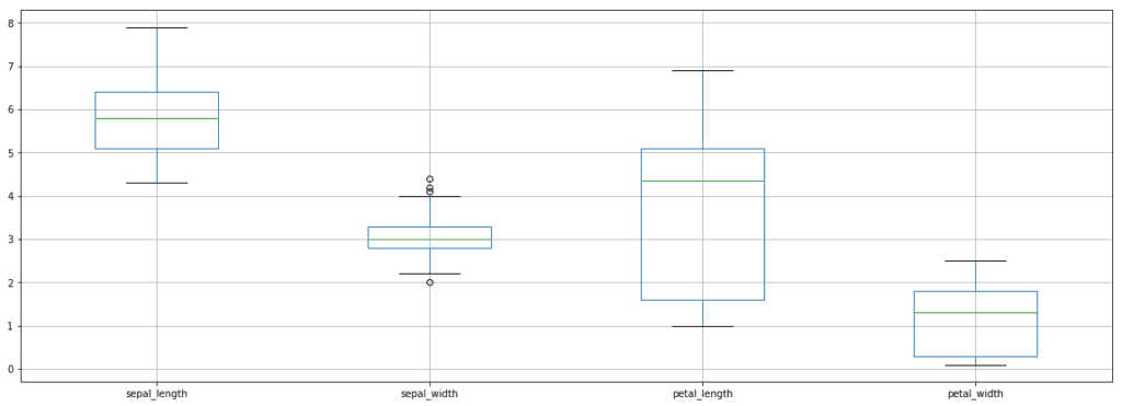 Box Plot for Iris Dataset
The box plot is a visual representation of five important aspects of a variable, namely:
- Minimum
- Lower Quartile
- Median
- Upper Quartile
- Maximum
As can be seen from the above graph, each variable is divided into four parts using three horizontal lines. Each section contains approximately 25% of the data. The area enclosed by the box is 50% of the data which is located centrally and the horizontal green line represents the median. One can identify an outlier if the point is spotted beyond the max and min lines.
From the plot, we can say that sepal_width has outlying points. These points can be handled in two ways:
- Discard the outliers
- Study the outliers separately
Sometimes outliers are imperative bits of information, especially in cases where anomaly detection is a major concern. For instance, during the detection of fraudulent credit card behavior, detection of outliers is all that matters.
Conclusion
Overall, EDA is a very important step and requires lots of creativity and domain knowledge to dig up maximum patterns from available data. Keep following this space to know more about bi-variate and multivariate analysis techniques. It only gets interesting from here on!
Originally posted here