
Tutorial Scenario
In this tutorial, we are going to be looking at heatmaps of Seattle 911 calls by various time periods and by type of incident. This awesome dataset is available as part of the data.gov open data project.
Steps
The code below walks through 6 main steps:
- Install and load packages
- Load data files
- Add time variables
- Create summary table
- Create heatmap
- Celebrate
Code
#################### Import and Install Packages ####################
install.packages(“plyr”)
install.packages(“lubridate”)
install.packages(“ggplot2”)
install.packages(“dplyr”)
library(plyr)
library(lubridate)
library(ggplot2)
library(dplyr)
#################### Set Variables and Import Data ####################
#https://catalog.data.gov/dataset/seattle-police-department-911-inci…
incidents <-read.table(“https://data.seattle.gov/api/views/3k2p-39jp/rows.csv?accessType=DOWNLOAD”, head=TRUE, sep=”,”, fill=TRUE, stringsAsFactors=F)
col1 = “#d8e1cf”
col2 = “#438484”
head(incidents)
attach(incidents)
str(incidents)
#################### Transform ####################
#Convert dates using lubridate
incidents$ymd <-mdy_hms(Event.Clearance.Date)
incidents$month <- month(incidents$ymd, label = TRUE)
incidents$year <- year(incidents$ymd)
incidents$wday <- wday(incidents$ymd, label = TRUE)
incidents$hour <- hour(incidents$ymd)
attach(incidents)
head(incidents)
#################### Heatmap Incidents Per Hour ####################
#create summary table for heatmap – Day/Hour Specific
dayHour <- ddply(incidents, c( “hour”, “wday”), summarise,
N = length(ymd)
)
dayHour$wday <- factor(dayHour$wday, levels=rev(levels(dayHour$wday)))
attach(dayHour)
#overall summary
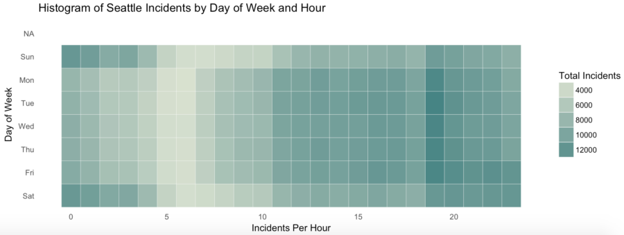
ggplot(dayHour, aes(hour, wday)) + geom_tile(aes(fill = N),colour = “white”, na.rm = TRUE) +
scale_fill_gradient(low = col1, high = col2) +
guides(fill=guide_legend(title=”Total Incidents”)) +
theme_bw() + theme_minimal() +
labs(title = “Histogram of Seattle Incidents by Day of Week and Hour”,
x = “Incidents Per Hour”, y = “Day of Week”) +
theme(panel.grid.major = element_blank(), panel.grid.minor = element_blank())
#################### Heatmap Incidents Year and Month ####################
#create summary table for heatmap – Month/Year Specific
yearMonth <- ddply(incidents, c( “year”, “month” ), summarise,
N = length(ymd)
)
yearMonth$month <- factor(summaryGroup$month, levels=rev(levels(summaryGroup$month)))
attach(yearMonth)
#overall summary
ggplot(yearMonth, aes(year, month)) + geom_tile(aes(fill = N),colour = “white”) +
scale_fill_gradient(low = col1, high = col2) +
guides(fill=guide_legend(title=”Total Incidents”)) +
labs(title = “Histogram of Seattle Incidents by Year and Month”,
x = “Month”, y = “Year”) +
theme_bw() + theme_minimal() +
theme(panel.grid.major = element_blank(), panel.grid.minor = element_blank())
#################### Heatmap Incidents Per Hour by Incident Group ####################
#create summary table for heatmap – Group Specific
groupSummary <- ddply(incidents, c( “Event.Clearance.Group”, “hour”), summarise,
N = length(ymd)
)
#overall summary
ggplot(groupSummary, aes( hour,Event.Clearance.Group)) + geom_tile(aes(fill = N),colour = “white”) +
scale_fill_gradient(low = col1, high = col2) +
guides(fill=guide_legend(title=”Total Incidents”)) +
labs(title = “Histogram of Seattle Incidents by Event and Hour”,
x = “Hour”, y = “Event”) +
theme_bw() + theme_minimal() +
theme(panel.grid.major = element_blank(), panel.grid.minor = element_blank())
Please see here for the full tutorial and steps