
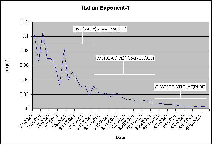
While I was laid off due to the new Coronavirus, I created a computer application called Little Blue Pearl (LBP) – named after our planet. Although I was recalled about 1.5 weeks later, I find myself continuing to follow the fatality numbers for different countries. I guess it is a bit like bird watching in a certain sense. It is not that I am focused on the number of deaths per se but rather the progress that different countries are making to overcome the deadly virus. In an earlier piece, I discussed using the Exponent-1 (exp-1 on the y-axis) to study fatalities: log(today) / log(yesterday) – 1. Today I will be dividing the technical data into three distinct periods: 1) initial engagement period; 2) mitigative transition period; and 3) asymptotic period. I haven’t developed exact criteria for these periods; but I offer my assessment of the graphics using the exp-1 for Italy as shown above.
The initial engagement period is highly volatile perhaps mostly due to the base: even a small increase in fatalities results in a large increase in the exp-1. It is during this time when the efforts of doctors, nurses, paramedics, and others in the health care profession are difficult to detect on a systemic or structural level. During the mitigative transition period, the rise in fatalities is clearly being constrained or limited by forces or systems in opposition. This opposition might not be a coherent system necessarily; but it is probably structural. For example, the low density of a geographic area can impair the pace of infection. The asymptotic period reflects the emergence of a relatively persistent and stable baseline. In other words, this is about as good as it gets. In order to achieve better outcomes – if the virus fails to give up all on its own – it might be necessary to redesign, reconfigure, or re-engineer systems and structures. In the next image, I zoom into the last 10 days for Italy to show the apparent lower boundary characteristic of the asymptotic period.
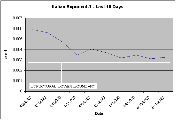
A structural lower boundary of around 0.003 means the daily exponential increase is 1.003; this is quite low mathematically but nonetheless undesirable in terms of the number of deaths. This boundary is useful in that it becomes possible to reasonably assess the effectiveness of specific changes intended to further ameliorate mortality. The baseline can also be used as a point of comparison with other countries that have also reached their asymptotic period. Sweden is an interesting country in that there has been a deliberate attempt by the government to allow citizens to carry on as usual despite the virus. Check out their pattern.
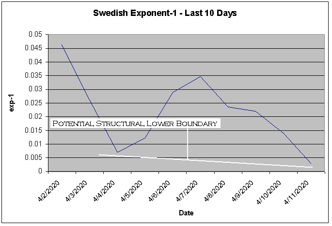
Perhaps many would suggest that Sweden still hasn’t reached its asymptotic period in light of the large swings in its exp-1. At the same time, because Sweden simply doesn’t have many fatalities, it is important not to necessarily expect a smooth asymptotic pattern. Here we have a situation where there are fewer structural constraints on the virus compared to many countries – although of course their medical system remains available to care for patients who feel they need it. Large fluctuations might be normal given the absence of control measures. Despite its policies, Sweden like many countries is still making progress – yes, even as it does nothing.
A country or region that is in its asymptotic period is more convincing for obtaining accurate estimates than if it is in a less mature period. Nonetheless, it is better to provide an estimate based on some data than to provide no guidance at all – cautioning everyone that the country has not reached a stable point on which to make reliable projections. To determine if the asymptotic period has been reached, to me one can simply use the standard deviation of the exp-1 as shown on the next table. This reading should be distinguished from the guidance: e.g. there is guidance that is more or less convincing depending on the level of deviation to the exp-1. On the table, a country shows CLEAR if either of the following is true: 1) there are fewer than 1,000 more deaths expected; and 2) 95 percent or more of the expected deaths have already occurred. The fact that CLEAR appears as the guidance does not mean that the country is genuinely clear; the stability of the asymptotic pattern has to be considered.
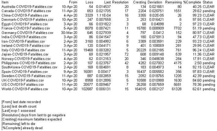
Generally speaking, I only update the data periodically – more often for countries that show lots of action or which are interesting case examples. I want to mention, for the purpose of determining the resolution date for countries, the above table uses the last 15 days of technical data based only on the number of fatalities. I suspect that many readers might dismiss the table outright since the expected number of deaths seems curiously much lower than some estimates from health care professionals. Well, I don’t take into account secondary and tertiary breakouts. Nor is LBP specifically designed to project fatalities. In an earlier blog, I mentioned that LBP attempts to connect or match day-to-day qualitative event data to the quantitative metrics. Using the system to evaluate quantitative patterns is a bit of bonus feature. Still, I hope readers still accept my argument that there are distinct periods; and the base for the asymptotic period in particular can be used ascertain the effectiveness of mitigation regimes.