

Summary
Clustering analysis is another standard method available with SAP BW Data Mining. The clustering models based on this method may apply various combinations of parameters (e.g., maximum number of clusters, minimum fraction of inter-cluster hops per iteration, etc.) in order to implement various clustering approaches. The clustering-specific reporting of the method makes possible analysis of the modeling results. In this paper we would like to discuss extensions to the standard reporting in order to improve insight into the results of clustering modeling. The mentioned extensions are implemented via the following analytics:
- Dashboard – SAP BW Data Mining Clustering Reporting
Business Requirements
We will focus the discussion on the method-specific (not problem-specific) indicators that are included on the standard clustering reporting in BW Data Mining. In other words, we will not be considering the part of the standard BW Data Mining reporting that visualizes clusters and their attributes (variables participating in the definitions of clusters) neither cluster influence coefficients for particular clustering models. However, we will focus on the indicators that provide insight as to the volume of models input data, as well as the quality of segmentation achieved via the models.
The method-specific indicators mentioned above can be viewed via either the modeling results overviews of models involved in analysis processes (transaction RSANWB, display the analysis process, right-click on the model and select to view modeling results) or directly via the modeling results overviews in model definitions (transaction RSDMWB, display the model, choose the modeling results button in the models toolbar).
An example of visualization available via the standard reporting of modeling results is provided in the below screenshot:
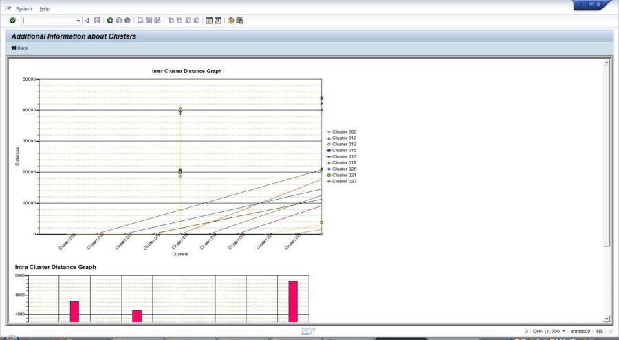
The standard visualization functionalities cover well the basic needs of a user that would like to obtain insight in the results of clustering modeling. Based on our practical experience with clustering modeling in SAP BW Data Mining the following additional business requirements could be suggested:
- Ability to browse specific clustering models to visualize their most important details without clicking into those models and studying them via a Display/Edit mode
- Ability to visualize the method-specific indicators of clustering models without going into modeling results overviews of individual processes and models
- Ability to visualize the method-specific indicators per model variable with sufficient precision (i.e. not rounded to an integer or to only three digits after the decimal point)
- Ability to select and visualize in a graphical mode a meaningful combination of the method-specific indicators (and to obtain additional valuable insight from the modeling results)
- Ability to select and visualize only the details (indicators and data properties) of specific model variables
Analytics
The implementation of the above business requirements in the SAP BW Data Mining Clustering Reporting dashboard is based on combining the functionality of the SAP BW Data Mining Model Reporting dashboard (find more details on this dashboard in SAP BW Data Mining Analytics: Model Reporting) with insight that is specific for the SAP_CLUSTERING method.
At startup, the SAP BW Data Mining Clustering Reporting dashboard displays four tabs:
- Model Master: contains the overall list of SAP BW Data Mining models defined in our system with their most important data properties, plus a set of controls allowing to browse and filter that list
- Clustering Models Distances Analysis: contains the list of models based on the SAP_CLUSTERING method with their variables and variable values, value frequencies (total percentage of a variables values assigned to data points in a specific cluster) and intra-cluster distance indicators, plus a set of controls allowing to browse and filter that list
- Clustering Models Values Analysis: contains the list of models based on the SAP_CLUSTERING method with their variables and variable values, maximum and minimum limits of a value, plus a set of controls allowing to browse and filter that list
- Clustering Models Graph: contains the bubble chart to visualize the average intra-cluster distance indicator for the models and variables chosen using the two other tabs
The selectors of the dashboard match the columns of the lists and allow limiting the models and variables visualized via the lists to specific criteria. Each time a specific value is selected, the respective selectors status indicator turns green.
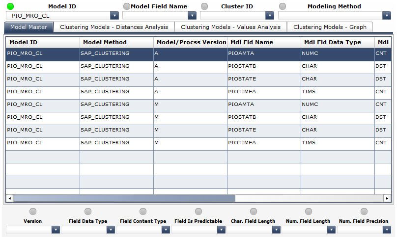
The following columns have been enabled in the list at the Model Master tab (see the screenshot below):
- Model ID a unique identifier, the technical name of the model in the overall model list
- Model Field Name an identifier of a variable (field) of the model in the overall model list
- Modeling Method the modeling method on which the model is based
- Version the version of the model
- Field Data Type the type of the data contained in a model field
- Field Content Type the role that a model field plays in the model
- Field Is Predictable contains X if the field is a predictable field, i.e. the one that if filled with prediction results
- Character Field Length the total length of a character field
- Numeric Field Length the total length of a numeric field
- Numeric Field Precision the number of digits after the decimal point in a numeric field
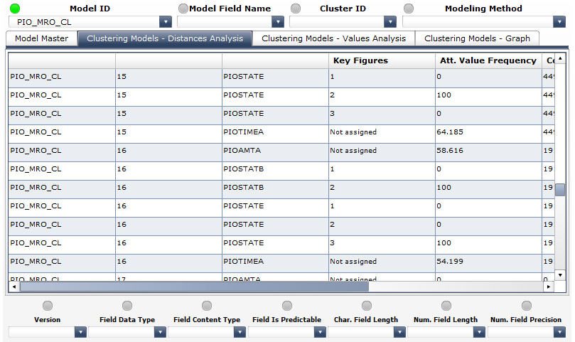
The following columns have been enabled in the list at the Clustering Models Distances Analysis tab (see the screenshot below):
- Model ID a unique identifier, the technical name of the model in the clustering-specific model list
- Cluster ID an identifier of a cluster that has been generated by the model in the clustering-specific model list
- Model Field Name an identifier of a variable (field) of the model in the clustering-specific model list
- Attribute Value ID an identifier of a variables value
- Attribute Value Frequency the total percentage of a variables values assigned to data points in a specific cluster
- Count of Data Points the number of data points loaded into a clustering model during its training that have been assigned to a specific cluster
- Minimum Distance an indicator of the minimum intra-cluster distance per a specific cluster
- Maximum Distance an indicator of the maximum intra-cluster distance per a specific cluster
- Average Distance an indicator of the average intra-cluster distance per a specific cluster
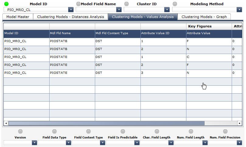
The following columns have been enabled in the list at the Clustering Models Values Analysis tab (see the screenshot below):
- Model ID a unique identifier, the technical name of the model in the clustering-specific model list
- Model Field Name an identifier of a variable (field) of the model in the clustering-specific model list
- Model Field Content Type the role that a model variable plays in the model
- Attribute Value ID an identifier of a variables value
- Attribute Value the variable value (exact for discrete variables or a binning range for continuous variables)
- Minimum Value 0 for discrete variables (because of exact attribute values) or the lower limit of a binning range for continuous variables)
- Maximum Value 0 for discrete variables (because of exact attribute values) or the upper limit of a binning range for continuous variables)
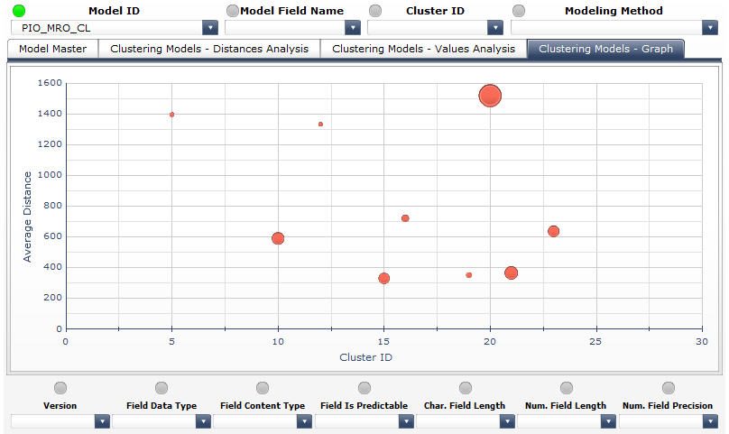
Finally, in the Clustering Models Graph tab we obtain graphical visualization of the average intra-cluster distance indicators per specific clusters of a specific model. In the below screenshot we can see all of the clusters generated by the PIO_MRO_CL model (X-axis corresponding to the cluster IDs, Y-axis corresponding to the average intra-cluster distances and bubble size reflecting the count of data points assigned to a specific cluster):
Typical Use Cases
The following could be examples of the typical use cases in which the usage of the SAP BW Data Mining Clustering Reporting dashboard could bring benefits:
1) A data mining specialist would like to visualize the models with Y as predictable variable and to study method-specific indicators of those of them that are based on the SAP_CLUSTERING method.
Use scenario: in the Model Master tab, select the records that correspond to the SAP_CLUSTERING method using the Modeling Method selector, then limit further your selection by choosing Y via the Model Field Name selector and X in the Field Is Predictable selector. The dropdown list of the Model ID selector will contain the technical names of the models we are interested in. Choose those models one by one in the Model ID selector and study their method-specific indicators in the Clustering Models Distances Analysis, Clustering Models Values Analysis and Clustering Models Graph tabs.
2) A data mining specialist would like to visualize the models based on the SAP_CLUSTERING method that contain the variable Y and have generated up to 10 clusters.
Use scenario: in the Model Master tab, select the records that correspond to the SAP_CLUSTERING method using the Modeling Method selector, and then limit further your selection by choosing Y in the Model Field Name selector. The model list in the Model Master tab will display the technical names of the models matching all of the above criteria except for having generated up to 10 clusters. To apply this last criterion, switch to the Clustering Models Distances Analysis tab and choose 10 in the Cluster ID selector (if 10 is not available, there are no models that match this criterion). The model list in the Clustering Models Distances Analysis tab will display the models satisfying to tall of the above criteria.
3) A data mining specialist would like to visually evaluate the quality of the clustering produced by the model M from the point of view of the homogeneity of the data points assigned to clusters and of the distribution of the data points across the clusters.
Use scenario: in the Model Master tab, select M in the Model ID selector to limit the evaluation to the model M. After that, switch to the Clustering Models Graph tab to proceed with the interpretation of the graphical visualization of the model Ms clusters (let us assume that we find there the visualization identical to the one presented in the below screenshot):

Based on the visual analysis of the above graph, we could make the following evaluation:
- Clusters 10, 15, 16, 19, 21 and 23 have relatively small average intra-cluster distances (from 300 through 800), the data points are distributed across them relatively evenly (least of the data points assigned to the cluster 19, most of the data points assigned to the cluster 21)
- Clusters 5, 12 and 20 have relatively large average intra-cluster distances (from 1300 through 1600), the data points are distributed across them unevenly with the vast majority of the data points assigned to the cluster 20
)