
Guest blog post by by Brian Back.
From the wide range of things you can do with D3, still one of the best things to make is the timeseries plot. In this post, I’ll walk through the basics of making a multi-column point plot/scatter plot. We’ll use a GISS dataset from NASA; dataset can be found here.
Setup
Loading the Dataset
First things first, let’s load the dataset into the visualization using the dashboard.dataset() function.’
var data=dashboard.dataset(‘f88aa708e-5388-4ed8-8507-ca61c1d6fbf3’);
//the function uses the file ID to import the dataset content as an object
Loading Libraries (optional)
Now that the dataset in contained in the variable “data”, let’s setup the libraries we need. In this case we only need one external library, the d3legeneds library. The legend is not an essential part of this project, but it’s considered best practice…feel free to skip it. Adding it is easy: just copy a link to a CDN containing that script by clicking on the “Add Library” button.
Defining the Columns
Since we’re not going to be using all the columns from the dataset, we need t define which columns we’re going to be plotting.
var columns=[‘Jan’,’Feb’,’Mar’,’Apr’,’May’,’Jun’,’Jul’,’Aug’,’Sep’,’Oct’,’Nov’,’Dec’];
Once we have defined the columns, let’s also define what our x-axis is going to be; it’s the years in the dataset. And then let’s declare what our axes labels are.
var x=’Year’,y=”;
//the variable y is going to be left blank since it’s going to change for every month
var xLabel=”Year”,yLabel=”Temperature”;
Container SVG
Here, we’re defining the SVG that contains all the elements of the plot. In addition, we also define the colors we’re going to be using for the points, the margin for the svg, and the x-axis itself.
var color=d3.scale.category20c();
var margin = {top: 50, right: 50, bottom: 50, left: 50},
width = window.innerWidth – margin.left – margin.right,
height = window.innerHeight – margin.top – margin.bottom;
var svg = d3.select(“body”).append(“svg”)
.attr(“width”, width + margin.left + margin.right)
.attr(“height”, height + margin.top + margin.bottom)
.append(“g”)
.attr(“transform”, “translate(” + margin.left + “,” + margin.top + “)”);
var xValue = function(d) { return d[x];},
xScale = d3.scale.linear().range([0, width]),
xMap = function(d) { return xScale(xValue(d));},
xAxis = d3.svg.axis().scale(xScale).orient(“bottom”);
xScale.domain([d3.min(data, xValue)-1, d3.max(data, xValue)+1]);
The Good Stuff
Now there many ways to do this (plotting the different columns), this is just one way.
Plotting the Columns
for(var i=0;i<columns.length;i++) {
var y=columns[i];
var yValue = function(d) { return d[y];},
yScale = d3.scale.linear().range([height, 0]),
yMap = function(d) { return yScale(yValue(d));},
yAxis = d3.svg.axis().scale(yScale).orient(“left”);
data.forEach(function(d) {
d[x] = +d[x];
d[y] = +d[y];
});
yScale.domain([d3.min(data, yValue)-0.2, d3.max(data, yValue)+0.2]);
svg.selectAll(“.dot”+i)
.data(data)
.enter()
.append(“circle”)
.attr(“class”, “dot”+i)
.attr(“data-legend”,function() { return y}) //optional legend
.style(“fill”,color(i))
.style(“stroke”,color(i))
.attr(“r”, 2)
.attr(“cx”, xMap)
.attr(“cy”, yMap);
}
All this is doing is going on a loop around what you would usually use to plot a single column. The two numbers here “-0.2” and “0.2” can be adjusted so you can zoom in and out of the plot. Relatively smaller numbers are preferred if you want to see the trends in detail (especially when doing line plots). Try setting them to “-1” and “1”:
yScale.domain([d3.min(data, yValue)-0.2, d3.max(data, yValue)+0.2]);
Axis
svg.append(“g”).attr(“class”, “x axis”).attr(“transform”,
“translate(0,” + height + “)”).call(xAxis).append(“text”).attr(“y”,
2).attr(“x”, width-20).style(“text-anchor”,
“end”).style(“fill”,”#333333″).style(“font-size”,”15px”).text(xLabel);
svg.append(“g”).attr(“class”, “y
axis”).call(yAxis).append(“text”).attr(“transform”,
“rotate(-90)”).attr(“y”, 6).attr(“dy”, “.71em”).style(“text-anchor”,
“end”).style(“fill”,”#333333″).style(“font-size”,”15px”).text(yLabel);
Having axes labels is always important as it always tells people what in the wold you’re showing them in the visualization. Not having axes is the easiest way to confuse everyone.
Legend
legend=svg.append(“g”)
.attr(“class”,”legend”)
.attr(“transform”,”translate(100,10)”)
.style(“font-size”,”12px”)
.style(“fill”,”#DBDCDE”)
.call(d3.legend);
And lastly we have the legend here with some minor styling.
Styling
I’ve copied the style here if you want the kind of theme I’ve used on my visualization. It’s my favorite theme. Since the Datazar D3 editor allows you to also write in CSS, you can just copy and paste this code in the CSS editor and render it.
body{
background:#484D60;
color:#FFFFFF;
font-size:11px;
font-family:Ubuntu, Roboto, Lato, “Open Sans”, sans serif;
overflow:hidden;
}
.axis path, .axis line {
fill:none;
stroke:#484D60;
shape-rendering:crispEdges;
}
.dot{
fill:#F6B1EE;
stroke:#F6B1EE;
}
.label{
fill:#FFFFFF;
}
.line{
fill:#F6B1EE;stroke:#F6B1EE;
}
.xAxis{
stroke:#FFFFFF;
fill:none;
}
.yAxis{
stroke:#FFFFFF;
fill:none
}
.mainBox{
background:#484D60 !important;
margin:10px;
border-radius:4px;-webkit-border-radius:4px;-moz-border-radius:4px;
border:1px solid #484D60;
}
.bubbleText{
font-size:12px;
fill:#FFFFFF;
}
.output{
font-size:14px;
font-family:Ubuntu, Roboto, Lato, “Open Sans”, sans serif
}
.title{
fill:#FFFFFF;
font-weight:400;
font-size:30px;
}
.legend rect {
fill:transparent;
stroke:transparent;}
The Result
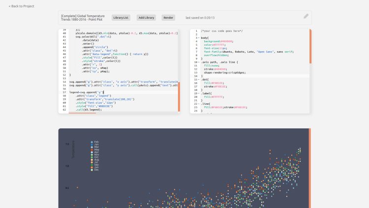
This is what my console looks like while making this visualization. Like I said at the top, this is one of my favorite visualizations. Not because it just looks good, but the data it’s showing is very important. It’s the complete temperature trend from 1880 to 2016. The trend is clear.