
Original post is published at DataScience+
Recently, I become interested to grasp the data from webpages, such as Wikipedia, and to visualize it with R. As I did in my previous post, I use rvest package to get the data from webpage and ggplot package to visualize the data.
In this post, I will map the life expectancy in White and African-American in US.
Load the required packages.
 ## LOAD THE PACKAGES ####
 library(rvest)
 library(ggplot2)
 library(dplyr)
 library(scales)
Import the data from Wikipedia.
 ## LOAD THE DATA ####
 le = read_html("https://en.wikipedia.org/wiki/List_of_U.S._states_by_life_expectancy")
 le = le %>%
 html_nodes("table") %>%
 .[[2]]%>%
 html_table(fill=T)
Now I have to clean the data. Below I have explain the role of each code.
 ## CLEAN THE DATA ####
 # select only columns with data
 le = le[c(1:8)]
 # get the names from 3rd row and add to columns
 names(le) = le[3,]
 # delete rows and columns which I am not interested
 le = le[-c(1:3), ]
 le = le[, -c(5:7)]
 # rename the names of 4th and 5th column
 names(le)[c(4,5)] = c("le_black", "le_white")
 # make variables as numeric
 le = le %>%
 mutate(
 le_black = as.numeric(le_black),
 le_white = as.numeric(le_white))
Since there are some differences in life expectancy between White and African-American, I will calculate the differences and will map it.
le = le %>% mutate(le_diff = (le_white - le_black))
I will load the map data and will merge the datasets togather.
## LOAD THE MAP DATA ####
 states = map_data("state")
 # create a new variable name for state
 le$region = tolower(le$State)
 # merge the datasets
 states = merge(states, le, by="region", all.x=T)
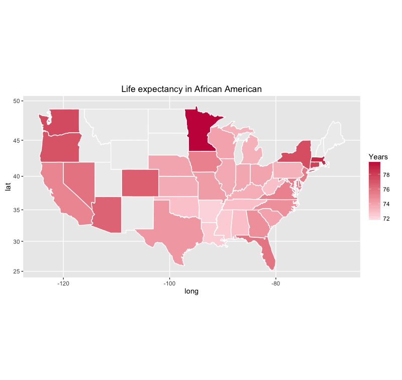
Now its time to make the plot. First I will plot the life expectancy in African-American in US. For few states we don’t have the data, and therefore I will color it in grey color.
## MAKE THE PLOT ####
 # Life expectancy in African American
 ggplot(states, aes(x = long, y = lat, group = group, fill = le_black)) +
 geom_polygon(color = "white") +
 scale_fill_gradient(name = "Years", low = "#ffe8ee", high = "#c81f49", guide = "colorbar", na.value="#eeeeee", breaks = pretty_breaks(n = 5)) +
 labs(title="Life expectancy in African American") +
 coord_map()
Here is the plot:
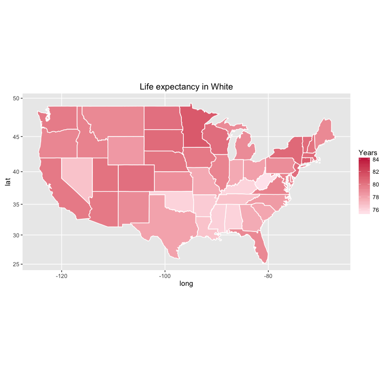
The code below is for White people in US.
 # Life expectancy in White American
 ggplot(states, aes(x = long, y = lat, group = group, fill = le_white)) +
 geom_polygon(color = "white") +
 scale_fill_gradient(name = "Years", low = "#ffe8ee", high = "#c81f49", guide = "colorbar", na.value="Gray", breaks = pretty_breaks(n = 5)) +
 labs(title="Life expectancy in White") +
 coord_map()
Here is the plot:
Finally, I will map the differences between white and African American people in US.
 # Differences in Life expectancy between White and African American
 ggplot(states, aes(x = long, y = lat, group = group, fill = le_diff)) +
 geom_polygon(color = "white") +
 scale_fill_gradient(name = "Years", low = "#ffe8ee", high = "#c81f49", guide = "colorbar", na.value="#eeeeee", breaks = pretty_breaks(n = 5)) +
 labs(title="Differences in Life Expectancy between \nWhite and African Americans by States in US") +
 coord_map()
Here is the plot:

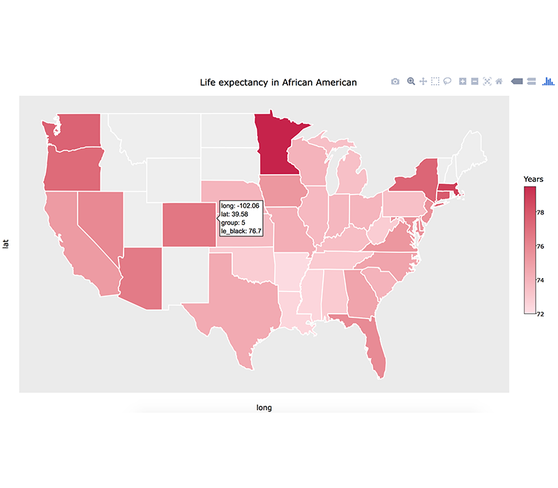
On my previous post I got a comment to add the pop-up effect as I hover over the states. This is a simple task as Andrea exmplained in his comment. What you have to do is to install the plotly package, to create a object for ggplot, and then to use this function ggplotly(map_plot) to plot it.
 library(plotly)
 map_plot = ggplot(states, aes(x = long, y = lat, group = group, fill = le_black)) +
 geom_polygon(color = "white") +
 scale_fill_gradient(name = "Years", low = "#ffe8ee", high = "#c81f49", guide = "colorbar", na.value="#eeeeee", breaks = pretty_breaks(n = 5)) +
 labs(title="Life expectancy in African American") +
 coord_map()
 ggplotly(map_plot)
Here is the plot:
Thats all! Leave a comment below if you have any question.
Original post: Map the Life Expectancy in United States with data from Wikipedia