
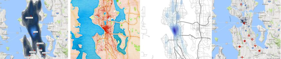
In my previous tutorial we created heatmaps of Seattle 911 call volume by various time periods and groupings. The analysis was based on a dataset which provides Seattle 911 call metadata.
It’s available as part of the data.gov open data project. The results were really neat, but it got me thinking – we have latitude and longitude within the dataset, so why don’t we create some geographical graphs?
Y’all know I’m a sucker for a beautiful data visualizations and I know just the package to do this: GGMAP! The ggmap package extends the ever-amazing ggplot core features to allow for spatial and geograhic visualization.
So let’s get going!
1) Set Up R
2) Install and load packages
R packages contain a grouping of R data functions and code that can be used to perform your analysis. We need to install and load them in your environment so that we can call upon them later.
# Install the relevant libraries – do this one time
install.packages(“lubridate”)
install.packages(“ggplot2”)
install.packages(“ggmap”)
install.packages(“data.table”)
install.packages(“ggrepel”)
install.packages(“dplyr”)
# Load the relevant libraries – do this every time
library(lubridate)
library(ggplot2)
library(ggmap)
library(dplyr)
library(data.table)
library(ggrepel)
3) Load Data File and Assign Variables
Rather than loading the data set right from the data.gov website , I’ve decided to pre-download and sample the data for you all. Map based graphs can take a while to render and we don’t want to compound this issue with a large data set. The resulting dataset can be loaded as step A below.
In step B, I found a website which outlined their opinion on the most dangerous Seattle cities. I thought it would be fun to layer this data on top of actual 911 meta data to test how many dangerous crimes these neighborhoods actually see.
#A) Download the main crime incident dataset
incidents = fread(‘https://raw.githubusercontent.com/lgellis/MiscTutorial/master/ggmap/i2Sample.csv’, stringsAsFactors = FALSE)
#B) Download the extra dataset with the most dangerous Seattle cities as per:
# https://housely.com/dangerous-neighborhoods-seattle/
n <- fread(‘https://raw.githubusercontent.com/lgellis/MiscTutorial/master/ggmap/n.csv’, stringsAsFactors = FALSE)
# Create some color variables for graphing later
col1 = “#011f4b”
col2 = “#6497b1”
col3 = “#b3cde0”
col4 = “#CC0000”
4) Transform Variables
We are going to do a few quick transformations to calculate the year and then subset the years to just 2017 and 2018. We are then going filter out any rows with missing data. Finally, we are creating a display label to use when marking the dangerous neighborhoods from the housely website review.
#add year to the incidents data frame
incidents$ymd <-mdy_hms(Event.Clearance.Date)
incidents$year <- year(incidents$ymd)
#Create a more manageable data frame with only 2017 and 2018 data
i2 <- incidents[year>=2017 & year<=2018, ]
#Only include complete cases
i2[complete.cases(i2), ]
#create a display label to the n data frame (dangerous neighbourhoods)
n$label <-paste(Rank, Location, sep=”-“)
5) Start Making Maps!
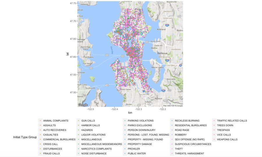
Map 1: Incident occurrences color coded by group
In this map we are simply creating the ggmap object called p which contains a Google map of Seattle. We are then adding a classic ggplot layer (geom_point) to plot all of the rows in our i2 data set.
##1) Create a map with all of the crime locations plotted.
p <- ggmap(get_googlemap(center = c(lon = -122.335167, lat = 47.608013),
zoom = 11, scale = 2,
maptype =’terrain’,
color = ‘color’))
p + geom_point(aes(x = Longitude, y = Latitude, colour = Initial.Type.Group), data = i2, size = 0.5) +
theme(legend.position=”bottom”)
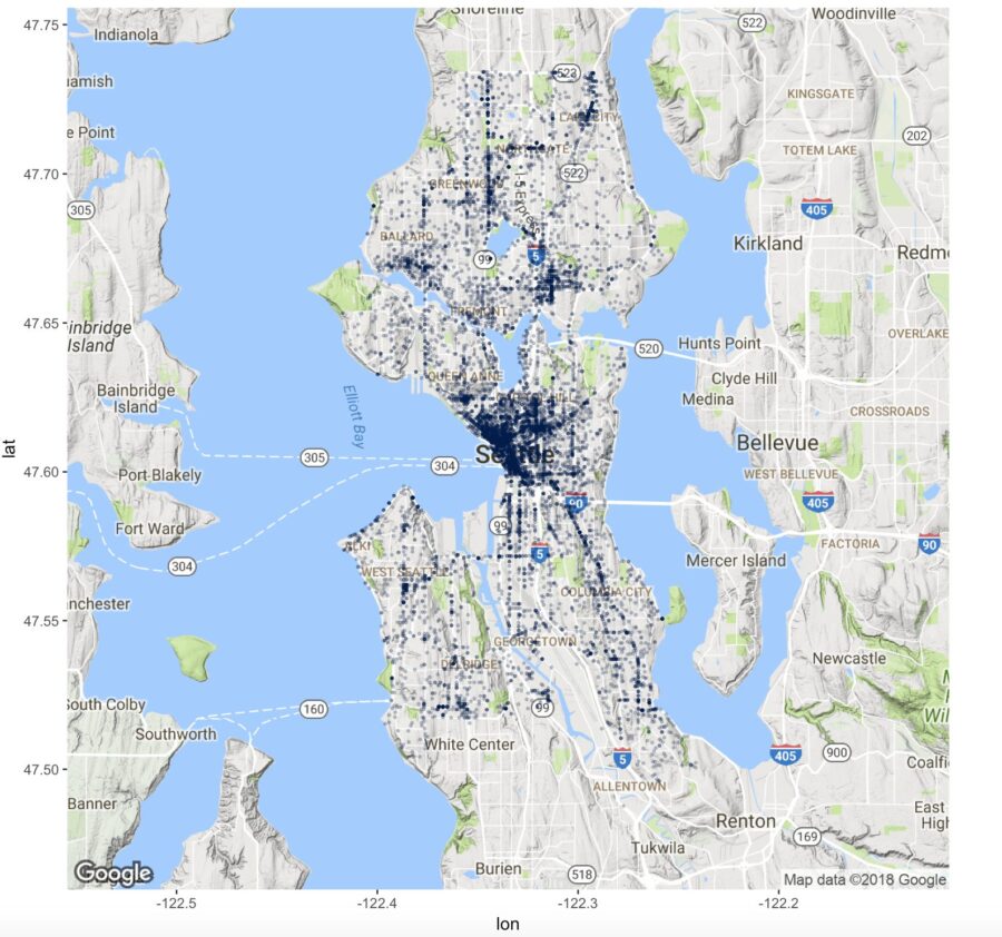
Map 2: Incident occurrences using one color with transparency
In the last map, it was a bit tricky to see the density of the incidents because all the graphed points were sitting on top of each other. In this scenario, we are going to make the data all one color and we are going to set the alpha variable which will make the dots transparent. This helps display the density of points plotted.
Also note, we can re-use the base map created in the first step “p” to plot the new map.
##2) Deal with the heavy population by using alpha to make the points transparent.
p + geom_point(aes(x = Longitude, y = Latitude), colour = col1, data = i2, alpha=0.25, size = 0.5) +
theme(legend.position=”none”)
More Maps!
We have just begun exploring maps. We still need to add labels, layer on data, explore formatting and dealing with high density, use different map styles and more. For 8 more map types and combinations, please see the original blog post here