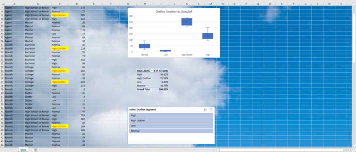
Download and use a free box and whisker outlier and anomaly detection template that first launched on KDNuggets.com in 2021. Or, copy, paste and run this FREE Outlier and Anomaly Detection Source Code to find, flag and visualize outliers and anomalies in your own datasets.
Outliers and anomalies in data might indicate potential fraud, poor customer experience, or a low level of satisfaction. They might also indicate service gaps, network interruptions or data errors that should be addressed at an operational level.
Analysts must identify and decide how to treat outliers and anomalies before developing predictive models using time series, classification, and parametric data analysis techniques. The free outlier and anomaly detection template is one of several box & whisker templates that allow users to identify, visualize and analyze outliers and anomalies posted in Box Plot Graph Outlier Data Analysis Templates. You can also follow a free outlier and anomaly detection tutorial to get started coding custom box & whisker templates for outlier analysis.
Time series data analysts can also download a FREE CASE STUDY: Humber River Water Levels Time Series Box Plot Data Analysis. This case study is the result of data being run through a box & whisker time series algorithm. A summary of how these and other templates apply the theory of the box & whisker plot to analyze data can be found at Box Plot Outlier Data Analysis Templates.
