
Summary: This blog is part II of a series showcasing management and analytics of the daily U.S. Covid-19 case/death data published by the Center for Systems Science and Engineering at Johns Hopkins University. Whereas part I focused on data management, part II highlights management while conducting a deeper dive in analytics. The technology deployed is R driven by its splendid data.table package. Analysts with several months of R experience should benefit from the notebook below.
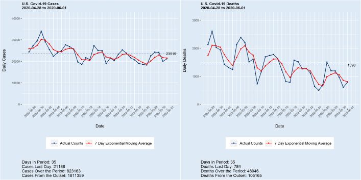
Deaths from covid-19 surpassed the grim total of 100,000 last week, with the count now exceeding 105,000 and still growing at almost 1,000 per day. Meanwhile, the number of cases in the U.S. stands at 1,800,000+, with more than 20,000 added daily. While a portion of these new case counts is undoubtedly the product of enhanced testing, the numbers are nonetheless staggering. A 150,000 death total by Labor Day with 200,000 by year’s end are conservative estimates. “This is just a flu” — Not.
The current day’s CSSE data are available for download at 10 CDT daily. There are case and death files, each of which has a similar structure. The granularity is geography such as county within states. A new column is added each day holding the cumulative counts for each geography. The data munging revolves on pivoting or melting the data into R data.tables and computing daily counts as differences of successive cumulative records.
A problem with the data, noted on the website, is that “The time series tables are subject to be updated if inaccuracies are identified in our historical data. The daily reports will not be adjusted in these instances to maintain a record of raw data.” I show examples of the problems below. One issue often encountered is that some states at times don’t update the counts. This will manifest as cumulative figures being identical on successive days. Another common anomaly is that some counts are initially attributed to an “unassigned” geography and later updated to known locations. The cumulative “unassigned” category thus decreases, resulting in negative daily counts. I manage around the data problems by generally avoiding counts for specific state geographies and days, working instead at the state level with moving averages.
After loading and munging the data, I assemble functions to report on cases/deaths using powerful data.table syntax. Some of these functions then feed ggplot visuals that demonstrate the disease’s workings over time. The groupby power of data.table allows state-level case-death reports to be generated in a few statements.
Finally, I preliminarily show how the summarized data can be used to estimate the reproduction number, known in epidemiology as R0 (R-Naught) with EpiEstim package. I do not, however, claim any but computational expertise in this area, and present just a simple illustration now. When all is said and done, my hope is that readers will find some of the thinking and code presented helpful in their own work.
The supporting platform is a Wintel 10 notebook with 128 GB RAM, along with software JupyterLab 1.2.4 and R 3.6.2. The R data.table, tidyverse, pryr, plyr, fst, and knitr packages are featured, as well as functions from my personal stash, detailed below.
Read the entire blog here.