
There are several thousands of languages in the world and they all have in common that they are defined and explained by some set of rules. This set of rules is so called grammar and with its help individual and separate words (like nouns and verbs) are combined into the right and meaningful sentences. The similar methodology can be applied on creating graphics. If we imagine that each graph is made up from its basic parts — components, we can define basic set of rules by which we will define and combine components into right and meaningful visualizations (graphs). This set of rules is so called grammar of graphics and in this article we’ll explain the methodology and syntax for one of the most famous graphics packages in R — ggplot2.
Graph as a composition of its individual components
The main idea that lies behind grammar of graphics is that each plot can be made from the same few components. Those components are:

- aesthetics
- geometrical shapes
- statistical transformations
- scaling
- faceting
- themes
Each component has its own set of rules and specific syntax (so called grammar of components) and together they are forming one single entity called graph.
In the next section we will introduce set of rules on two levels:
- set of rules and ggplot2 syntax on component level
- set of rules and ggplot2 syntax on graph level
Set of rules on component level
The first step in mastering the grammar is understanding individual components and their set of rules that are needed for proper definition and control. Below we are presenting short explanations for each of the components.
Data
Data frame object as input data source
Description: Through this component we are defining input data set that will be used in visualization.
Syntax: data set name is defined inside ggplot() function. Ggplot() function initializes a new graph and data set name is one of its necessary arguments:
          #graph initialization and data source
ggplot(data_frame_name)
Set of rules: ggplot2 requires that data are stored in a tidy data frame object. It is the most popular R data type object used for storing tabular data. You can imagine data frame as a table which has variables in the columns and observations in the rows. Any other objects like matrices, lists or similar are not accepted by the ggplot2.
Aesthetics
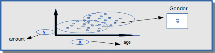
Mapping x,y to age and amount variable. Third variable gender is shown through color
Description: Component represents mapping between variables and visual properties like axes, size, shape and color. What will represent the axes on my plot? Beside variables that will represent axes do we want to see some additional informations? Through this component two variables will be mapped to horizontal and vertical axis. Additional informations (variables) can be added through color, shape and size.
Syntax: aesthetics are defined inside aes() function.
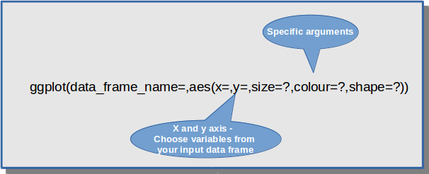
Set of rules: aes() function can be defined inside ggplot() or it can be defined inside other components like geometrical shapes and statistics. If aes() is defined inside ggplot() function then its definition is common for all components (for example x and y axis will be the same for all geometrical shapes on the graph). Otherwise, its definition is recognized only inside specific component.
          #aesthetics that is common for all components - points and text
          ggplot(df1, aes(x=col1,y=col2))+geom_point()+geom_text()
 #aesthetics that is specified only for points
           ggplot(df1)+geom_point(aes(x=col1,y=col2))
Geometrical shapes
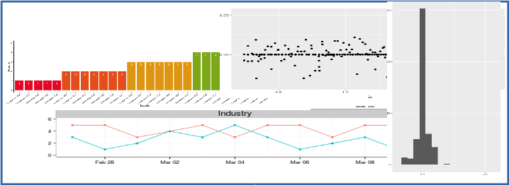
Description: Plot type definition. More precise, we are defining how our observations (points) will be displayed on the graph. There are many different types (like bar chart, histogram, scatter-plot, box-plot ,…) and each type is defined for specific number and types of variables.
Syntax: Syntax starts with geom_* and here are the most used shapes:
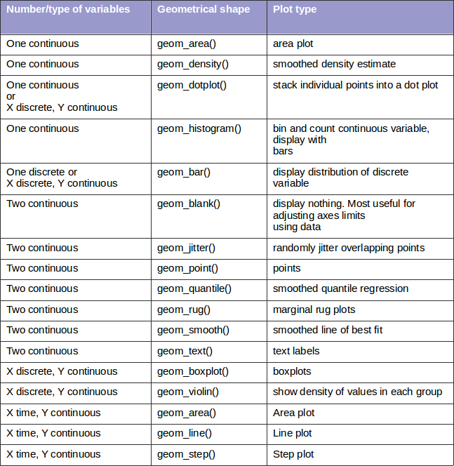
Set of rules:
- Each geom shape can be defined with its own dataset and aesthetics that will be valid only for that shape. In that case data frame and aes() are defined inside geom_*() function.
- Each shape have its own specific aesthetics arguments. For example hjust and vjust are arguments specific only for geom_text() and linetype is an argument specific only for line graphs.
- It is possible to combine geometrical shapes which means that each graph can have one or more geom shapes. For example, sometimes it is useful to show on one graphics bar plot and a line plot or let’s say scatter plot and a line plot.
          #two geom shapes - geom_line and geom_point used on one graph
ggplot(GOT, aes(x=Episode,y=Number_of_viewers, colour=Season, group=Season)) + geom_line()+geom_point()
Statistical transformations
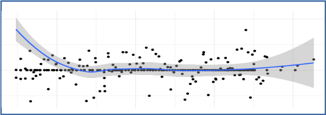
Famous statistical transformation — smoothing
Description: Component is used to transform the data (summarize the data in some matter) before visualization. Many of those transformations are used “behind the scene” during geometrical shapes creation. Often we don’t define them directly, ggplot2 is doing that for us.
Syntax: Syntax depends on a used transformation. Below are often used statistics:
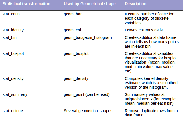
Set of rules:
- with statistical components additional variables are created (usually some aggregate values or similar). To visualize those data we need to use some geom_*() function. Otherwise the newly created variables will not be visible on the screen.
- there are two ways to use statistical functions. First way is to use stat_*() function and define geom shape as an argument inside that function (geom argument). The second way is to use geom_*() and define statistical transformation as an argument inside that function (stat argument). Here is an example:
          #define stat_*() function and geom argument inside that function
ggplot(input_data,aes(col1,col2))+geom_point()+stat_summary(geom="point",fun.y="mean",colour="red")
 #define geom_*() function and stat argument inside that function
 ggplot(input_data,aes(col1,col2))+geom_point()+geom_point(stat="summary",fun.y="mean",colour="red")
Scaling
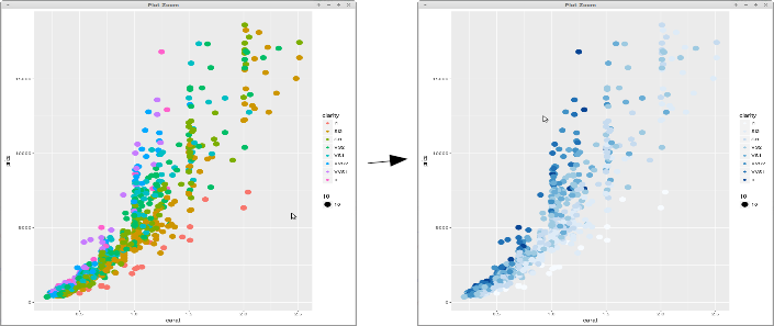
Controlling the colors with scaling
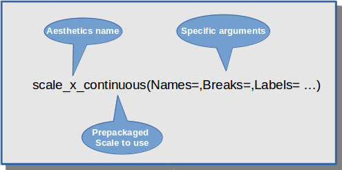
Description: With aesthetics we define what we want to see on the graph and with scaling we define how we want to see those aesthetics. We can control colors, sizes, shapes and positions. Scales also provide the tools that let us to read the plot: the axes and legends (we can customize axis titles, labels and their positions). Ggplot2 creates automatically default predefined scales for each aesthetics that we define. However, if we want to customize scales we can modify each scale component by ourselves.
Syntax: Basic syntax is following:
Basic scaling syntax
Here are the scales for different types of aesthetics:
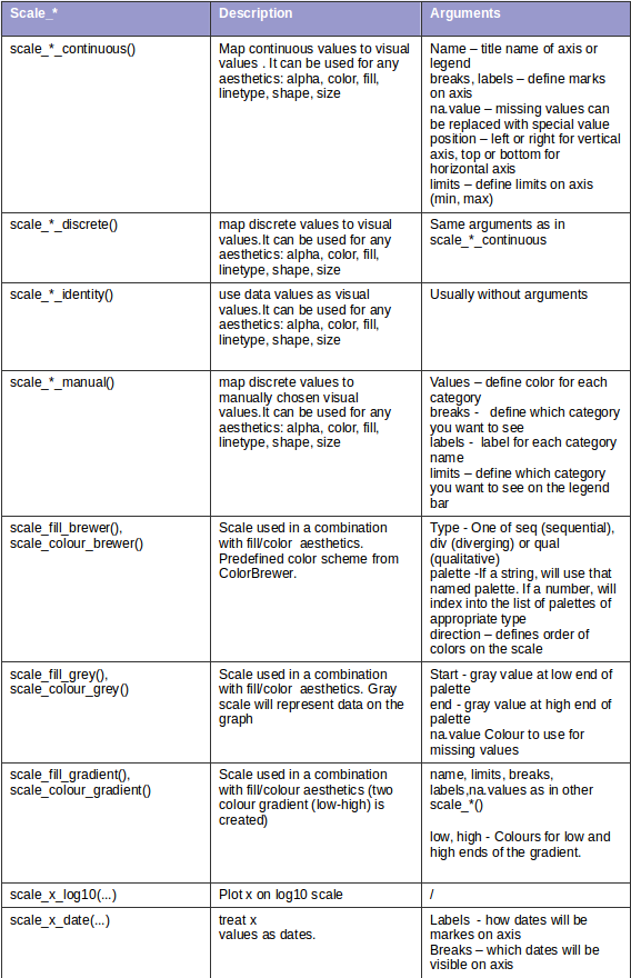
Set of rules:
- There are no specific rules — just appropriate function name needs to be chosen. Scaling syntax is a little bit more complex because for each aesthetics scaling we need to know aesthetics name (x,y, color, size, shape), type of a variable (continuous, discrete) and arguments that are specific for each scale function. Keep in mind that you will use these functions only when you are not satisfied with predefined scheme (default scaling that is created by ggplot2).
Faceting
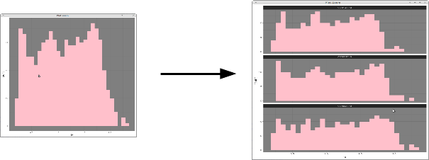
Sub-plotting histogram
Description: With faceting we are dividing the data into subsets by some discrete variable and displaying the same type of a graph for each data subset.
Syntax: Facet_wrap() or facet_grid() function is used for displaying subsets of data.
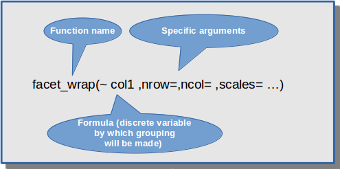
Faceting — sub-plotting by col1 variable
          ggplot(data_set, aes(col1,col2))+ geom_point()+
          facet_wrap(~col3)
Set of rules:
- Faceting can be used in a combination with different geom shapes, there is no restriction at all. The main idea with faceting is that once you make a graph you can easily split the data (by some criteria)and display sup-graphs which are going to be visible on the screen.
Themes
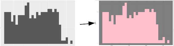
Changing background color of the plot
Description: With themes it is possible to control non-data elements on the graph. With this component we don’t change a type of graph, scaling definition or used aesthetics. Instead of that, we are changing things like fonts, ticks, panel strips and background colors.
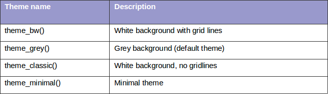
Syntax: There are several predefined themes and here is the list of some of them:
Each of this themes will change all theme elements to values which are designed to work together harmoniously (complete theme is changed, not just individual elements). However, if we want to change individual elements (for example just background color or just font of our title) we can use theme() function and specify the exact element we want to change.
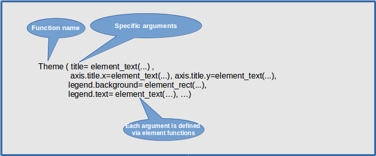
Theme and element function
Set of rules: Each theme element (that is controlled via theme() arguments) is associated with an element function, which describes visual properties of that element. For example, if you want to set up background color you will need to define background color argument inside element_rect() function. If you decide to change axis labels you will need to define new labels inside element_text() function. Each argument in theme function needs to be defined with the help of one of these element_*() functions.
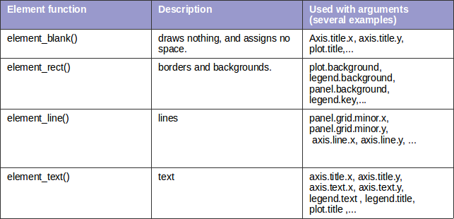
There are four basic element_functions and each is used in a combination with specific theme arguments:
Here is an example how we combine arguments with element functions:
          ggplot(data_set_name, aes(col1,col2)) + geom_point() +
          theme_bw() +
           #panel background is used with element_rect()
           theme(panel.background = element_rect(fill = "white",colour = "grey"))
Usually you’ll use predefined themes but it is useful to know that you can change each individual element using theme() function.
With that said, we explained basic rules related to each component of the graph. The next question which we ask ourselves is:” How are these components combined into one single entity called graph?”
Set of rules on graph level
Combining the components
After we defined each component separately we need to combine them together and create a proper and meaningful composition called graph.
Basic set of rules for combining:
- Each new graph is initialized with ggplot() function.
- Ggplot() is used to declare input data frame name and also to specify the set of plot aesthetics intended to be common throughout all geometrical shapes that will be used on one graph.
- any component that is used in graph building will be added with ‘+’ sign
- each component has its own corresponding function name and arguments that are related only for that component.
- we can combine different components, we are not limited to certain combinations
- each component will use the same input data frame and aesthetics that are defined inside ggplot() function (unless otherwise stated)
- aesthetics can be defined inside ggplot() function or inside any geometrical shape. If defined inside ggplot() they will be common for all shapes. Otherwise, they will be defined for one specific component/shape.
- each component has its own special arguments, rules and syntax. In some cases, two components can define special arguments that are unique only for that combination. For example, if geom_text() is used then special arguments inside aes() function are hjust and vjust. They are typical just for geom_text() object (we don’t use those arguments with other shapes).
- stat_*() component needs to be combined with geom_* component. The reason lies in the fact that statistical transformations are only creating new variables. In order for them to be visible on the screen we must define the corresponding geom_* type which will visualize the new data.
Pseudo code is presented below:
          ggplot(data_frame_name, aes()) +
          component_for_geom1_*() +
           component_for_geom2_*() + … +
               #optional components
           component_for_scaling_*() +
           component_for_faceting_*() +
           component_for_themes_*() + ...
For the end we are presenting one real example:
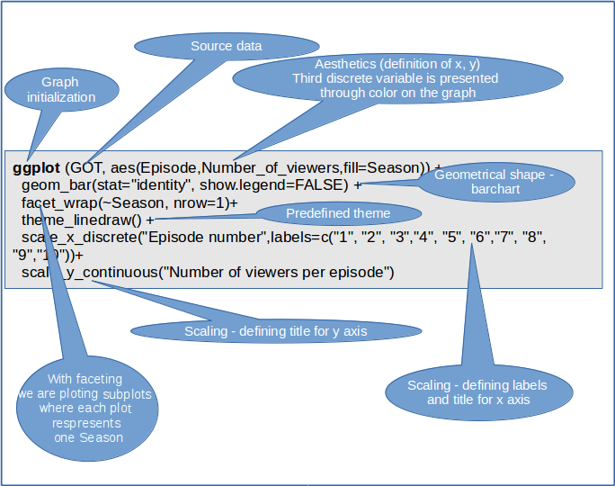
ggplot2 — sub-plotting bar-charts
Result is a graph that looks like this:
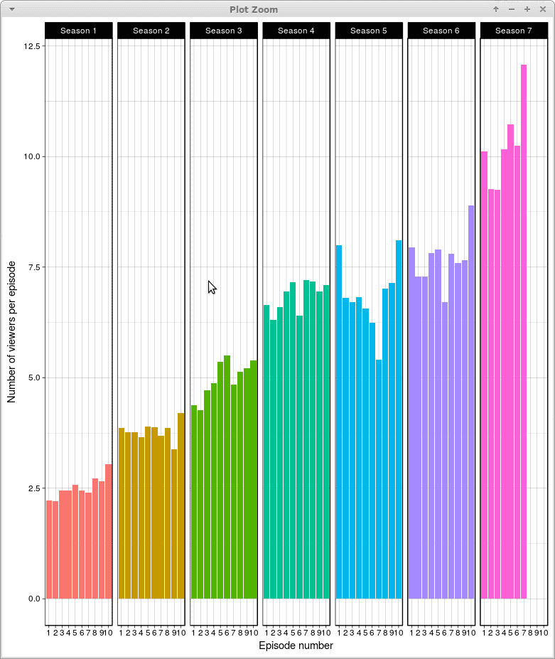
ggplot2 — faceting bar-charts
Summary
In this article we showed in what way ggplot2 relies on grammar of graphics. It may seem complex at the beginning because there a lot of rules and topics to master. Firstly you need to understand each component separately — meaning, syntax and rules for each of them independently. After that, you need to additionally learn how to properly combine those component in a one single entity called graph. There is a lot of theory behind the scene. But once you overcome this theory you can control and modify anything you like on your plot so that is nothing left to chance. After mastering the grammar distance from mind to “paper” becomes really short — almost every your idea can be accurately transposed on the screen.
To read original blog , click here.