
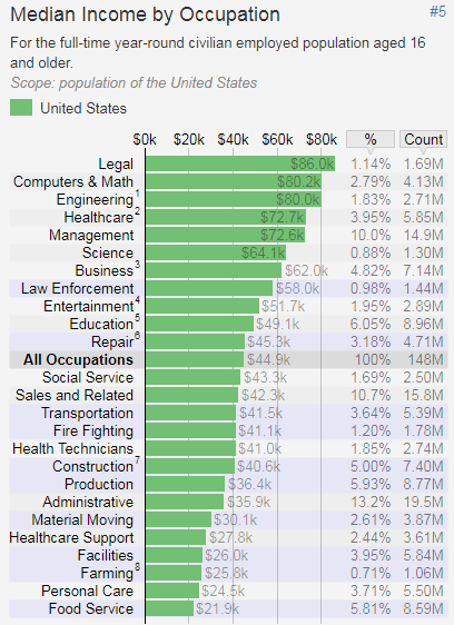
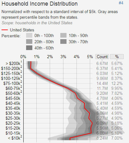
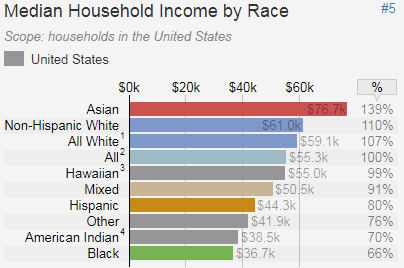
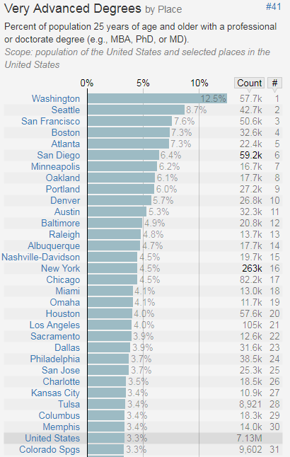
I found an interesting websites featuring hundreds of charts derived from US census data. It shows contrasts between states, cities, regarding education, jobs, languages spoken, salaries, even discrepencies between men and women or Asians and Caucasians, regarding various metrics broken down by location, education, or other criteria. I selected four of these charts.
You can access all the charts here. The data was last updated in September 2018, according to the website.