
 I teach AP Statistics in China at an International school and I believe it’s important to not only show my students how to do plots and inferential statistics on their TI Nspire calculators, but also in R using ggplot, dplyr, and R Markdown.
We are starting the third unit in AP Statistics and we will be learning about scatter plots and regression. I will teach them how to do this in R and use R Markdown to export to Word.
I have already gone over some of the basics of opening RStudio and entering some data and saving to their home directory. We have R and RStudio on all forty of our school computers. They are also required to install R and RStudio on their home computer. I’ll keep the online Microsoft Data Scientist Workbench as a backup.
Here are some ggplot basics that I’ll start with.
I’ll use examples from our AP stats book and the IB book. We are using The Practice of Statistics 4th edition by Starnes, Yates and Moore (TPS4e) for AP Statistics class. I want to recreate some of the plots in the textbook so I can teach my students how they can create these same plots. We can probably improve in some way on these plots and at the same time, teach them the basics of regression and R programming.
Here is my general plan:
- Enter the data into the TI nspire cx.
- Generate a scatter plot on the TI.
- Use the Smartboard to show the code in R using RStudio.
- On the first day use an R Script for the R code.
- All following days, use R Markdown to create and annotate the scatter plots.
- Publish to our Moodle page or maybe saturnscience website.
Making a scatter plot
Now let’s make a scatter plot with the example in the TPS4e book Chapter 3, page 145.
The general form of a ggplot command will look like this:
myGraph <- ggplot(myData, aes(variable for x axis, variable for y axis)) + geom()
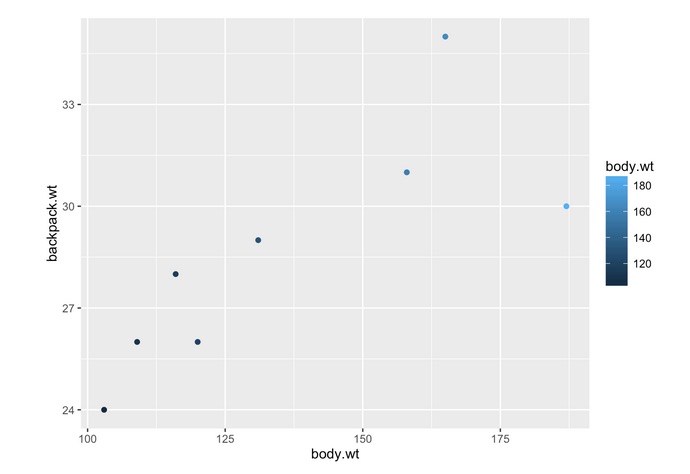
Here is the data from page 145 in the TPS 4e textbook and how we enter it in. We use the “c” command to combine or concatenate into a vector. We then turn these two vectors into a data frame.
body.wt=c(120,187,109,103,131,165,158,116)
backpack.wt=c(26,30,26,24,29,35,31,28)
 TPS145= data.frame(body.wt,backpack.wt) TPS145

 Now we put this data frame into the ggplot object and name it scatter145 and call the ggplot2 package.
library(ggplot2) scatter145=ggplot(data=TPS145, aes(body.wt,backpack.wt)) +
geom_point()
Here is the scatter plot below produced from the above code:This is a starting point and we can add to this plot to really spruce it up.

I added some blue color to the plot based on the body weight.
scatter145=ggplot(data=TPS145, aes(body.wt,backpack.wt,colour=body.wt)) +
geom_point()

 scatter145

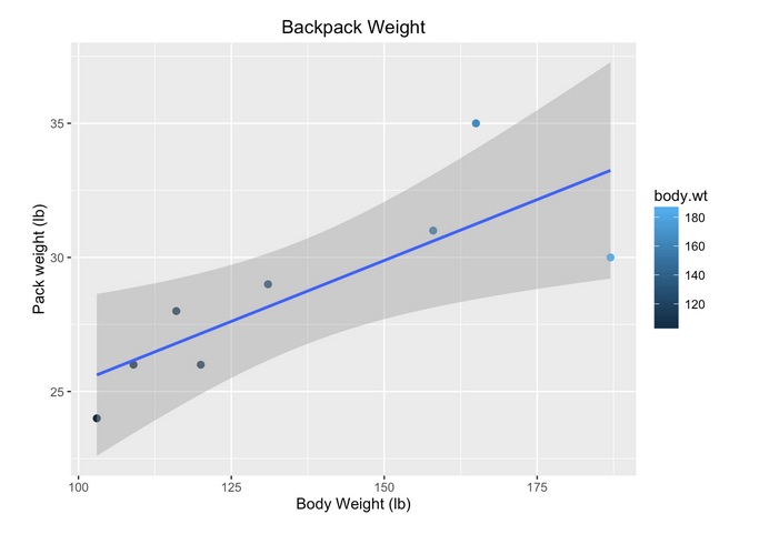
Adding Labels And Adjusting The Size Of The Data Point
To add the x, y and main labels, I add on to my plot with the xlab, ylab, and main arguments inside ggplot’s scatter plot. I also increased the size of the plotted data to make it easier to see.
scatter145 = scatter145+ geom_point(size=2) +
xlab("Body Weight (lb)") +
 ylab("Pack weight (lb)") +
 ggtitle("Backpack Weight")

 scatter145
How To Add The Regression Line.
I will keep adding to the plot by plotting the regression line. The function for adding a liner model is “lm”. The gray shaded area is the 95% confidence level interval.
Here is the final code for creating the scatter plot with the regression line.
  scatter145=scatter145+ geom_point(size=3) +
xlab("Body Weight (lb)") +
 ylab("Pack weight (lb)")+
 ggtitle("Backpack Weight")+
 geom_smooth(method = "lm")
Here is the scatter plot with the regression line.
My motivation for working in R Markdown is that I want to teach my students that R Markdown is an excellent way to integrate their R code, writing, plots and output. This is the way of the near future in Introductory Statistics. I also want to model how reproducible research should be done.
Two research papers I read recently support this view.
Some Recent Research On Reproducible Research And Intro Statistics
The authors Deborah Nolan and Jamis Perrett in their paper Teaching and Learning Data Visualization: Ideas and Assignments paper here argue that statistical graphics should have a more prominent role in an introductory statistics course.
This article discusses how to make statistical graphics a more prominent element of the undergraduate statistics curricula. The focus is on several different types of assignments that exemplify how to incorporate graphics into a course in a pedagogically meaningful way. These assignments include having students deconstruct and reconstruct plots, copy masterful graphs, create one-minute visual revelations, convert tables into `pictures’, and develop interactive visualizations with, e.g., the virtual earth as a plotting canvas.
Another paper R Markdown: Integrating A Reproducible Analysis Tool into Introductory Statistics by Ben Baumer, Mine Cetinkaya-Rundel, Andrew Bray,Linda Loi and Nicholas J. Horton argue that teaching students R Markdown helps them to grasp the concept of reproducible research.
R Markdown is a new technology that makes creating fully-reproducible statistical analysis simple and painless. It provides a solution suitable not only for cutting edge research, but also for use in an introductory statistics course. We present evidence that R Markdown can be used effectively in introductory statistics courses, and discuss its role in the rapidly-changing world of statistical computation.