
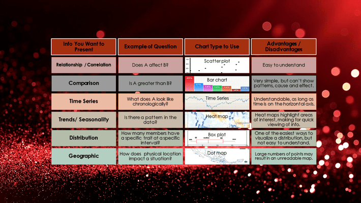
The following graphic is based on Sam Priddy’s excellent DSC/Tableau Webinar How to Accelerate and Scale Your Data Science Workflows. Sam covered many interesting points for organizing, analyzing and presenting data–including which graph is best suited for different data types. This graphic is an overview of some of Sam’s points. For more information and tips, check out his webinar.