
Article was originally published on author’s blog, here.
Learning to use data visualization programs
Imagine spending countless hours analyzing your data and finding a meaningful insight that can help shape direction of your business – the only missing piece is convincing functional stakeholders that your analysis is in fact valuable. In this article we will discuss learning resources offered by leading tools that help us communicate our data findings. In fact, no analysis no matter how thorough and complex it might be could yield any real value if the compelling recommendation is not provided to help company leadership take further action. This is exactly where data visualization comes into play: this software allows us to connect to disparate data sources, wrangle our data, perform ad-hoc analyses, distill a powerful data story and even build dashboards to enable further analysis by other folks in our organizations.
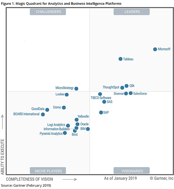
According to Gartner’s Magic Quadrant for Analytics and Business Intelligence Platforms (1) the list of leaders in the data visualization fields include Microsoft Power BI, Tableau and Qlik . In an apparent effort to grow their user base and democratize data analytics, all of these providers offer fully functional versions of their programs free of charge or in case of Microsoft with an affordable subscription plan. Even better, these vendors formalized their knowledge base via various free online learning options.
1. Microsoft Power BI .
With the ease of use rivaling only Tableau (# 2 on this list), Power BI Desktop has a great following of loyal Microsoft users who find its interface rather familiar. Microsoft offers different versions of Power BI products, starting with its free version of Power BI Desktop as well as reasonably priced Pro version subscription at under $10 per month. While Free version will suffice for most casual users, Pro version would be needed to help you share your work, collaborate with coworkers, enable apps, or embed APIs.
Guided Learning is the official collection of lessons created for users new to the product. Another great resource would be edX’s Analyzing and Visualizing Data with Power BI MOOC offered by Microsoft. Yet another free resource would be Introducing Microsoft Power BI ebook by Microsoft Press. You can also subscribe to Power BI’s official YouTube channel for more content. If this were not enough, when you feel stuck on your learning journey you can feel free to turn to the friendly community for help.
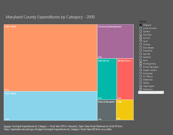
Here is the quick example of a treemap chart I created in PowerBI that shows budget categories’ % of total for Maryland counties where a user can select a county of interest:
2. Tableau Public .
Tableau program itself is often seen synonymous with data visualization software, and rightfully so. It entered the stagnant world of traditional Business Intelligence tools in 2003 and managed to disrupt it by offering simplicity of use, intuitive charting options, and powerful self-service capabilities never available before. Often compared to the ever-developing Power BI, Tableau is favored by users with Designer backgrounds, while the latter’s interface is more familiar to people with database/data warehouse background. If you read your favorite blogs showcasing embedded visualizations, chances are that the work was done in Tableau Public. This is a fully functional program that comes with the only cost of your data made available to the general public. If you rather not share your work with anyone who has Internet connection, PowerBI’s Pro version might be an inexpensive, but needed alternative.
An innovator in the learning scene, Tableau’s How-to Videos offer comprehensive on-demand tutorials to get you started with this program. Any of your questions can be answered by very helpful participants in user forums or found in the official help section. Tableau’s channel can also be found on the second largest search engine of the internet. Should you prefer even more structured approach, Coursera offers a slew of MOOCs focusing on this program.
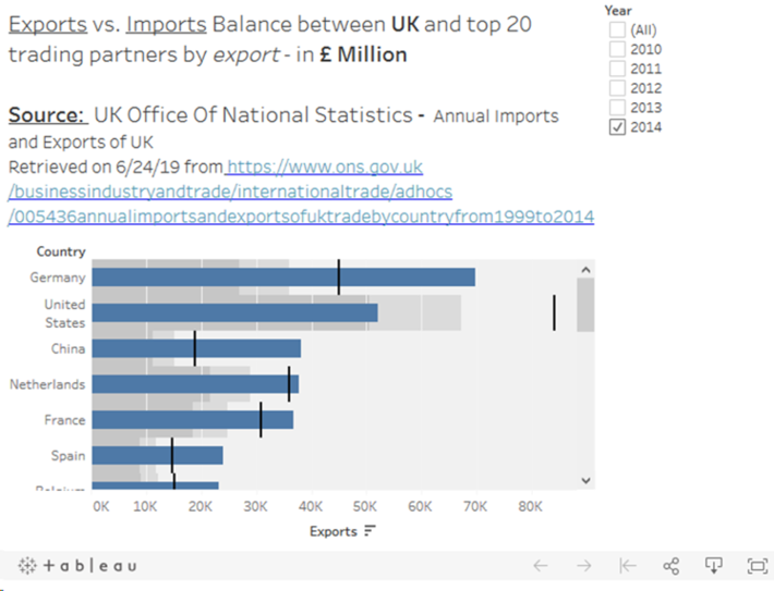
Below is the bullet graph showing import/export trade balance of UK. Tableau allows us to choose a year of interest:
3. QlikView Personal .
Not only Qlik is the only non-US vendor on our list, it is also the most mature one: founded in 1993 in Sweden. While most of the company offerings have a very heavy BI focus and come with a hefty price, we will focus on QlikView Personal edition that made some noticeable strides towards building its own data viz prowess. This vendor markets their software to be so intuitive that “anyone” can create personalized and dynamic dashboards. Perhaps it is worth a while to give them a chance and see for ourselves?
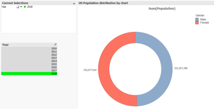
This is what a pie chart showing breakout of US population by year by gender looks like:
4. Google DataStudio – BONUS.
Not to be outdone by its competition Google released its DataStudio product out of beta last September. The newest entrant to the field offers state of the art interactive drag & drop interface for its vast charting options, data blending capabilities, custom field calculations, and connections to various data sources, including all of the leading databases. Users who already heavily rely on Google Tech stack will appreciate additional benefits of Google-specific connectors: Sheets, BigQuery, and even digital marketing and site analytics platforms (Double Click Manager, Google Ads, YouTube Analytics, Google Analytics and the like.) It’s sharing options include View only access, access to people with the link or access for specific email addresses. This software is not found in the Gartner’s Magic quadrant just yet; however I wouldn’t be surprised if in the near future DataStudio takes on PowerBI in the same fashion Chrome dominated the then leading internet browser: Internet Explorer .
To get started you can watch educational short videos here or take an introductory class here .
Using DataStudio I created a geo map of US population by state that allows user to filter it by gender dimension:
1. 2019 Magic Quadrant for Analytics and Business Intelligence Platforms. Retrieved September 30, 2018 from https://www.qlik.com/us/gartner-magic-quadrant-business-intelligence
What is your favorite data visualization program and how did you learn to use it?