

K-means is a centroid based algorithm that means points are grouped in a cluster according to the distance(mostly Euclidean) from centroid.
Centroid-based Clustering
Centroid-based clustering organizes the data into non-hierarchical clusters, in contrast to hierarchical clustering defined below. k-means is the most widely-used centroid-based clustering algorithm. Centroid-based algorithms are efficient but sensitive to initial conditions and outliers. This course focuses on k-means because it is an efficient, effective, and simple clustering algorithm.

Clustering Workflow
To cluster your data, you’ll follow these steps:
- Prepare data.
- Create similarity metric.
- Run clustering algorithm.
- Interpret results and adjust your clustering.
This page briefly introduces the steps. We’ll go into depth in subsequent sections.

Prepare Your Data:
- in case of clustering Yours rows should be your observations and columns should be your Variables.
- You can’t afford missing values in your dataset if you have too many missing value in any observation remove it like your bad habits and if its few replace with estimated values like you estimate your future salary.
- You must scale your data for easy comparable observation with zero mean and one standard variation.
let’s show you a snippet in R how it is done (remember i always choose simple examples that is not practical)
I will choose USArrests dataset from R to show you this
summary(df)
Murder Assault UrbanPop Rape
Min. : 0.800 Min. : 45.0 Min. :32.00 Min. : 7.30
1st Qu.: 4.075 1st Qu.:109.0 1st Qu.:54.50 1st Qu.:15.07
Median : 7.250 Median :159.0 Median :66.00 Median :20.10
Mean : 7.788 Mean :170.8 Mean :65.54 Mean :21.23
3rd Qu.:11.250 3rd Qu.:249.0 3rd Qu.:77.75 3rd Qu.:26.18
Max. :17.400 Max. :337.0 Max. :91.00 Max. :46.00summary of the data
summary(df)
Murder Assault UrbanPop Rape
Min. :-1.6044 Min. :-1.5090 Min. :-2.31714 Min. :-1.4874
1st Qu.:-0.8525 1st Qu.:-0.7411 1st Qu.:-0.76271 1st Qu.:-0.6574
Median :-0.1235 Median :-0.1411 Median : 0.03178 Median :-0.1209
Mean : 0.0000 Mean : 0.0000 Mean : 0.00000 Mean : 0.0000
3rd Qu.: 0.7949 3rd Qu.: 0.9388 3rd Qu.: 0.84354 3rd Qu.: 0.5277
Max. : 2.2069 Max. : 1.9948 Max. : 1.75892 Max. : 2.6444preprocessed data
In addition to this you have to make sure that your data can easily let you calculate you the similarity
This preprocessing consists of
Normalizing Data
You can transform data for multiple features to the same scale by normalizing the data. In particular, normalization is well-suited to processing the most common data distribution, the Gaussian distribution. Compared to quantiles, normalization requires significantly less data to calculate. Normalize data by calculating its z-score as follows:x′=(x−μ)/σwhere:μ=meanσ=standard deviation
Let’s look at similarity between examples with and without normalization. In Figure 1, you find that red appears to be more similar to blue than yellow. However, the features on the x- and y-axes do not have the same scale. Therefore, the observed similarity might be an artifact of unscaled data. After normalization using z-score, all the features have the same scale. Now, you find that red is actually more similar to yellow. Thus, after normalizing data, you can calculate similarity more accurately.
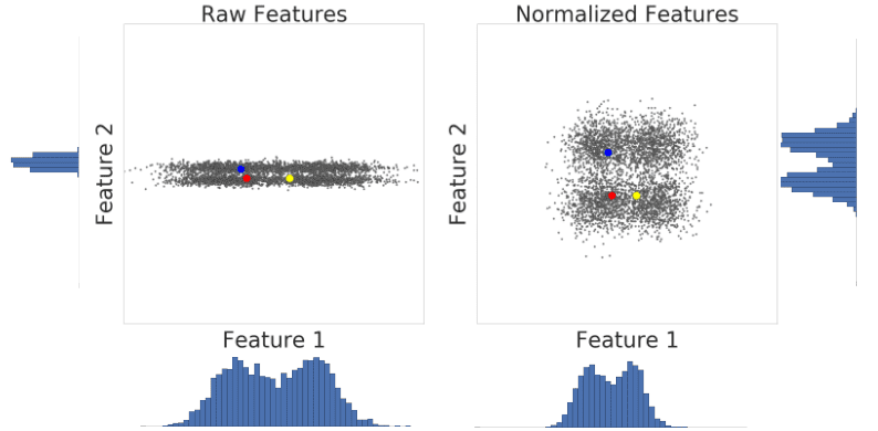
Figure 1: A comparison of feature data before and after normalization.
In summary, apply normalization when either of the following are true:
- Your data has a Gaussian distribution.
- Your data set lacks enough data to create quantiles.
Using the Log Transform
Sometimes, a data set conforms to a power law distribution that clumps data at the low end. In Figure 2, red is closer to yellow than blue.
What is power law?
In statistics, a power law is a functional relationship between two quantities, where a relative change in one quantity results in a proportional relative change in the other quantity, independent of the initial size of those quantities: one quantity varies as a power of another. For instance, considering the area of a square in terms of the length of its side, if the length is doubled, the area is multiplied by a factor of four
Major Properties:
Scale invariance
One attribute of power laws is their scale invariance. Given a relation

scaling the argument x}by a constant factor c causes only a proportionate scaling of the function itself. That is,

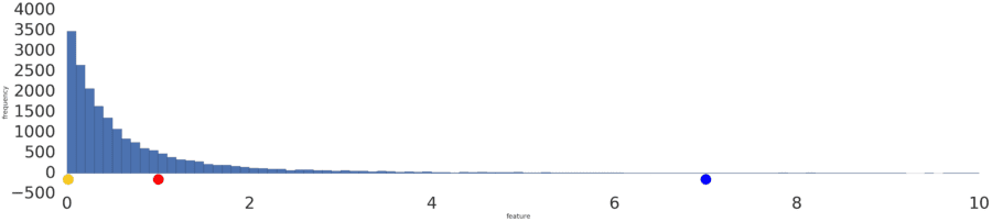
Figure 2: A power law distribution.
Process a power-law distribution by using a log transform. In Figure 3, the log transform creates a smoother distribution, and red is closer to blue than yellow.
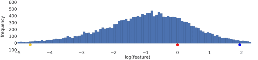
Figure 3: A normal (Gaussian) distribution.
Normalization and log transforms address specific data distributions. What if data doesn’t conform to a Gaussian or power-law distribution? Is there a general approach that applies to any data distribution?
Let’s try to preprocess this distribution.
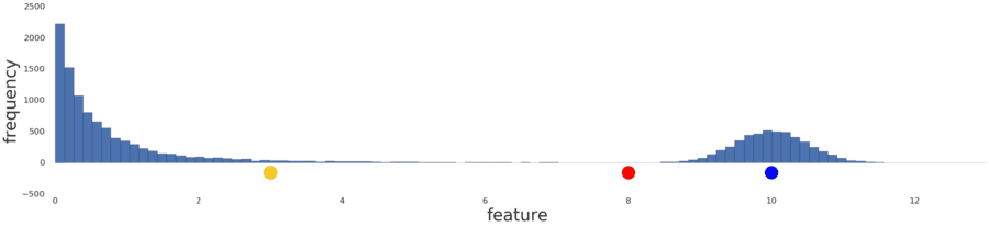
Figure 4: An uncategorizable distribution prior to any preprocessing.
Intuitively, if the two examples have only a few examples between them, then these two examples are similar irrespective of their values. Conversely, if the two examples have many examples between them, then the two examples are less similar. Thus, the similarity between two examples decreases as the number of examples between them increases.
Normalizing the data simply reproduces the data distribution because normalization is a linear transform. Applying a log transform doesn’t reflect your intuition on how similarity works either, as shown in Figure 5 below.
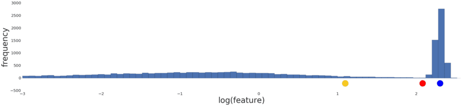
Figure 5: The distribution following a log transform.
Instead, divide the data into intervals where each interval contains an equal number of examples. These interval boundaries are called quantiles.
Convert your data into quantiles by performing the following steps:
- Decide the number of intervals.
- Define intervals such that each interval has an equal number of examples.
- Replace each example by the index of the interval it falls in.
- Bring the indexes to same range as other feature data by scaling the index values to [0,1].
![A graph showing the data after conversion into quantiles. The line represent 20 intervals.]](https://www.datasciencecentral.com/wp-content/uploads/2021/10/Quantize.png)
Figure 6: The distribution after conversion into quantiles.
After converting data to quantiles, the similarity between two examples is inversely proportional to the number of examples between those two examples. Or, mathematically, where “x” is any example in the dataset:
- sim(A,B)≈1−|prob[x>A]−prob[x>B]|
- sim(A,B)≈1−|quantile(A)−quantile(B)|
Quantiles are your best default choice to transform data. However, to create quantiles that are reliable indicators of the underlying data distribution, you need a lot of data. As a rule of thumb, to create n quantiles, you should have at least 10n examples. If you don’t have enough data, stick to normalization.
hope these will explain why we do normalization in our example (due to lack of data )
before go into similarity metrics details let’s dive into mathematics behind k-means
Given a set of observations (x1, x2, …, xn), where each observation is a d-dimensional real vector, k-means clustering aims to partition the n observations into k (≤ n) sets S = {S1, S2, …, Sk} so as to minimize the within-cluster sum of squares (WCSS) (i.e. variance). Formally, the objective is to find:

where μi is the mean of points in Si. This is equivalent to minimizing the pairwise squared deviations of points in the same cluster:

see how k-means converges:
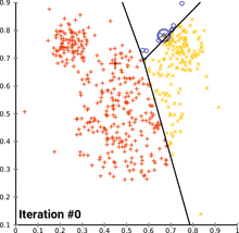 wikipedia
Create a Manual Similarity Measure
To calculate the similarity between two examples, you need to combine all the feature data for those two examples into a single numeric value.
For instance, consider a shoe data set with only one feature: shoe size. You can quantify how similar two shoes are by calculating the difference between their sizes. The smaller the numerical difference between sizes, the greater the similarity between shoes. Such a handcrafted similarity measure is called a manual similarity measure.
What if you wanted to find similarities between shoes by using both size and color? Color is categorical data, and is harder to combine with the numerical size data. We will see that as data becomes more complex, creating a manual similarity measure becomes harder. When your data becomes complex enough, you won’t be able to create a manual measure. That’s when you switch to a supervised similarity measure, where a supervised machine learning model calculates the similarity.
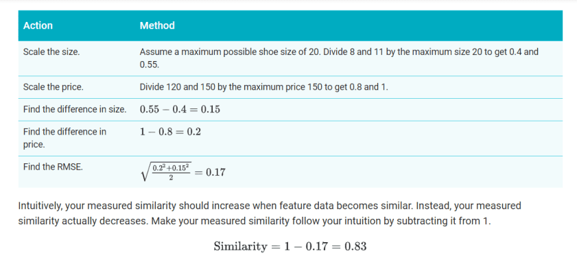
To understand how a manual similarity measure works, let’s look at our example of shoes. Suppose the model has two features: shoe size and shoe price data. Since both features are numeric, you can combine them into a single number representing similarity as follows.
- Size (s): Shoe size probably forms a Gaussian distribution. Confirm this. Then normalize the data.
- Price (p): The data is probably a Poisson distribution. Confirm this. If you have enough data, convert the data to quantiles and scale to [0,1].
- Combine the data by using root mean squared error (RMSE). Here, the similarity is sqrt(s2+p2/2).
For a simplified example, let’s calculate similarity for two shoes with US sizes 8 and 11, and prices 120 and 150. Since we don’t have enough data to understand the distribution, we’ll simply scale the data without normalizing or using quantiles
in case of categorical value: If univalent data matches, the similarity is 1; otherwise, it’s 0. Multivalent data is harder to deal with. For example, movie genres can be a challenge to work with. To handle this problem, suppose movies are assigned genres from a fixed set of genres. Calculate similarity using the ratio of common values, called Jaccard similarity.
What is Jaccard Similarity?
Given two objects, A and B, each with n binary attributes, the Jaccard coefficient is a useful measure of the overlap that A and B share with their attributes. Each attribute of A and B can either be 0 or 1. The total number of each combination of attributes for both A and B are specified as follows:
represents the total number of attributes where A and B both have a value of 1.

represents the total number of attributes where the attribute of A is 0 and the attribute of B is 1.

represents the total number of attributes where the attribute of A is 1 and the attribute of B is 0.

represents the total number of attributes where A and B both have a value of 0.
The Jaccard similarity coefficient, J, is given as:

Cons of Manual Selection:
when data gets complex, it is increasingly hard to process and combine the data to accurately measure similarity in a semantically meaningful way. Consider the color data. Should color really be categorical? Or should we assign colors like red and maroon to have higher similarity than black and white?
Supervised Similarity Measure
Instead of comparing manually-combined feature data, you can reduce the feature data to representations calledembeddings, and then compare the embeddings. Embeddings are generated by training a supervised deep neural network (DNN) on the feature data itself. The embeddings map the feature data to a vector in an embedding space. Typically, the embedding space has fewer dimensions than the feature data in a way that captures some latent structure of the feature data set. The embedding vectors for similar examples, such as YouTube videos watched by the same users, end up close together in the embedding space. We will see how the similarity measure uses this “closeness” to quantify the similarity for pairs of examples.
Remember, we’re discussing supervised learning only to create our similarity measure. The similarity measure, whether manual or supervised, is then used by an algorithm to perform unsupervised clustering.
Comparison of Manual and Supervised Measures
This table describes when to use a manual or supervised similarity measure depending on your requirements.
| Requirement | Manual | Supervised |
|---|---|---|
| Eliminate redundant information in correlated features. | No, you need to separately investigate correlations between features. | Yes, DNN eliminates redundant information. |
| Provide insight into calculated similarities. | Yes | No, embeddings cannot be deciphered. |
| Suitable for small datasets with few features. | Yes, designing a manual measure with a few features is easy. | No, small datasets do not provide enough training data for a DNN. |
| Suitable for large datasets with many features. | No, manually eliminating redundant information from multiple features and then combining them is very difficult. | Yes, the DNN automatically eliminates redundant information and combines features. |
Process for Supervised Similarity Measure
The following figure shows how to create a supervised similarity measure:

google
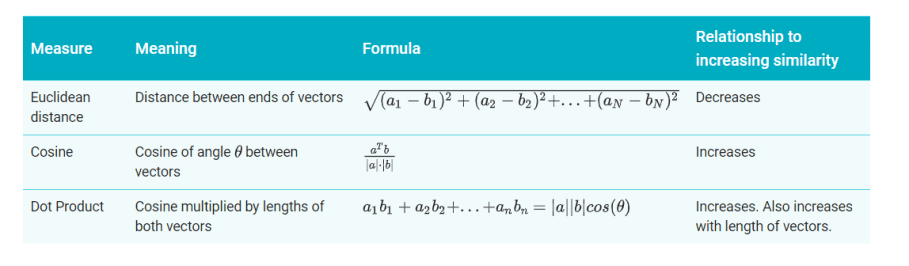
Measuring Similarity from Embeddings
You now have embeddings for any pair of examples. A similarity measure takes these embeddings and returns a number measuring their similarity. Remember that embeddings are simply vectors of numbers. To find the similarity between two vectors A=[a1,a2,…,an] and B=[b1,b2,…,bn], you have three similarity measures to choose from, as listed in the table below.
How to work in real life dataset:
google
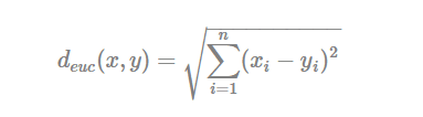
Methods for measuring distances
The choice of distance measures is a critical step in clustering. It defines how the similarity of two elements (x, y) is calculated and it will influence the shape of the clusters.
The classical methods for distance measures are Euclidean and Manhattan distances, which are defined as follow:
- Euclidean distance:
- Manhattan distance:
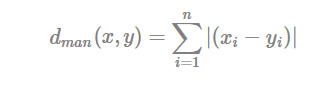
Where, x and y are two vectors of length n.
Other dissimilarity measures exist such as correlation-based distances, which is widely used for gene expression data analyses. Correlation-based distance is defined by subtracting the correlation coefficient from 1. Different types of correlation methods can be used such as:
- Pearson correlation distance:
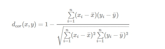
Pearson correlation measures the degree of a linear relationship between two profiles.
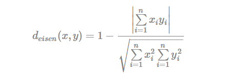
- Eisen cosine correlation distance (Eisen et al., 1998):
- Spearman correlation distance:
The spearman correlation method computes the correlation between the rank of x and the rank of y variables
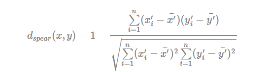
Where x′i=rank(xi)xi′=rank(xi) and y′i=rank(y)yi′=rank(y).
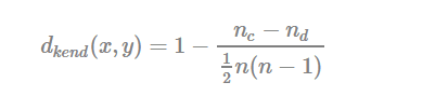
- Kendall correlation distance:
Kendall correlation method measures the correspondence between the ranking of x and y variables. The total number of possible pairings of x with y observations is n(n−1)/2n(n−1)/2, where n is the size of x and y. Begin by ordering the pairs by the x values. If x and y are correlated, then they would have the same relative rank orders. Now, for each yiyi, count the number of yj>yiyj>yi (concordant pairs (c)) and the number of yj<yiyj<yi (discordant pairs (d)).
Kendall correlation distance is defined as follow:
- ncnc: total number of concordant pairs
- ndnd: total number of discordant pairs
- nn: size of x and y
Note that,
- Pearson correlation analysis is the most commonly used method. It is also known as a parametric correlation which depends on the distribution of the data.
- Kendall and Spearman correlations are non-parametric and they are used to perform rank-based correlation analysis.
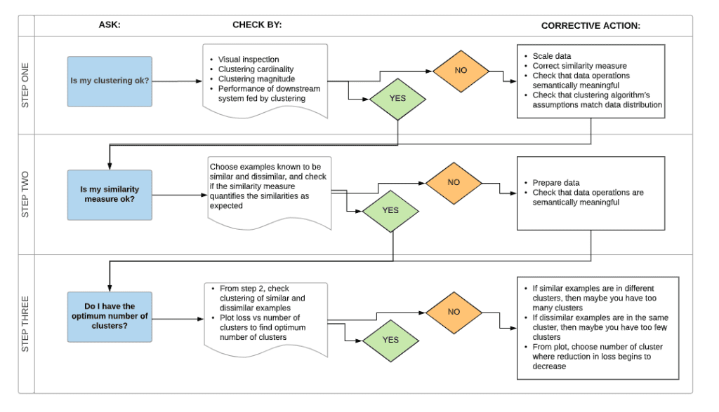
Find Optimum Number of K :
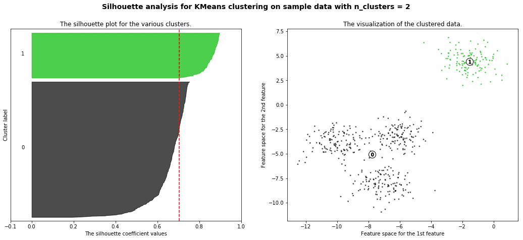
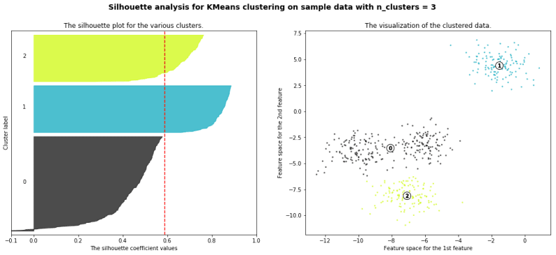
silhouette analysis:
Silhouette analysis can be used to study the separation distance between the resulting clusters. The silhouette plot displays a measure of how close each point in one cluster is to points in the neighboring clusters and thus provides a way to assess parameters like number of clusters visually. This measure has a range of [-1, 1].
Silhouette coefficients (as these values are referred to as) near +1 indicate that the sample is far away from the neighboring clusters. A value of 0 indicates that the sample is on or very close to the decision boundary between two neighboring clusters and negative values indicate that those samples might have been assigned to the wrong cluster.
with the example given in github you will get a result like this
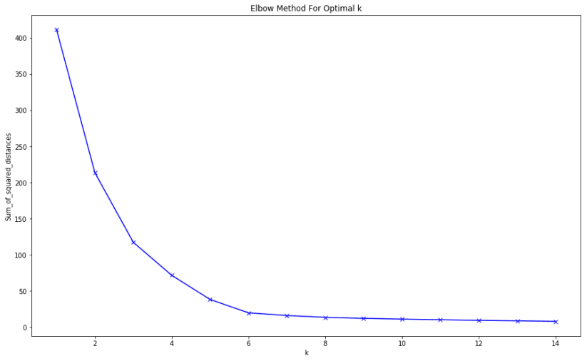
We will also understand how to use the elbow method as a way to estimate the value k
The dataset
The dataset we will study refers to clients of a wholesale distributor. It contains information such as clients annual spend on fresh product, milk products, grocery products etc. Below is some more information an each feature:
- FRESH: annual spending (m.u.) on fresh products (Continuous)
- MILK: annual spending (m.u.) on milk products (Continuous)
- GROCERY: annual spending (m.u.) on grocery products (Continuous)
- FROZEN: annual spending (m.u.) on frozen products (Continuous)
- DETERGENTS_PAPER: annual spending (m.u.) on detergents and paper products (Continuous)
- DELICATESSEN: annual spending (m.u.) on delicatessen products (Continuous)
- CHANNEL: customer channels – Horeca (Hotel/Restaurant/Cafe) or Retail channel (Nominal)
- REGION: customer regions – Lisnon, Oporto or Other (Nominal)
The end result of the elbow method on the dataset is this:
final treat for you
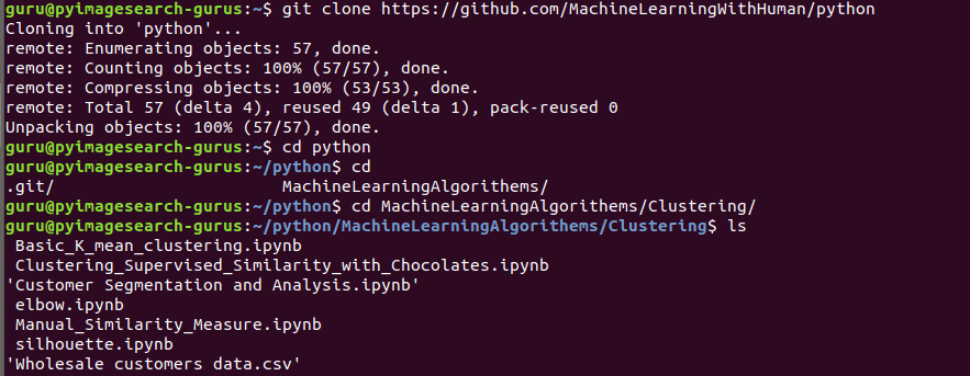
- full code on a real world clustering implementation on python
github code: