
In this article we will review application of clustering to customer order data in three parts. First, we will define the approach to developing the cluster model including derived predictors and dummy variables; second we will extend beyond a typical “churn” model by using the model in a cumulative fashion to predict customer re-ordering in the future defined by a set of time cutoffs; last we will use the cluster model to forecast actual revenue by estimating the ordering parameter distributions on a cluster basis, then sampling those distributions to predict new orders and order values over a time interval.
Clustering is a data analysis method taught in beginning analytics and machine learning. It is conceptually simple but sometimes very powerful. A typical example is to use clustering to classify multi-variate data into two or more classes, such as detecting cancer from observation data on tissue samples (note: such an application could also be done with image classification, or a combination, and other methods). Another commonly cited application is to predict customer “churn”, where some criteria is used to say a customer “churned” (i.e. is no longer a customer) and you would like to predict in advance which ones might churn and target marketing to them.
Most examples you see in classes or online are pretty simple—usually only a few factors or a few clusters or both. This is so that some degree of intuition can apply to reinforce the student learning process. However, as in many real-world data science problems, clustering can be very complex in use. For example, clustering is used as part of text search algorithms (along with other more sophisticated techniques), and the number of dimensions can be all the words in a vocabulary along with past search experience, reaching thousands of dimensions.
R provides a wide array of clustering methods both in base R and in many available open source packages. One of the great things about R is the ability to establish defaults in function definitions, so that many functions can be used by simply passing data, or with just a few parameters. A side effect of this is that many methods are used, and taught, using mainly defaults. We would all be happy if the defaults produced the best, or at least good results, all the time. However, often this is not the case in the real world. Here we are analyzing data regarding orders of a large number of products by a couple thousand customers (example: an industrial B2B case), and will use that to illustrate a couple of points you may find useful.
Returning to the customer churn case, a more interesting problem is to try to predict not only will a customer leave or not, but when might they reorder? We approached this by defining a series of timeframes and using clustering to analyze the same data at each time frame. This is roughly equivalent to changing the churn criteria and repeating the analysis.
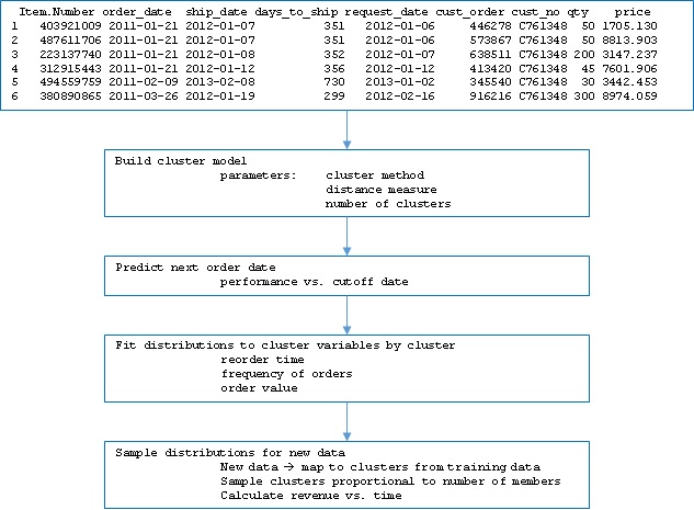
The basic data set consists of the following fields for each line in the data:
Item.Number
order_date
ship_date
request_date
cust_order
cust_no
qty
price
As there are a few years of history available, there are around 200,000 lines including about 2000 customers and a larger number of items. Request_date is the date the customer asked for the shipment to occur, and ship_date is the date the shipment actually occurred.
From these data, we defined a few derived values:
- Value per order = average of the value of all orders for a customer in the date range used for analysis.
- Recency = days from today or some cutoff to the most recent past order for a customer.
- Average reorder = average days between orders for a customer for the date range used for analysis.
- Customer longevity = duration the customer has been placing orders. This is bounded by the earliest date used in the analysis.
- Last series = the product series or the most recent order (the one corresponding to recency).
- Frequency = number of orders in the range of dates used for analysis.
We also calculated the standard deviation of the recurring variables to use later in estimating distributions. Note that an assumption has been introduced that the data are consolidated, similar to a pivot table in Excel, on the customer numbers. Since this combines multiple instances per customer, hence the above new variables. This consolidation was done using the functions melt and cast from the R package resphape2.
Since it is likely that particular item numbers may indicate more likely reorder or sooner reorder, it might be beneficial to include item numbers in the cluster variables. The challenge is that there are about 6000 item numbers in the data, and including them all could over-specify the problem (i.e. having many more variables than the typical instances per customer) as well as be computationally slow. We took an approach of using the top 100 item numbers that appeared most often in the data. Beyond the scope of what we show here it would be possible to evaluate the benefit and significance of adding more item numbers as cluster variables (essentially treating the number of item numbers included as another hyperparameter).
In order to include the item numbers, so-called dummy variables are generated where a column is added for each used item number, and if the instance had that item number, a 1 is included in that row/column intersection. As the raw data are unique lines for each item number (regardless of whether they were on a combined order under a single order number), each instance has a 1 in only 1 column for the raw data, but could have multiple 1s in the consolidated data. However, we chose to build the cluster model using only the last item number ordered. Another extension of this approach would be to parameterize the number of items to “look back” and include them in the dummy variables. The R function model.matrix was used to generate the dummy variables; to use multiple items per row a more complicated approach would be needed.
The last detail in preparing data is to define training data, test data, and validation data. We used a 60/20/20 split for the analyses shown here; in the code the split is parameterized so we could investigate the sensitivity of the performance to the split values. Note that the split is done on customer, so that the data subsets have mutually exclusive customer groups. Keep in mind that the raw data contain order history such that there are multiple instances for many customers in the data. The melt/cast (“pivot”) operation we performed already consolidated by customer, so that only one instance per customer exists in the data used for modeling. Had we worked from the raw data, we would still have wanted to group by customer into the splits, since we want to be able to look into the future to determine churn and future order behavior. If we had randomly split the raw data, we would have randomly put history and future data for a given customer across the splits and impacted the analysis. Here is an overview of the data after splitting:
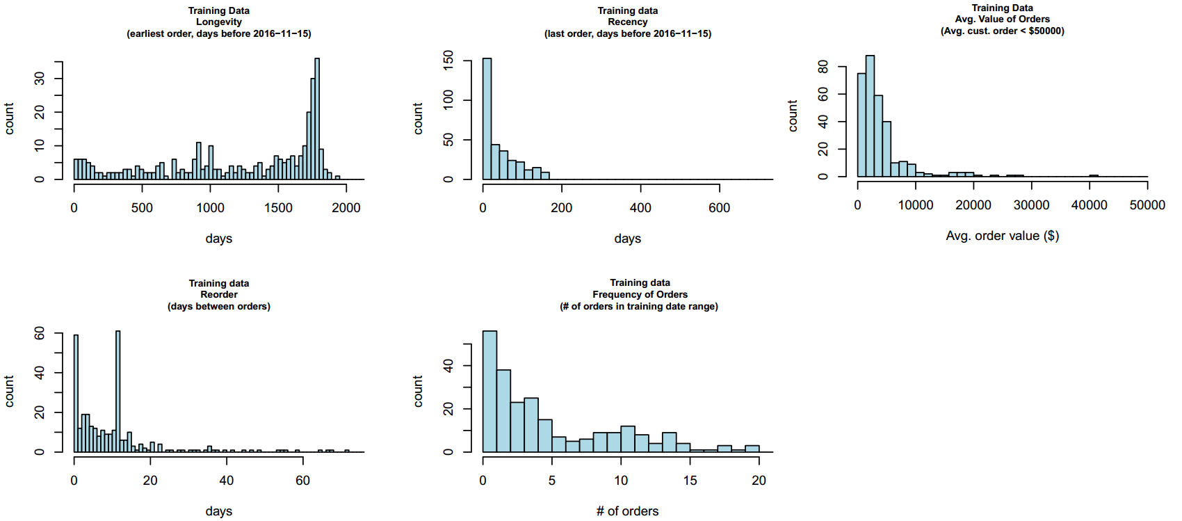
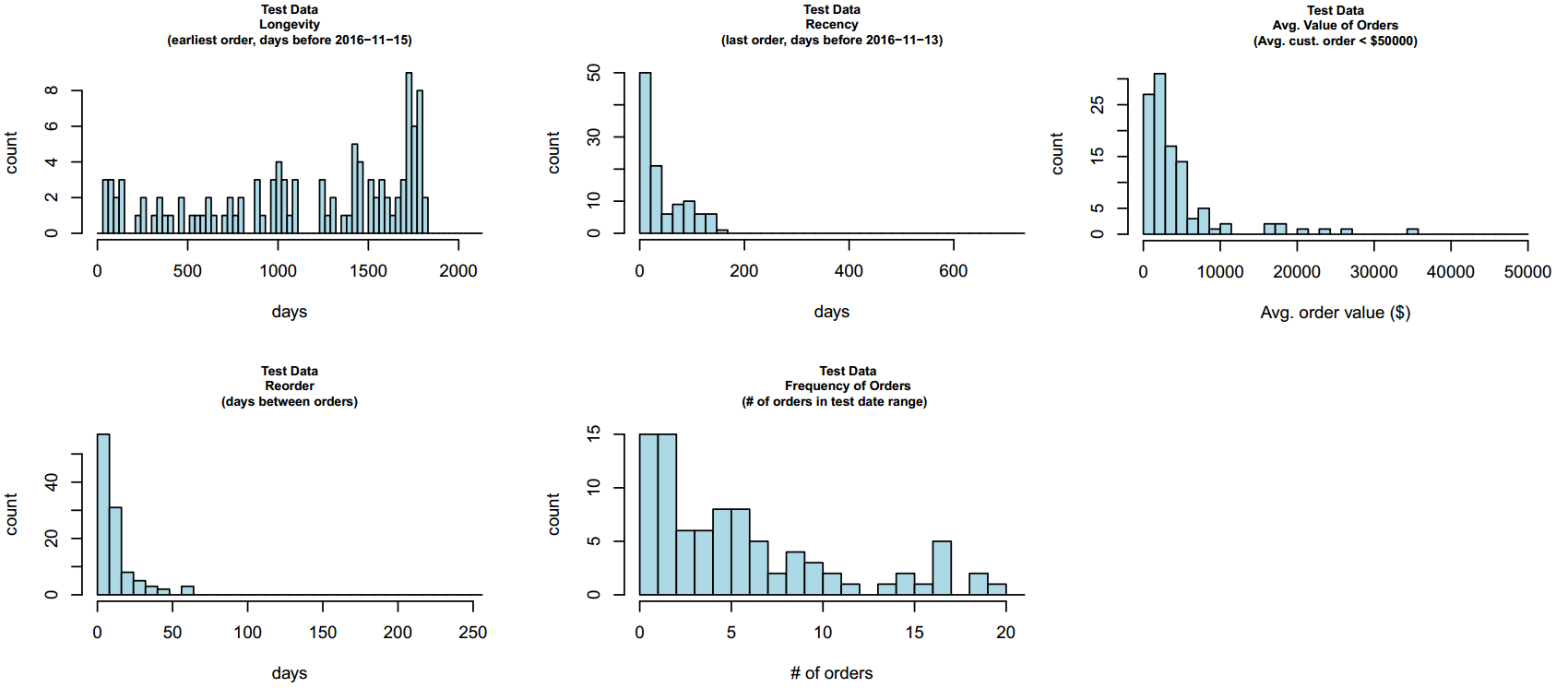
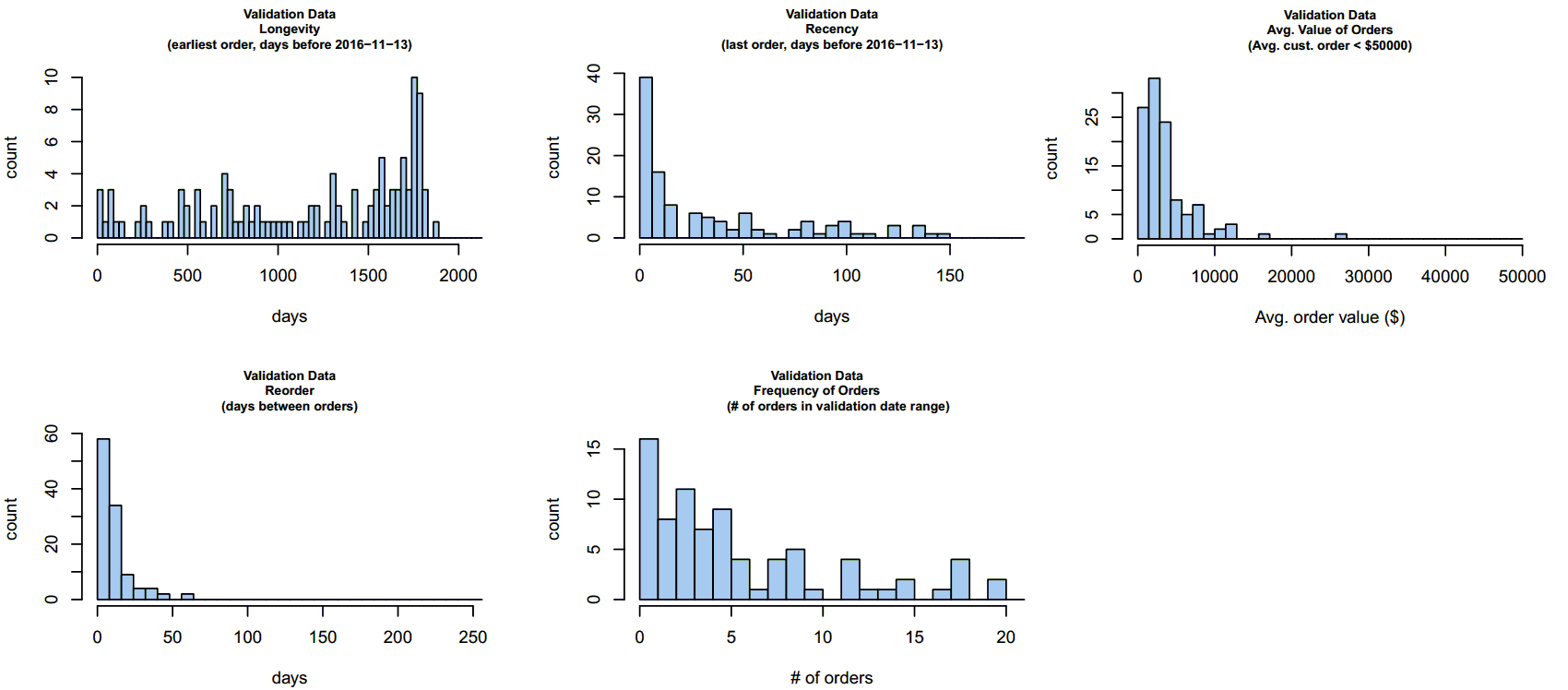
We can see that the data have similar characteristics in the three subsets.
With the data in hand, we defined what we are trying to predict as whether a given customer will reorder in a series of date ranges. In this case, we used 15-day wide buckets out to 90 days in the future. Therefore, we ask if each of the customers will reorder within the time from the end of the clustered data out to each cutoff, at 15, 30, 40 etc. days. In order to “train” the model, the data are given to clustering algorithms. Once the training data are grouped in clusters, the cluster “centers” are computed (or are returned by the algorithm, depending on the method).
The next step is to determine the distance of every instance in the test data to every cluster in the model, and assign the instance of the test data to the nearest cluster. The predicted reorder time is then taken, for each instance, to be the average reorder time for the cluster in which it is a member.
We now turn to selection of the clustering algorithm and the distance measure used. The stats package which is included with R includes the function kmeans and the function hclust. kmeans essentially finds the n clusters whereby the distance of every member to the center of the cluster is less than the member’s distance to any other cluster center. The center is defined intuitively as the centroid, which is the geometric mean position of all the points, generalized to however many dimensions there are in the cluster data. The purpose here isn’t to dive into the details of how the solution is found; it is worth noting that for kmeans a unique best solution isn’t guaranteed, and as the solution proceeds iteratively, the number of iterations is an important parameter. As a unique solution isn’t guaranteed, another parameter controls how many different starting points are used attempting to find the best solution. As noted earlier, defaults are set, in this case at 10, and 1 (iterations and starting points, respectively); we used 500 and 15 after testing a bit what was needed to ensure consistent results on our data.
The other important parameter in kmeans is what method to use. There are four offered in the base function: Hartigan-Wong, Lloyd, Forgy, and MacQueen. Lloyd and Forgy are the same algorithm by different names. All these are named for relatively well-known researchers dating back to the 1950s. The default is Hartigan-Wong. Rather than trial and error, we coded iterating over the methods to see which performed best.
The call to kmeans looks as follows:
cluster_model <-
kmeans(train_cust_summary_temp,
centers = clusters_used,
algorithm = all_methods[cluster_method],
iter.max = 500,
nstart = 15,
trace = FALSE)
Here, train_cust_summary_temp is the prepared training data, clusters_used is the parameter with the number of clusters to use in the model, all_methods [] is a vector holding the available methods, and cluster_method is the particular method used on this pass. The cluster_model variable is a list which contains information on cluster membership, the cluster centers, and other information.
hclust works by initially assigning each instance to its own cluster, the combining nearest 2 clusters in a reverse hierarchy, until at the top there is a single cluster. The method of determining nearest is formally a “dissimilarity” measure, but for the purposes here you can consider it to be roughly distance as used in kmeans. The result is usually obtained by “cutting” the “tree” at some level, thereby throwing away all the lower (smaller) clusters. The cutting is done by a function cutree(), and the distance methods are implemented by calling the dist function.
In the case of hclust, there are many more methods, as well as control over the distance measure used during clustering. The available methods are Ward.D, Ward.D2, single, complete, average, McQuitty, median, and centroid, and the distance methods are Euclidean, maximum, Manhattan, Canberra, binary, and Minkowski. It is also possible to modify the distance since it is a parameter which can be a function; a common modification is to square the Euclidean distance. Again, we parameterized the methods to investigate performance.
We also parameterized the number of clusters, which is a parameter in both cases. In contrast to simple tutorial cases, we used clusters ranging from 20 to 80 in number, given the large number of dimensions and the size of the data set. The call to hclust is then as follows.
hcluster_model <-
cutree(hclust(dist(train_cust_summary_temp,
method = method)^use_exponent,
method = all_methods[cluster_method]),
k = clusters_used)
where the variables are as before, and we have added use_exponent that is used to apply the squared Euclidean distance to some cases.
As explained earlier, after building the cluster model, the test data and validation data were assigned to clusters, and the average reorder time used to predict the reorder time of each customer. This was done one date bucket at a time. In order to evaluate performance, some metric is needed. While in many analysis problems accuracy (in some form) is used to compare methods and parameters, this has issues in problems like ours here, where the data have the characteristic called class imbalance.
If we define accuracy as number predicted correctly divided by total number of predictions, in cases where there are a lot of negative results, this can be misleading. This is the essence of class imbalance. By negative we mean that if we are predicting if a customer will reorder between 1 and 15 days, and the actual result is they do not, that is a negative result. If there are a high proportion of negatives in the data, a method that just reports false for every point would score a high accuracy score. This is the case for much of our data here.
Although there are methods to address class imbalance in the data itself (such as resampling the under-represented class and under-sampling the over-represented class), we did not take that approach here; instead this is addressed by several other metrics used commonly in machine learning and analytics for this type of problem. Precision is defined as the number of true positives divided by the sum of true positives and false positives, where true positive means a correctly predicted positive result, and false positive means a result predicted positive but actually negative:
Precision can be thought of as “of the things we predict positive, what fraction of those are correct?”
Recall is defined as the number of true positives divided by the sum of true positives and false negatives. False negatives are cases predicted negative but actually positive. Thus, recall can be thought of as “of the actual number of positive results, what fraction did we predict correctly?”
You can see that depending on what is important to you, you may put more emphasis on precision or on recall. Another metric is defined as sort of an average of both of these, called F1, and is the ratio:
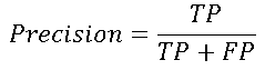
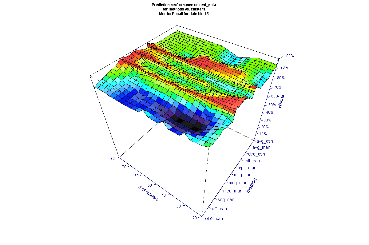
To evaluate the methods, we organized the results into surface plots for each date bin. Here is an example of Recall (as a percent) evaluated on test data for 15-day cutoff (the vertical scale is inverted to show the features of the surface, and most methods are not explicitly shown on the axis for clarity).
* all method names not shown for clarity
It may be surprising that there are large differences between the methods used. In the figure above, we can see that there are several methods towards the upper right that have markedly poorer Recall for some numbers of clusters (keeping in mind the inverted scale). We can also see there are many methods that generate peaks (inverted) across most of the data (these appear as troughs in the figure), and those that are poorer across most of the data. To better compare across the time scales, we filtered the data for the best performing methods. The filter was created using the average performance metric across all clusters and including only those methods above a threshold, to view the top 10-15 methods for each date. The picture for the same 15-day cutoff looks a bit different after filtering (here the vertical scale is not inverted, so higher values are better).
Analyzing all the results it is interesting that some methods seem to produce good results in some date ranges and not others. We took the view that there isn’t an argument for why that is the case, and so we wanted to select final methods that appeared the most robust. Looking across the test data results and averaging the F1 metric across the date buckets and number of clusters results in the following. The following figure averages the results for 15, 30, and 45 days, where performance is generally poorer (because most customers tend to reorder eventually, as we move to longer date cutoffs, in general we see better prediction performance since it becomes progressively more likely a reorder will occur).
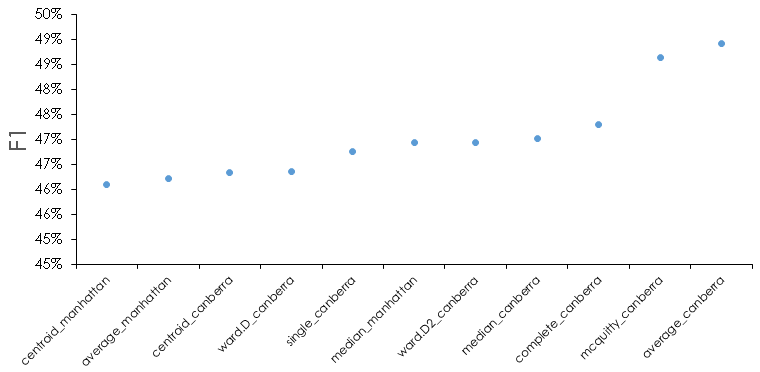
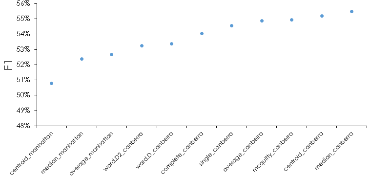
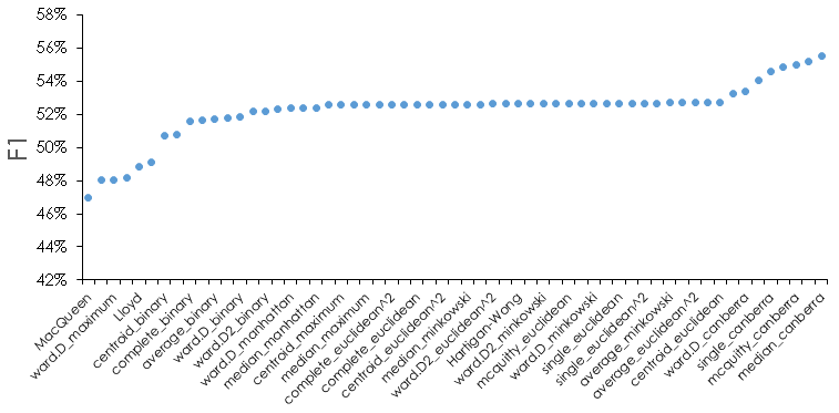
For reference, here is what the F1 metric looks like for all methods for the test data.
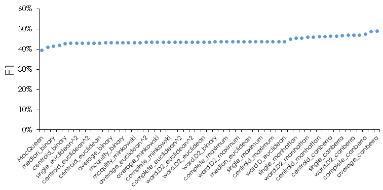
We see that there is about a 10% difference between the best and worst methods, and that most methods are very similar in this metric. We can also see that some methods or distance metrics seem to perform better—for instance the Canberra distance appears often in the best performing cases. There are some subtleties we should address. If we look at the filtered methods in detail at each date cutoff, we see that in certain instances one of the metrics may be 0; in this case it indicates we are predicting 0 positive values when there are actual positives. For the test data, this looks as follows for the 10 best performing method.
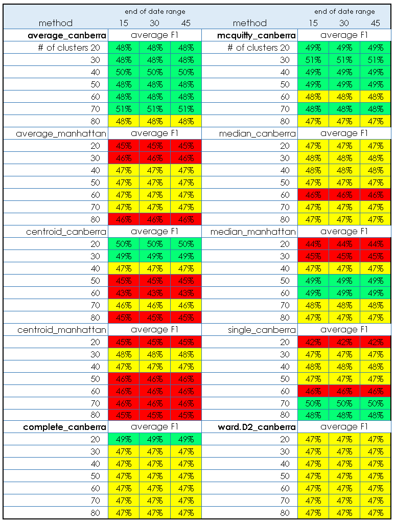
What we can see here is that in general, the number of clusters isn’t very important for the best performing methods, but that some methods are slightly worse in certain regions when we look at the detail. In fact, the differences are greater for the data set as a whole, but we have already filtered the “top” methods by choosing the best average F1 performers. In particular, we want to narrow down the methods if possible—to this end, the same methods filtered from test results will be used to look at the performance on the validation data. Because we are using performance on the test data to choose the methods, we are essentially optimizing “hyperparameters” of cluster number, cluster method, and distance method to the test data. Therefore, it is important to have the other held out validation data and use that for final evaluation. If the validation step is omitted, there is a risk the method may not generalize to new data as expected.
Here are the results for the same “best” methods for the validation data, followed by the full results.
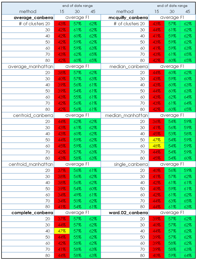
What we see is that the selected methods seem to generalize to the validation data acceptably. Of interest, the performance in the 15 day cutoff is generally a bit worse than in the test data, but by 45 days it is actually better. Note that the color scheme used is arbitrary and chosen only to help visualize the results.
From the results so far, we could use the cluster model developed on the training data, and apply the method to new data to predict likely reorder windows, or to predict churn/not churn at a given date cutoff of interest. We would probably choose an ensemble of the best performing methods as a way to increase the likely generalization of the model to future unseen data.
In practice, just predicting reorder is OK for churn analysis, but here we are more interested in forecasting. Recall that we calculated and stored the reorder time, the order frequency, and the order value for each instance in the data, and thus those are dimensions in the cluster model. Given that, we can proceed as follows:
- Develop the cluster model as described using the training data.
- For every cluster, calculate the distribution of reorder time by assuming a gamma distribution of each element, and using the element means and the element standard deviations to calculate a (weighted) distribution by using sample() to generate a set of samples, then feeding those samples into the rgamma() function. The weights are the frequency variable of each element which indicates how often a given customer ordered in the past. Data for customers ordering more often are given more weight. The weights are passed to the sample() function as probabilities, such that customers ordering more frequently and/or with higher value are sampled more often.
The process looks like this (code simplified for clarity):
for (cluster in 1:no_of_clusters) {
temp_samples <-
which(test_cust_summary_temp$cluster == cluster)
probs <- frequencies
samples_cluster[, cluster] <- sample(temp_samples,
prob = probs,
size = 1000,
replace = TRUE)
#
# model reorder time using a gamma distribution
#
temp_distribution[i] <-
rgamma(n = 1000,
shape =
(ave_reorder[sampes_cluster[, cluster] / sd_reorder[samples_cluster[, cluster])^2,
scale =
(sd_reorder[samples_cluster[, cluster])^2 / ave_reorder[samples_cluster[, cluster])
}
Here we have used the fact that the gamma distribution shape and scale parameters can be estimated from the mean and standard distribution of the raw data.
- The cluster distributions are then be sampled according to membership of future (unseen) data to estimate future revenue. The method is to first assign the new data to the existing clusters, then to sample each cluster in proportion to the number of members, and use the sampled frequency, reorder time, and value as data for a forecast revenue estimate.
We chose a gamma distribution based on EDA which showed one of the following two reorder time behaviors for many clusters:
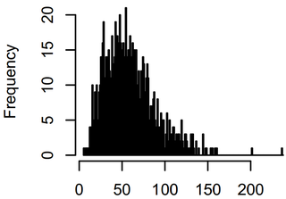

The same general distribution was observed for all the data subsets. Sampling all the clusters based on the training data membership should return an estimate of the distribution of time between orders for the training data. It should look similar to the distribution found from the actual data:
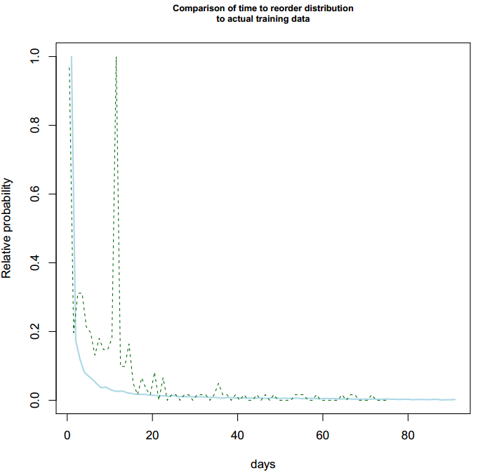
Note that the estimated distribution (solid blue line) lacks the spike in order times around 2 weeks. The spike is an artifact of “real” data and we will revisit this later—if you look back at the summary data visualization after splitting, you can see this spike in the training data. This spike appears to be a function of certain business practices, and is not modeled by the single gamma distribution. This introduces error into the process, and a future extension will be to investigate if we can handle the 2-week order events separately and generate a more accurate overall forecast.
We can then apply the estimated distribution to unknown data by assigning all new data to the appropriate clusters, then sampling the cluster distributions with probability equal to the ratio of the numbers in each cluster. The latter step normalizes to the particulars of the new data. The result of this process is an estimate of future order value over time from recurring customers. Here is the result for the test data and how it compares to the actual data:
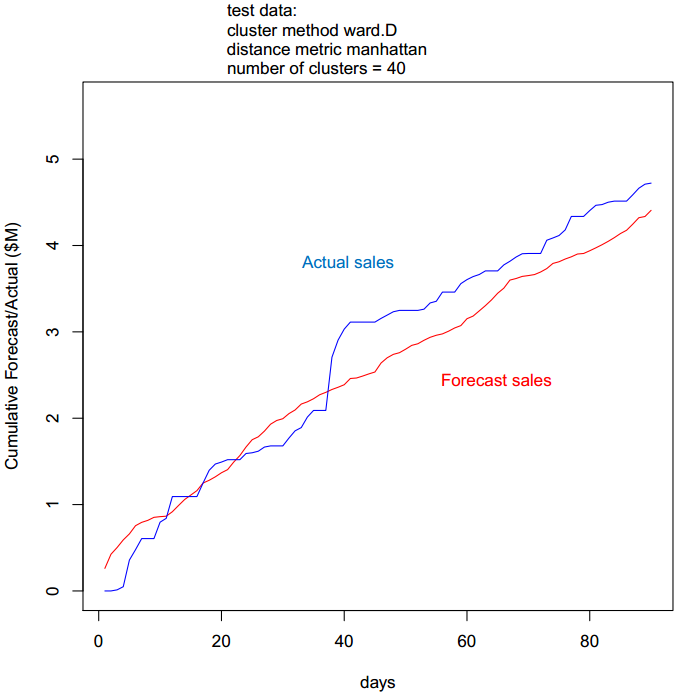
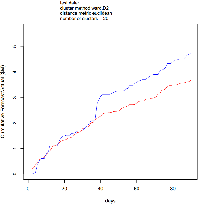
Here we note that the actual data have a surge around 40 days which is not seen in the forecast for this particular combination of parameters. Recall earlier that we saw the overall reorder time distribution contains characteristics not modeled by the overall estimated distribution. Depending on the particular cluster population of the data, it is likely the forecast may miss some characteristics for the same reason. In fact, inspecting all the test results, we find there are many cases where the first 35 days are modeled extremely well, but the forecast deviates beyond that. An example of a better fit to the early data is given here:
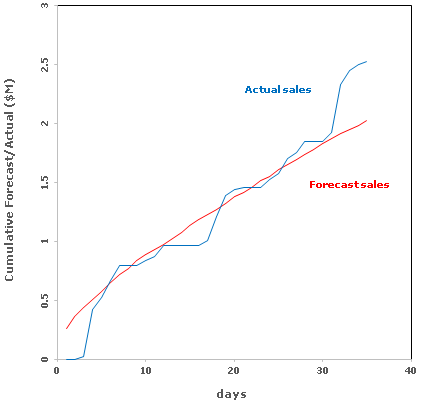
We subset the best methods using a two-fold criteria—first, the result should have an overall accuracy (in this case, the prediction at 35 days) better than 20%, and the mean average accuracy should also be better than 20%. This eliminated cases where there were large deviations over some period of time but where the forecast converged near the time window. We then computed the overall mean absolute error for the selected cases, and obtained a result of 9% for the test data.
As noted earlier, it is important to choose the method(s) using the test results then validate using only the chosen method(s) on the validation data. Otherwise, we would be fitting to the validation data and a good result could simply be due to overfitting. There were 28 cases where the test data met our criteria. The mean absolute error on the validation data using the 28 cases as an ensemble was 8%. Note that as we are modeling cumulative sales, the first few data points can have very large error values which distort the mean error. In the case here, there are 0 sales for the first two days of the forecast period, which makes the error undefined at those points. We therefore trimmed off the first few days before computing the mean absolute error. The ensemble prediction for the first 35 days vs. the actual validation data is shown here:
Repeat customer orders are not, of course, the only source of future revenue and a complete forecast requires estimating new orders and other factors. In addition, the simple process descried here does not attempt to estimate increase or decrease over time of orders from recurring customers, which requires more time series analysis and other methods. In our approach, we combine the methods shown here with another statistical analysis of the sales pipeline and regression analysis of the sales history to build a composite model.
As noted there are several extensions where we could further parameterize and optimize the method, and try to account for the actual distribution of order times more accurately. Nonetheless, we hope this illustrates potential to extract more value from data using approachable methods. In summary, we have shown that standard clustering methods can be applied to customer order data, then the distributions of the predictors for each cluster can be used with new data to go beyond simple churn analysis and predict revenue from repeating customers.