
This is a tutorial to show how to implement dashboards in R, using the new “flexdashboard” library package.
this new library leverages these libraries and allows us to create some stunning dashboards, using interactive graphs and text. What I loved the most, was the “storyboard” feature that allows me to present content in Tableau-style frames. Please note that for this you need to create RMarkdown (.Rmd) files and insert the code using the R chunks as needed.
Storyboard format allows you to logically move the audience through the analysis : problem statement, raw data and exploration, different parts of the models/simulations/ number crunching, patterns in data, final summary and recommendations. Presenting the patterns that allow you to accept or reject a hypothesis has never been easier.
Storyboard Dashboard:
Instead of analyzing a single dataset, I have chosen to present different interactive graph types using the storyboard feature. This will allow you to experience the range of options possible with this package.
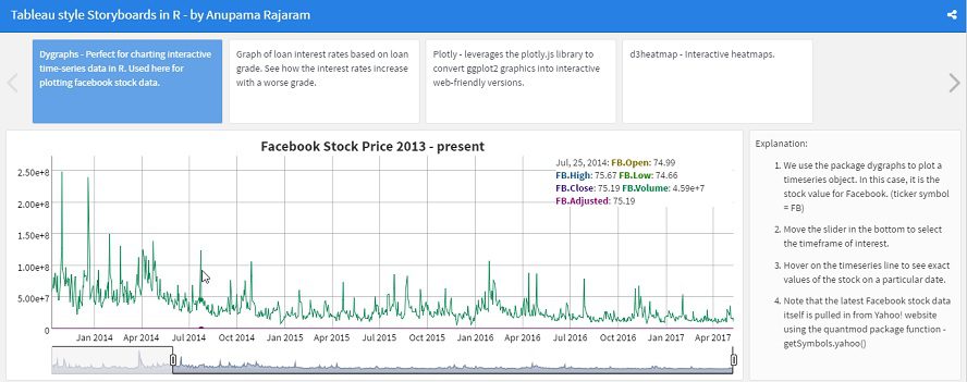
An image of the storyboard is shown below, but you can also view the live document here (without source code or data files) . The complete data and source code files are available for download here, under May 2017 on the Projects page.
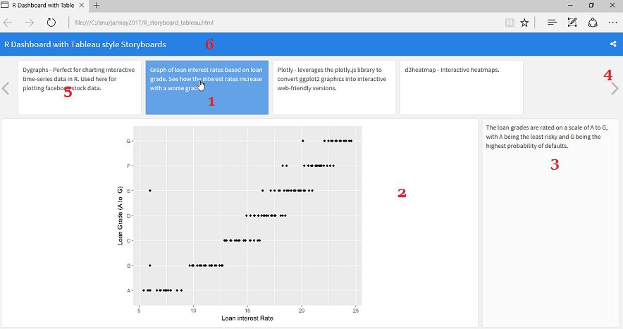
The storyboard elements are described below:
- Element 1 – Click on each frame to see the graph and explanation associated with that story point. (click element 5 to see Facebook stock trends)
- Element 2 – This is the location for your graphs, tables, etc. One below each story point.
- Element 3 – This explanation column in the right can be omitted, if required. However, my personal opinion is that this is a good way to highlight certain facts about the graph or place instructions, hyperlinks, etc. Like a webpage sidebar.
- Element 4 – My tutorial only has 4 story elements, but if you have more flexdashboard automatically provides left-right arrow for navigation. (Just like Tableau).
- Element 6 – Title bar for the project. Notice the social sharing button on the far right.
Story Points:
The different frames in the storyboard showcase different packages supported by R, for creating beautiful visuals.
- Dygraphs – shows Facebook stock data, with an interactive slider to select dates of interest. Uses the “quantmod” package to pull in latest Facebook stock prices from Yahoo! Finance.
- Plotly – Data rich graphs which allows you to zoom in or out. Values are shown on mouse hover.
- d3heatmap – Interactive heatmaps. You can highlight specific rows or columns by clicking on the row / column names.
Hope you found these implementations. Please do add your valuable feedback and inputs in the comments section.
Until next time, happy coding! 🙂