
In this 5 Minute Analysis we’ll preprocess, join, and explore disjoint sales data for retail locations. Then we’ll dive into the relation between store type, fuel prices, and weekly sales as well as prepare the data for easy loading into Business Analysis tools such as Tableau and PowerBI. Finally, we’ll explore and analyze our preprocessed and joined data in Tableau and use its powerful visualizations to draw additional insights.
Dataset: Retail Data Analytics
This blog post explores and analyzes the data using PivotBillions, available freely on docker.
Steps
Load the Data and View its Structure
- Download the dataset from Kaggle.
- Unzip your downloaded data.
- Access the Pivot Billions URL for your machine.
- Click the Plus (+) icon on the bottom left hand side of the window.
- Select Drag & Drop.
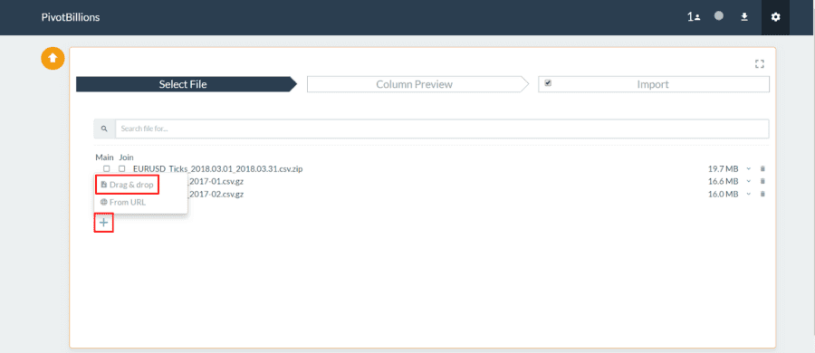
- Drag your downloaded “Features data set.csv”, “sales data-set.csv”, and
“stores data-set.csv” files to the Drag & Drop box in Pivot Billions. - Click the dropdown arrow
 to the right of the “sales data-set.csv” file in Pivot Billions to view the schema of the data and see a sample.
 to the right of the “sales data-set.csv” file in Pivot Billions to view the schema of the data and see a sample.
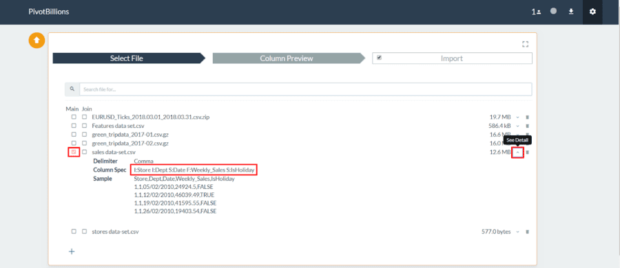
- Then select the left checkbox (Main) next to that file and the right checkbox (Join) next to the “Features data set.csv” file and next to the “stores data-set.csv” file.
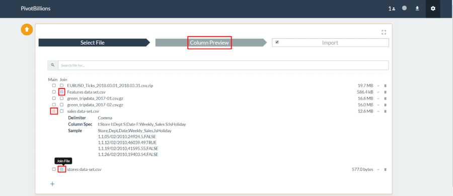
- Click Column Preview at the top of the screen.
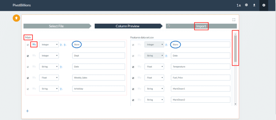
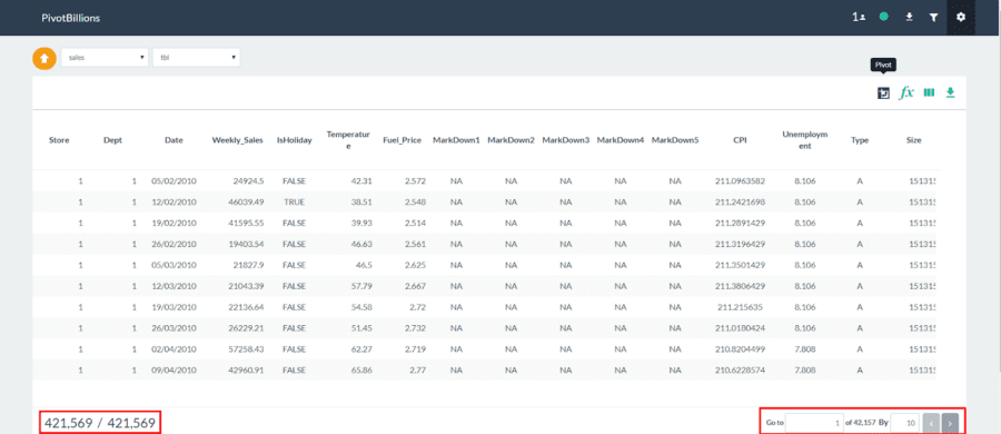
You can now see the columns and types of each dataset and modify them as you see fit. You can also view or change which column or columns are set as primary keys and determine how the datasets should be joined. When you are done viewing or modifying the data structure, you can import and load the data.
- Select the symbol next to the Store field under the Main table. This sets the Store field as the join column. You can also see that the Store field is in both of the other datasets we plan to join.
- Unselect the symbol next to the Date field under the Main table.
- Click Import at the top of the screen.
Explore and Filter the Joined Data.
We now have access to all 421,569 rows of the joined retail sales data. This contains the data and features from each of the three separate data files from our original dataset.
By hovering over each column name you can sort the data by that column, view that column’s distribution over all of the data, filter by the data in that column, or rename that column. For example, we can view the distribution of the Temperature during the sales period in our data by clicking on the second-from-the-left icon (distribution) in ![]() for the Temperature column.
for the Temperature column.
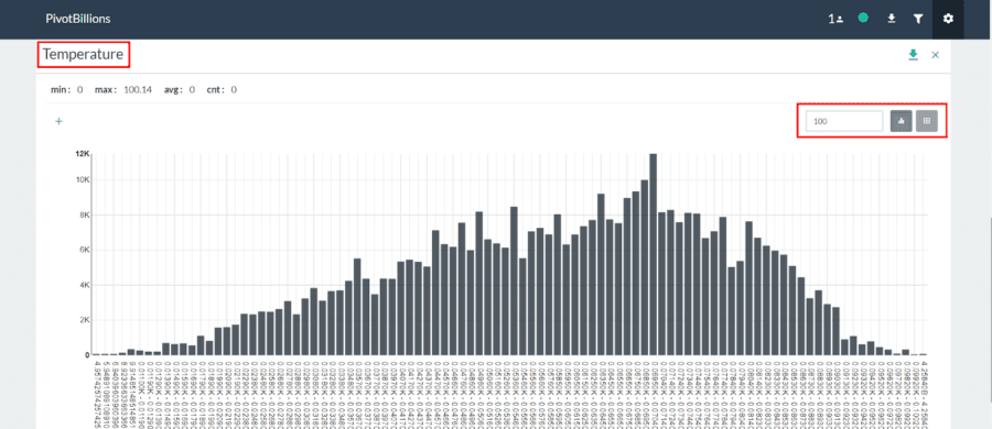
As expected it has a relatively normal distribution.
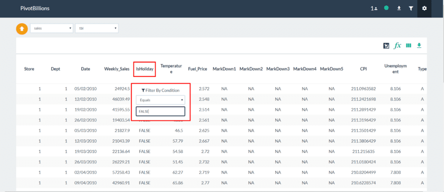
Now, for our analysis we’ll filter all of the data to get rid of Holiday sales since they are less indicative of general sales during the year.
- Click on the second-from-the-right icon (filter) in for the IsHoliday column.
- Select Equals from the dropdown and then enter “FALSE” and press enter
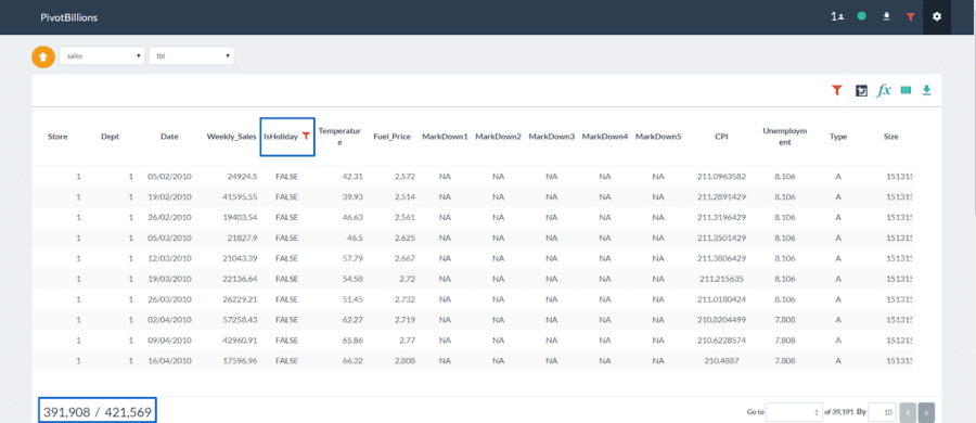
All of our data is immediately filtered to data occurring on non-Holiday days.
Explore the Effect of Store Type and Fuel Price on Weekly Sales
We’ll now do some basic analysis to see what relationship the fuel price has on each store type’s weekly sales.
- Click the Pivot icon in the the top right of your data table.
- Click the Plus (+) icon under Dimensions and select the “Type” column.
- Click the Plus (+) icon again and select the “Fuel_Price” column.
- Click the Plus (+) icon under Values and select the “Weekly_Sales” column.
- Click View to pivot your data.
Pivot Billions now quickly reorganizes your data by store type and fuel price. It also provides counts, sums, and statistics on the corresponding weekly sales. You can also sort by a column or filter the data. The data is sorted by Count by default.
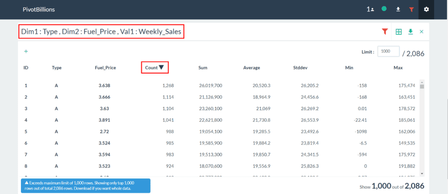
You can see that Pivot Billions quickly organizes the data by the 2,086 unique combinations of the Type and Fuel Price Columns. We’ll now interactively view the data.
- Click the Switch View Type icon in the top right of the pivot widget and select Pivot View.
- Drag the Type box to below the drop down selection box.
- Change the topleft dropbox from “Table” to “Horizontal Bar Chart”.
- Click the lower drop down selection box and change “Count” to “Average”.
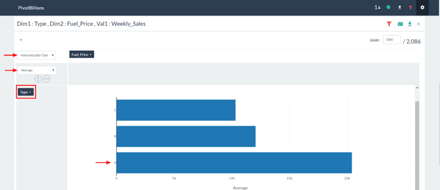
We can immediately see that Store Type A has by far the most sales of each of the store types.
Now let’s view the relationship between weekly sales by store type and fuel price.
- Drag the Fuel_Price box to the right of the drop down selection box as shown below.
- Change the topleft dropbox from “Horizontal Bar Chart” to “Bar Chart”.
- Select the arrow next to Type and unselect the A and C Types.
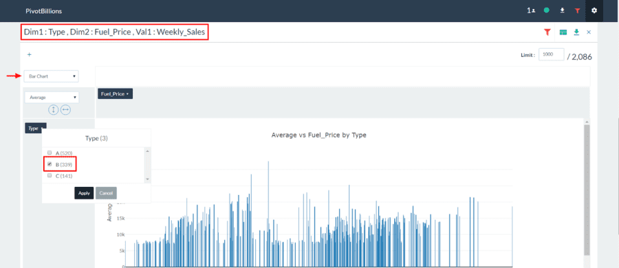
You can see an increase in sales during some periods of low fuel prices for Store Type B. However, it is unclear whether this increase is solely due to low fuel prices since the increase in sales is not present for all periods of low fuel prices.
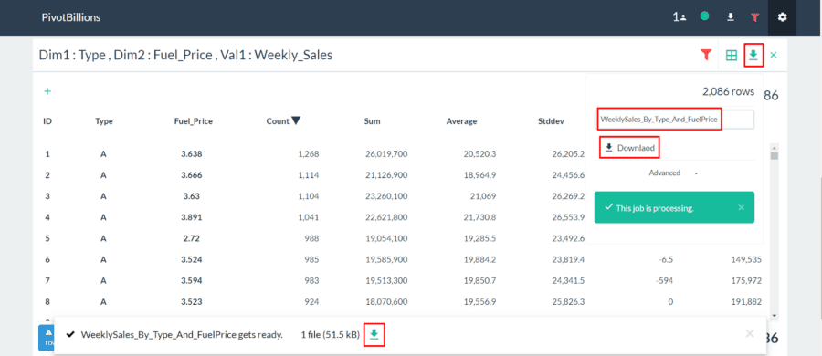
This warrants further exploration either in Pivot Billions or another tool. In Pivot Billions we could simply add another dimension or filter to explore their effect on our results. If we want to use another tool such as Tableau or PowerBI we simply click the download button on the top right of the pivot widget, enter our filename, and select Download.
Export the Data into Tableau for Additional Exploration
We can also load all or some of the data directly into Tableau, without the need to rearrange it. For efficiency we’ll look at all of the non-holiday data for the first ten departments across all stores and types.
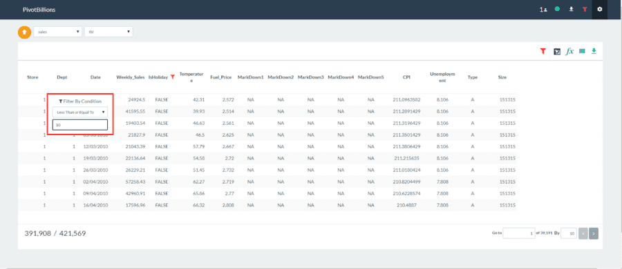
- In the main table, click on the second-from-the-right icon (filter) in for the Dept column.
- Select Less Than or Equal To from the dropdown and then enter “10” and press enter
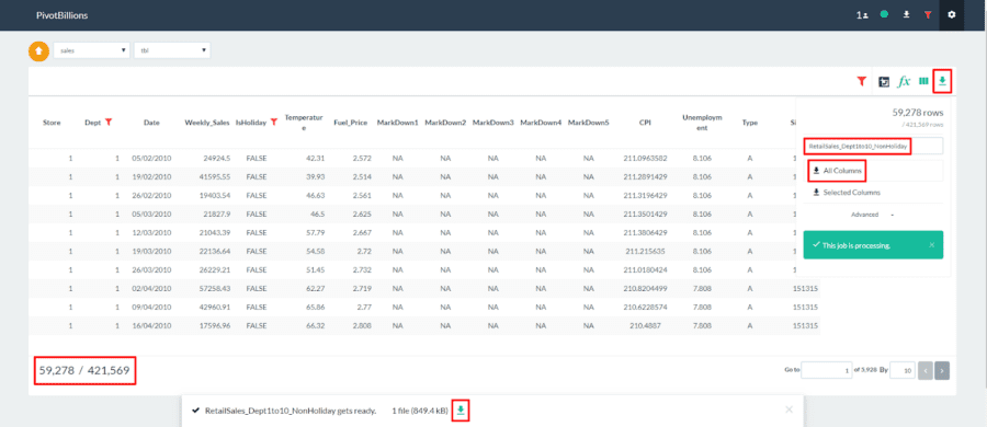
- Now click the icon on the top right.
- Enter “RetailSales_Dept1to10_NonHoliday” for the file name and then click All Columns.
- When the file is ready for download click the at the bottom of the screen as seen below.
We can now easily import this data into Tableau and use its powerful visualizations to dive into the data.
- Unzip the “RetailSales_Dept1to10_NonHoliday.csv.zip” file we just downloaded from PivotBillions.
- Open Tableau and click Text under Connect.
- Navigate to the folder where the “RetailSales_Dept1to10_NonHoliday.csv” file is located and Open it.
- Then click on Sheet1.
- Right click Dept under Measures and select Convert to Dimension.
- Drag Dept to Rows and drag Type to Rows as seen below.
- Drag Type to Color.
- Drag Weekly Sales to Columns and change its Measure to Average.
- Click on one of the “Null” values for Type and then click Exclude.
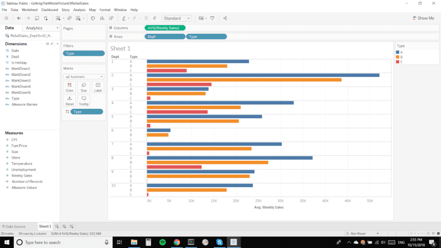
Visualizing the data this way makes it clear that Department 6 has the least average weekly sales of the first 10 departments for each store type. Also, Type C Stores have heavily concentrated sales in Departments 1, 2, 4, and 8 with the other departments making up an insignificant percentage of sales. This could warrant dropping some of those departments for Type C Stores or Department 6 for all store types if those departments don’t have secondary benefits such as drawing customers to the stores.
To view and interact with this visualization or download the workbook to Tableau, see my Getting the Whole Picture of Retail Sales Workbook on Tableau Public.