

Data pipeline diagrams function as blueprints that transform unprocessed data into useful information. According to an IBM study, 39% of businesses anticipate increased revenue and reduced operating costs, and 44% of businesses expect quick data to help them make better decisions. These figures demonstrate the importance of fast data pipelines for businesses looking to stay ahead.
Businesses that use predictive models driven by AI have seen a 20% improvement in risk management. A well-designed data pipeline architecture diagram facilitates real-time data processing. This enables companies to make evidence-based decisions more quickly. These flow diagrams demonstrate how systems efficiently scale AI operations and manage massive volumes of data. Additionally, it facilitates the document processing steps that enable AI systems to continuously learn from new data.
This composition
You’ll understand the core components, see real examples, and find the right tools to create visuals that add business value.
Understanding data pipeline architecture diagrams
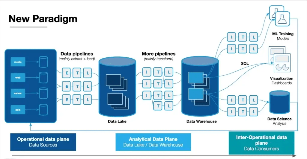
Image Source: Monte Carlo Data
Data visualization helps everyone understand complex data systems better. Data pipeline architecture diagrams show how data moves through different stages—from collection to transformation to delivery. These blueprints help data engineers and analysts learn about how information flows throughout an organization.
A data pipeline architecture diagram: What is it?
The flow of data from source systems to their destination is depicted in a data pipeline architecture diagram. Symbols, boxes, and directional arrows illustrate different stages of data processing. Data sources, ingestion systems (such as Kafka), processing elements, and storage locations are all represented by the elements in these visual representations.
These diagrams do more than just document processes. Teams use them to:
- See complex data relationships and dependencies
- Spot potential bottlenecks or failure points
- Plan capacity and resource allocation
- Explain technical architecture to non-technical stakeholders
A data pipeline architecture diagram shows how organizations design their data movement. The diagram reveals both simple flows and complex processes where data comes from multiple sources, gets reorganized, and combines at different times before reaching its destination.
Differences between ETL and ELT in diagram modeling
ETL (Extract, Transform, Load) and ELT (Extract, Load, Transform) represent two different approaches to data pipeline design. Their diagram representations reflect these differences.
ETL diagram modeling shows this flow:
- Data extraction from source systems
- A separate transformation layer or server (shown as a middle processing component)
- Final loading into the target database
ETL diagrams emerged during the 1970s. They have a sequential structure. The diagrams must show transformation happening before data reaches the warehouse, often with a separate processing server.
ELT diagram modeling shows:
- Data extraction from source systems
- Direct loading to the target storage
- Transformation is happening within the destination environment
ELT diagrams became popular in 2017. They show a flexible structure where transformations take place in the storage environment. This fundamental change affects modern data pipeline diagrams—they have fewer intermediate systems but more complex transformation capabilities in the destination.
The complexity of the diagrams varies depending on which of these methods is used. Transformation servers and additional staging areas must be depicted in ETL diagrams. ELT diagrams concentrate on how transformations are handled by the data lake or warehouse. For instance, ELT diagrams are more capable than ETL diagrams of illustrating parallel processing for real-time data analysis.
Small, structured datasets requiring intricate transformations are best suited for ETL diagram models, particularly in sectors with stringent compliance regulations. ELT diagram models are appropriate for cloud-based, large-scale data operations that require fast data analysis and adaptable transformations.
Key components in a high-speed data pipeline flow diagram
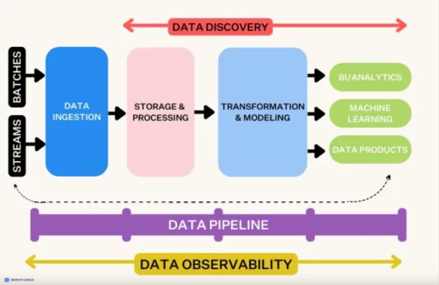
Image Source: AI Joux
Understanding architecture fundamentals leads us to high-speed data pipeline diagrams with several critical components that allow uninterrupted information flow. These interconnected elements are the foundations of quick data processing systems. Each element serves a specific purpose in the pipeline’s operation.
Data ingestion nodes and connectors
Data ingestion nodes serve as the entry point of any data pipeline diagram to collect and import raw data from various sources. These nodes work as the original checkpoint where information enters the pipeline. Strong ingestion components support multiple data formats and collection methods:
- Batch data: Collected and processed in discrete chunks from static sources like databases or logs
- Streaming data: Immediate, continuous flows from sources such as IoT devices, sensors, or transaction feeds
Apache Kafka stands out among popular ingestion tools in pipeline diagrams. It functions as a “data conveyor belt” that simultaneously sends information to several targets. Apache Flume focuses on log aggregation, while Amazon Kinesis provides flexible streaming. Through directional arrows that display data flow patterns, the visualization links source systems to an ingestion layer.
Feature engineering blocks and transformation layers
Following ingestion, transformation layers become key components in pipeline diagrams. At this point, raw data is cleaned, normalized, and enhanced. ETL (Extract, Transform, Load) or ELT (Extract, Load, Transform) patterns are used in modern diagrams to depict transformation layers.
Feature engineering blocks represent a specialized subset of transformation components. They convert raw data into features that machine learning models can use. These diagram elements show processes that manipulate and transform data to boost ML algorithm learning capabilities. Feature engineering diagrams display connections between transformation processes that handle tasks like:
- Scaling or normalizing numeric values
- Encoding non-numeric data (text/images)
- Creating combined features across data sources
Organizations standardize data transformation processes through visual representation. They apply these processes once at the data warehouse level instead of repeating them for every report or dashboard.
Modules for model training and inference
High-speed pipeline diagrams display segments of the machine learning pipeline that demonstrate how models are trained on processed data. These elements come together to form a robust infrastructure that permits standardized, modular methods of developing machine learning systems.
ML elements usually consist of:
- Modules for training models using TensorFlow or PyTorch, and
- Validation sections that demonstrate how models are examined against test datasets
- Pathways of inference that illustrate how learned models forecast fresh data
To depict execution order, these components are displayed as directed acyclic graphs (DAGs) in contemporary machine learning pipeline diagrams. The distinction between training and inference paths is evident in sophisticated diagrams. While inference necessitates instantaneous processing capabilities, training requires processing of historical data.
Endpoints for storing and retrieving data
The last elements in high-speed pipeline diagrams are storage locations and retrieval systems. Storage components vary according to the type of data and its intended use:
Data warehouses are organized storage spaces that are primarily used to hold relational data and are optimized for business intelligence and reporting. Data lakes work as flexible storage components designed for various data types in native formats. Advanced pipeline diagrams might use the medallion architecture to segment storage into bronze (raw), silver (cleaned), and gold (analytics-ready) layers.
Diagrams show retrieval endpoints to make processed data available to users and applications. These components link to visualization tools, APIs, or query interfaces that enable data extraction for reports, dashboards, and further analysis. Effective diagrams connect these endpoints to multiple consumer systems. This approach emphasizes how centralized data transformations meet various downstream needs.
Examples of data pipeline diagrams for use cases in real time
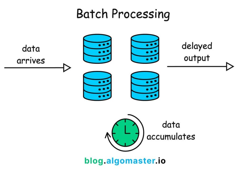
Image Source: AlgoMaster Newsletter
Depending on particular use cases and requirements in real-world scenarios, data pipeline implementations can differ significantly. Examining real-world examples demonstrates how businesses organize their data flows for various processing situations.
Batch vs. streaming pipeline diagram comparison
Two essentially distinct methods of data processing are represented by batch and streaming pipelines. Every strategy has unique architectural patterns. Data is shown moving through predetermined stages at predetermined intervals in batch pipeline diagrams. They handle a lot of data at once. With temporal boundaries between steps, these diagrams clearly show the separation of the extraction, processing, and loading phases.
Diagrams of streaming pipelines show continuous data flow without specified endpoints. In contrast to batch diagrams, which display scheduled processes, they highlight always-running components that process information as it comes in. The key differences between these diagrams appear in how they represent:
- Latency requirements: Streaming diagrams show millisecond-level processing paths while batch visualizations prioritize throughput over speed
- Resource allocation: Batch diagrams display concentrated computing resources at specific intervals compared to streaming’s distributed, continuous processing nodes
- State management: Streaming pipeline diagrams include state storage components that batch designs don’t typically have
Diagram of a real-time fraud detection pipeline
Systems for detecting fraud must have instantaneous capabilities. Systems that analyze transaction data within milliseconds of creation are depicted in these specialized diagrams. Diagrams of fraud detection pipelines show several parallel processing routes. They successfully spot suspicious timing patterns, anomalous amounts, odd transaction groupings, and suspicious patterns.
Sensor nodes that record transaction events are depicted in the standard fraud detection pipeline diagram. Stream processing components use decision gateways to flag possible threats and analyze data instantly. Machine learning inference modules that adjust to new fraud patterns are frequently seen in these diagrams.
Recommendation system hybrid pipeline
Hybrid pipeline designs, which integrate several methods, are used in recommendation systems. The limitations of a single methodology are lessened by this combination. Three main architectural patterns are usually visible in these diagrams:
- Several recommendation strategies are combined into a single algorithm with a variety of input data sources in a monolithic design.
- Parallelized design: distinct recommender systems generate independent recommendation lists that eventually combine
- Hybrid recommendation pipeline diagrams illustrate how various data sources pass through specialized processing components. Pipelined design illustrates sequential recommender components, where output from one becomes input for the subsequent one. They create cohesive recommendation outputs by fusing contextual data, user behavior, and content metadata. By integrating complementary systems, this method addresses issues like data sparsity and cold start issues.
Materials and methods: Tools for building data processing pipeline diagrams
The quality and effectiveness of data pipeline diagrams depend on choosing the right tools. Today’s specialized solutions help teams visualize, configure, and manage these critical technical representations throughout the development lifecycle.
Using Lucidchart and Draw.io for architecture diagrams
Lucidchart and Draw.io are leading platforms that create data pipeline architecture diagrams. Draw.io has complete Data Flow Diagram (DFD) shape libraries with all core components needed for structured data flow analysis. These diagrams work alongside UML representations and provide higher-level abstract views of information flow through systems without implementation details. Lucidchart gives teams a collaborative environment to build sophisticated diagrams with live cloud integration.
These platforms come with template libraries that speed up diagram creation. Draw.io has templates in its Software section specifically for data flow visualization. Teams can track every change in page history when these diagrams blend with knowledge management systems like Confluence. This approach will give teams the current documentation.
JSON and YAML schemas for pipeline setup
Configuration files that specify pipeline behavior go hand in hand with visual diagrams. YAML has evolved into a platform-neutral format for pipeline definitions. Azure-pipelines.yml files located at the repository roots define Azure DevOps pipelines. GitLab specifies CI/CD jobs that comprise pipelines using .gitlab-ci.yml.
With a vocabulary that annotates and validates pipeline documents, JSON Schema enhances these configurations. $schema, which displays the draft version, and $id, which generates a distinct URI for reference, are features of the basic schema definitions. These schemas are used by organizations to standardize pipeline structures among teams.
Diagrams using version control and CI/CD integrations
Along with code versioning, astute companies also use version control for pipeline diagrams and configurations. Native. Draw.io files that are compatible with common version control systems are one way that Draw.io facilitates this. Teams can work together while adhering to best practices.
Like code, pipeline configurations in YAML reside in repositories and are versioned alongside the logic of the application. This integration keeps diagrams from deviating from the behavior of the system and helps architectural documentation change as it is implemented.
The drawbacks of complex data pipeline visualization
It is difficult to visualize the intricate relationships found in modern data pipelines. Organizations create complex data flows, but the complexity of these systems cannot be fully captured by traditional diagram approaches.
Problems with scalability in static diagrams
Large-scale systems cannot be adequately depicted by static data pipeline architecture diagrams. As volume and complexity rise, data diagrams become cluttered and challenging to read. The system encounters data processing bottlenecks, where slower pipeline components cause delays across the board. A single slow transformation step acts as “a slow barista in a busy coffee shop” that impedes all subsequent processes, even though a pipeline may function efficiently overall.
Additionally, static representations are unable to convey how pipelines handle unexpected spikes in traffic. During holiday sales, retail businesses deal with a deluge of data, but diagrams rarely demonstrate the autoscaling capabilities required to safeguard the pipeline. Because competing processes slow each other down, resource contention makes visualization more difficult. This results in erratic performance, where jobs get
Schema development-related diagram drift
Data structures adapt to changing business requirements. It is challenging to maintain pipeline diagram accuracy due to schema development, which is the inevitable alteration of data schemas over time. During reprocessing, CDC (Change Data Capture) events with schema changes make it challenging to handle combinations of recent and historical events.
Schema development lets users modify table structures to fit changing data needs. These changes often create misalignments between old and new data structures. This “diagram drift” happens when visual representations lag behind actual system changes. The result can be incorrect or inconsistent information flowing to downstream applications.
Tool fragmentation and lack of standardization
Pipeline visualization today suffers from severe tool fragmentation. Only 13% of organizations have unified visualizations and dashboards that show all telemetry data in one solution. About 23% struggle with separate visualization tools that don’t communicate with each other.
Engineers have to monitor several screens to grasp the whole pipeline, which causes a “swivel-chair integration” issue. Mergers and acquisitions exacerbate this problem as companies inherit more incompatible tools. Though teams may lose access to the greatest technology for their particular requirements, tool consolidation helps to control this dispersed network.
Conclusion
Organizations need effective data pipeline diagrams to turn raw data into practical insights. We have explored everything in high-speed data pipelines – from basic architecture to implementation challenges. The right approach to visualizing these complex systems can affect how teams design, implement, and maintain their data infrastructure.
Businesses should think about whether ETL or ELT approaches are more appropriate for their particular requirements. Before loading, ETL provides tried-and-true transformation procedures. In contemporary cloud-based settings, where data changes after being loaded into the destination system, ELT offers greater flexibility. Organizations’ information processing and decision-making processes are influenced by their choice between batch and streaming architectures.
Data pipeline diagrams provide great value but have clear limitations. Static representations don’t scale well as systems grow complex. On top of that, it becomes harder to maintain accurate documentation as schemas change over time. Tool fragmentation across the industry makes standardization harder, and most organizations juggle multiple visualization solutions.
These challenges exist, but well-designed pipeline diagrams offer more benefits than drawbacks. Teams can spot bottlenecks, plan capacity needs, and explain complex technical concepts to different stakeholders with effective visualizations. Tools like Lucidchart, Draw.io, and standardized configuration formats help create and maintain these vital representations.
Data volumes continue to increase at an exponential rate, and live processing is becoming increasingly important every day. Businesses that master the creation of high-speed data pipeline diagrams will have significant competitive advantages. More than just documents, these visual blueprints are strategic tools that facilitate quick, well-informed decisions based on seamless data flow from unprocessed input to real-time insights.
This breakdown effectively illustrates the journey from raw data to actionable insights using a high-speed data pipeline. Highlighting key stages—like ingestion, processing, storage, and visualization—makes it easy to understand the flow and purpose of each component. Including real-world tools gives the explanation practical relevance. A visual diagram would further enhance clarity and comprehension, especially for those unfamiliar with modern data architectures. This article is very helpful to me.