
This post covers the following tasks using R programming:
- cleans the texts,
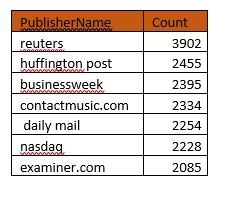
- sorts and aggregates by publisher names
- creates word clouds and word associations
The dataset used for the analysis was obtained from Kaggle Datasets, and is attributed to UCI Machine Learning. (Please see acknowledgement at the end). The raw tabular data includes information about news category (business, science and technology, entertainment, etc.)
My code in R programming with comments and description can be downloaded here (under text analytics)
R language has some useful packages for text pre-processing and natural language processing. Some of these packages we use for our analysis include:
- Wordcloud,
- qdap,
- tm,
- stringr,
- SnowballC
Analysis Procedure:
Step 1:
Read the source file containing text for analysis. I prefer fread() over read.csv() due to its speed even with large datasets.
text_dict_source <- data.frame(fread(“uci-news-aggregator.csv”))
For the scope of this program, we limit ourselves to only the headline text and publisher name.
text_sourcedf <- subset(text_dict_source, select = c(“ID”, “TITLE”, “PUBLISHER”))
Step 2:
Clean up the headlines by removing special characters and “emojis” from tweets, if any.
text_sourcedf$TITLE <- sapply(text_sourcedf$TITLE,function(row) iconv(row, “latin1”, “ASCII”, sub=””))
Step 3:
We use a “for loop” to filter and a custom function aggregate the headline texts for each publisher.
Step 4:
Create word corpus with one object for each publisher. Clean and pre-process the text by removing punctuations, removing “stop words” (a, the, and, …) using tm_map() function as shown below:
wordCorpus <- tm_map(wordCorpus, removePunctuation)
Step 5:
Create wordclouds for Publisher = “Reuters”. This can be done for any (or all) publishers using the wordcloud() function. The “color” option allows us to specify color palette, “rot.per” allows us to customize the word rotations and “scale” specifies whether word size should be dependent on frequency of occurrence.
wordcloud(wordCorpus1, scale=c(5,0.5), max.words=100, random.order=FALSE, rot.per=0.35, use.r.layout=FALSE, colors = brewer.pal(16, “Dark2”))
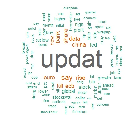
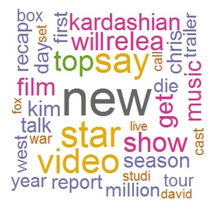
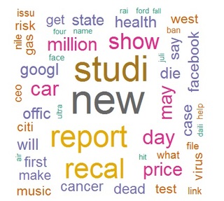
We create wordclouds for 2 more publishers (Celebrity Café & CBS_Local) as shown below. Notice how the words for a financial news engine like Reuters differ from celebrity names and events (image2). Contrast them both with the everyday words (music, health, office) on a local news site like CBS (image 3).
Step 6:
Word frequency and word associations. Some examples are given below:
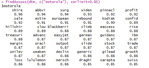
findAssocs(dtm, c(“motorola”), corlimit=0.98)
findAssocs(dtm, ” ukrain”), corlimit=0.95 ) # specifying a correlation limit of 0.90
Step 7:
Plot word association:
plot(dtm, term = xfrqdf, corThreshold = 0.12, weighting = F, attrs=list(node=list(width=20, fontsize=24, fontcolor=”blue”, color=”red”)))
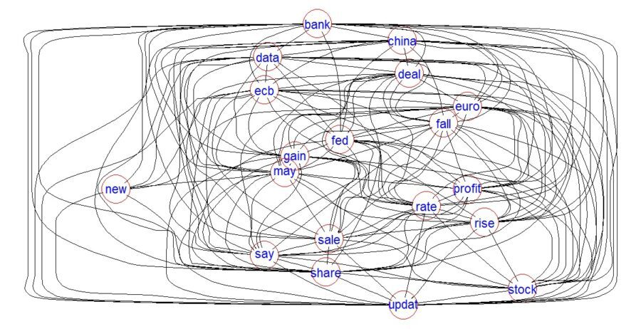
The image (above) looks more like a plate of spaghetti, indicating all the words are inter-related. (logically correct since all the terms relate to global finance.)
The complete code for this analysis is available here (under text analytics), in both text and R program formats. Please do take a look and share your thoughts and feedback.
Acknowledgments:
This dataset comes from the UCI Machine Learning Repository.
Source – Lichman, M. (2013. UCI Machine Learning Repository [http://archive.ics.uci.edu/ml]. Irvine, CA: University of California, School of Information and Computer Science.