
Mark Twain famously said “There are three kinds of lies: lies, damned lies, and statistics.” Maybe if Mark Twain were alive today, he’d add “alternative facts” to that list. BusinessWeek in the article “Lies, Damn Lies, and Financial Statistics” reminds us of the management challenges with statisticians or “data scientists” who manipulate the data to create “pseudo-facts” that can lead to sub-optimal or even dangerously wrong decisions.
My University of San Francisco class recently did a hackathon with a local data science company. It was insightful for all involved (and I learned of a new machine learning tool – BigML – which I will discuss in a future blog). One team was trying to prove that the housing prices in Sacramento where on the same pricing trajectory (accelerating upward) as the Brooklyn and Oakland housing markets, cities next to major technology hubs. She had just bought a house in Sacramento and was eager to prove that her investment was a sound one. Unfortunately, her tainted objective caused her to ignore some critical metrics that indicated that Sacramento was not on the same pricing trajectory. She got the model results that she was seeking, but she did not necessarily get the truth.
Statisticians know that by selectively munging, binning, constraining, cleansing and sub-segmenting one’s data set, they can get the data to tell almost any story or validate almost any “fact.” Plus with the advent of seductive data visualization tools, one can easily distract the reader from the real facts and paint a visually compelling but totally erroneous story from the data (see Figure 1).

Figure 1: Distorting The “Truth” with Data Visualization
The Weapon of Alternative Facts: p-Hacking
This flawed statistical behavior of staging and presenting the data in a way that supports one’s already pre-conceived answer has a name: p-hacking. As described in the BusinessWeek article, p-hacking is a reference to the p-value, which is a measure of statistical significance. To quote Andrew Lo, director of MIT’s Laboratory of Financial Engineering: “The more you search over the past, the more likely it is you are going to find exotic patterns that you happen to like or focus on. Those patterns are least likely to repeat.”
What is the ‘P-Value’[1]? The p-value is the level of marginal significance within a statistical hypothesis test representing the probability of the occurrence of a given event. A small p-value (less than .05) means that there is stronger evidence in favor of the alternative hypothesis. The hacking of a p-value can sometimes inadvertently happen through a statistical practice known as overfitting.
Overfitting Challenges
Understanding the concept of overfitting is important to make sure that one is not taking inappropriate liberties with the data. Ensuring that one isn’t inadvertently p-hacking the data requires 1) an understanding of overfitting and 2) a touch of common sense. From the BusinessWeek article:
“An abundance of computing power makes it possible to test thousands, even millions, of trading strategies. [For example], the standard method is to see how the [trading] strategy would have done if it had been used during the ups and downs of the market over, say, the past 20 years. This is called backtesting. As a quality check, the technique is then tested on a separate set of “out-of-sample” data—i.e., market history that wasn’t used to create the technique. In the wrong hands, though, backtesting can go horribly wrong. It once found that the best predictor of the S&P 500, out of all the series in a batch of United Nations data, was butter production in Bangladesh.”
So what is evil thing called overfitting? Overfitting occurs when the analytic model is excessively complex, such as having too many parameters or variables in the model relative to the number of observation points.
I love the overfitting example shown in Figure 2. In Figure 2, one is trying to fit the different shapes on the left side of the figure into one of the containers that minimizes the unused space in the container. The shapes fit into the right-most container with the lowest amount of unused space[2].

Figure 2: Fitting Shapes Into Containers
However when a new shape is added in Figure 3, a shape significantly different than the shapes used to minimize the container space, the originally selected container does not work because the container was over-fitted for just those shapes that were originally available.

Figure 3: Overfitting
Once new data gets added, especially data that might be different from the test data in some significant way (e.g., different time periods, different geographies, different products, different customers), the risk that the model that was created with the original set of data just doesn’t work with the next set of data that is not exactly like the original set.
P-hacking Summary
Okay, this is the most nerdy of jokes, but the web comic Randall Munroe captures the over-fitting management challenge creatively in the comic of a woman claiming jelly beans cause acne (see Figure 4).
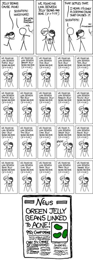
Figure 4: The Most Nerdy Overfitting Example
When a statistical test shows no evidence of an effect, the woman revises her claim that acne must depend on the flavor of the jelly bean. So the statistician tests 20 flavors. Nineteen show nothing. But by chance there’s a high correlation between jelly bean consumption and acne breakouts for green jelly beans. The final panel of the cartoon is the front page of a newspaper: “Green Jelly Beans Linked to Acne! 95% Confidence. Only 5% Chance of Coincidence!”
Yea, it’s nerdy but it also makes this final critical point: use your common sense to contemplate whether the correlation really exists or not. There are plenty of examples of distorting the data and applying statistics to show the most absurd correlations (see Figure 5).

Figure 5: Source: http://tylervigen.com/old-version.html
I mean, look at the correlation for that relationship (0.993)! The relationship between United States spending on the space program and suicides must be true!
Additional reading:
- Freakonometrics: “P-Hacking, Or Cheating On A P-Value”
- BusinessWeek: “Lies, Damn Lies, and Financial Statistics
- Heap: “How to Lie with Data Visualization”
[1] http://www.investopedia.com/terms/p/p-value.asp
[2] Special thanks to John Cardente, from Dell EMC’s Office of the CTO for the overfitting slides