
Guest blog by Michael Grogan.
Here is how we can use the maps, mapdata and ggplot2 libraries to create maps in R.
In this particular example, we’re going to create a world map showing the points of Beijing and Shanghai, both cities in China. For this particular map, we will be displaying the Northern Hemisphere from Europe to Asia.
require(maps)
require(mapdata)
library(ggplot2)
library(ggrepel)
cities = c(“Beijing”,”Shanghai”)
global <- map_data(“world”) ggplot() + geom_polygon(data = global, aes(x=long, y = lat, group = group)) + coord_fixed(1.3)
ggplot() + geom_polygon(data = global, aes(x=long, y = lat, group = group), fill = NA, color = “red”) + coord_fixed(1.3)
gg1 <- ggplot() + geom_polygon(data = global, aes(x=long, y = lat, group = group), fill = “green”, color = “blue”) + coord_fixed(1.3)
gg1
coors <- data.frame( long = c(122.064873,121.4580600), lat = c(36.951968,31.2222200),
stringsAsFactors = FALSE
)
#xlim and ylim can be manipulated to zoom in or out of the map
coors$cities <- cities gg1 + geom_point(data=coors, aes(long, lat), colour=”red”, size=1) +
ggtitle(“World Map”) +
geom_text_repel(data=coors, aes(long, lat, label=cities)) + xlim(0,150) + ylim(0,100)
Upon running this code, here is our map…
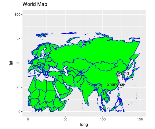
A few points to note:
- The “cities” variable is used to specify the labels for the cities.
- The “coors” data frame is used to define the latitude and longitude for each city.
- The xlim and ylim under ggplot is used to zoom in or out of the map, depending on the coordinates we set.
Note that we are also using the ggrepel library in order to space out the labels on the points for each city. Were this library not to be incorporated, then the labels have the potential to overlap each other, and it doesn’t look very visually appealing…
But…what if I want maps that zoom in on a country?
cities = c(“Paris”,”Berlin”)
coors <- data.frame(
lat = c(48.864716,52.520008),
long = c(2.349014,13.404954),
stringsAsFactors = FALSE
)
coors$cities <- cities
gg1 +
geom_point(data=coors, aes(long, lat), colour=”red”, size=1) +
ggtitle(“World Map”) +
geom_text_repel(data=coors, aes(long, lat, label=cities)) + xlim(-10,40) + ylim(35,60)
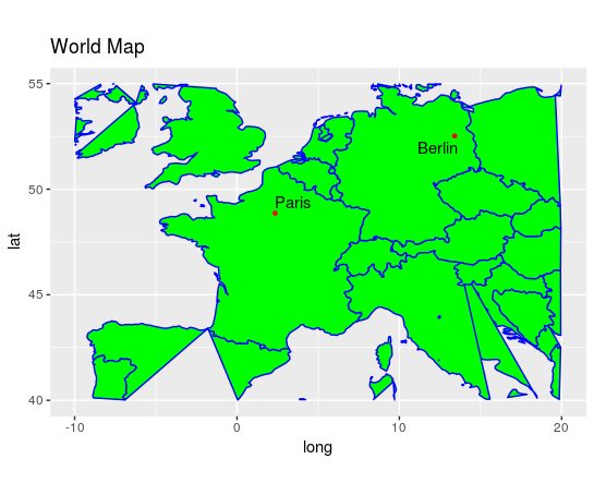
As mentioned, xlim and ylim are set to a narrower margin. Here, xlim is set to (-10,40) and ylim is set to (35,60). However, in the previous map xlim was set to (0,150) and ylim was set to (0,100).
Note that because this method is using a world map database, you might often find that the countries surrounding the ones we want (in this case, France and Germany) appear somewhat “broken up”. This may not be an issue if you are simply looking to represent a particular country, but you could also choose to plot one country in isolation, e.g. specifying map_data(“usa”) instead of map_data(“world”).