New & Notable
Top Webinar
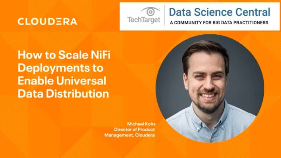
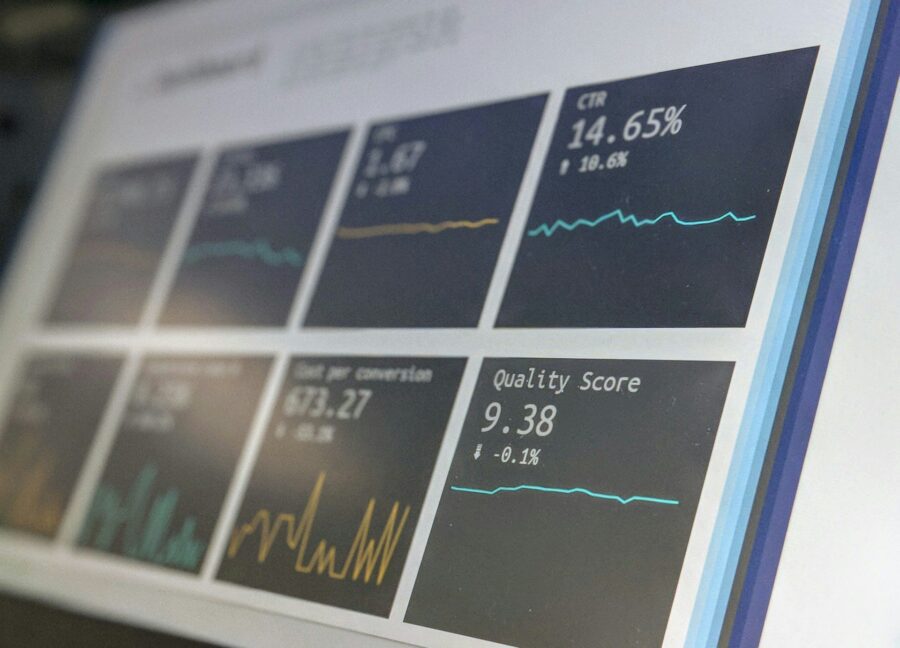
DSC Webinar Series: How to Scale NiFi Deployments to Enable Universal Data Distribution
Ben Cole | August 29, 2023 at 3:08 pmRecently Added
DSC Weekly 16 April 2024
Scott Thompson | April 16, 2024 at 1:38 pmAnnouncements Top Stories In-Depth...

Using window functions for advanced data analysis
Erika Balla | April 15, 2024 at 1:53 pmWindow functions are an advanced feature of SQL that provides powerful tools for detailed data analysis and manipulation...
Get ready for future innovations with large language models
Prasanna Chitanand | April 12, 2024 at 2:00 pmNowadays, almost all businesses use generative AI and large language models after realizing their ability to boost accur...

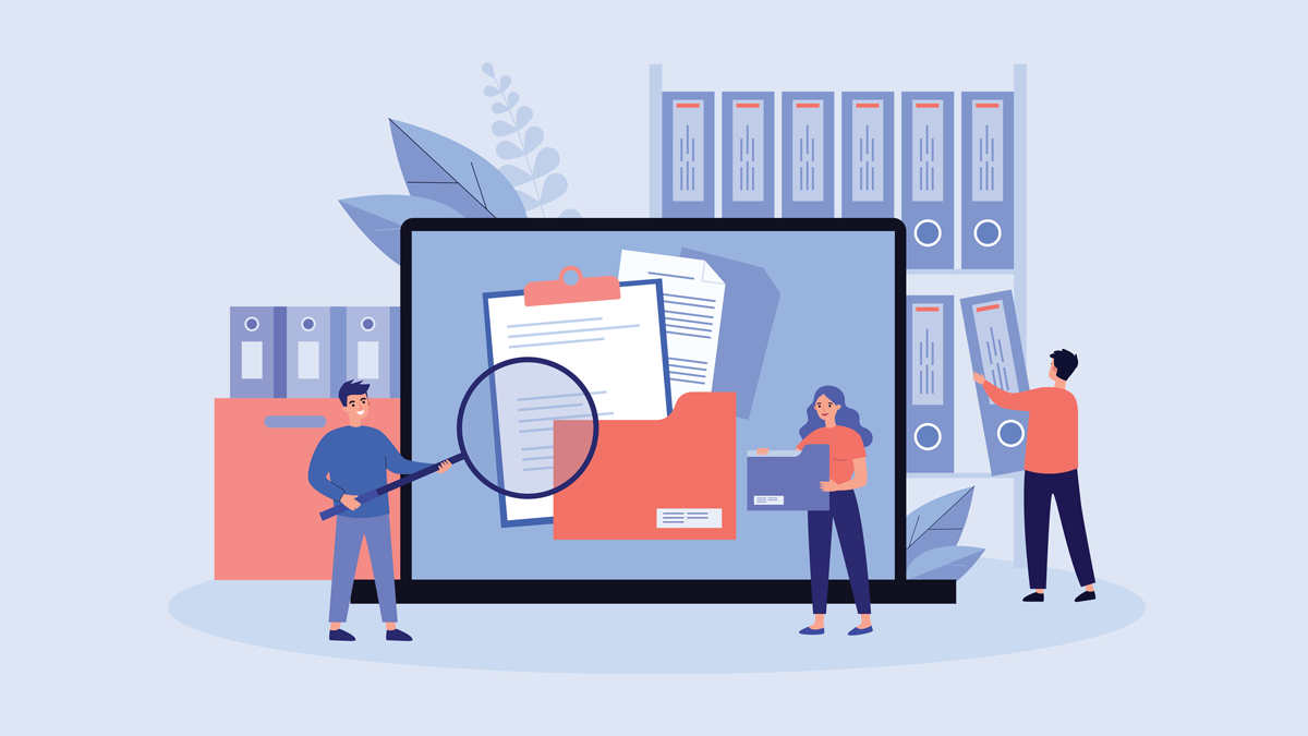
5 mistakes to avoid in CMMC compliance
Erika Balla | April 12, 2024 at 11:02 amThink of a battlefield — not filled with soldiers but cyber warriors. The Defense Industrial Base (DIB) stands as ...
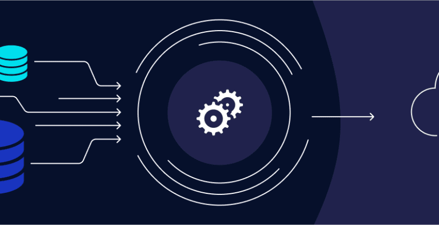
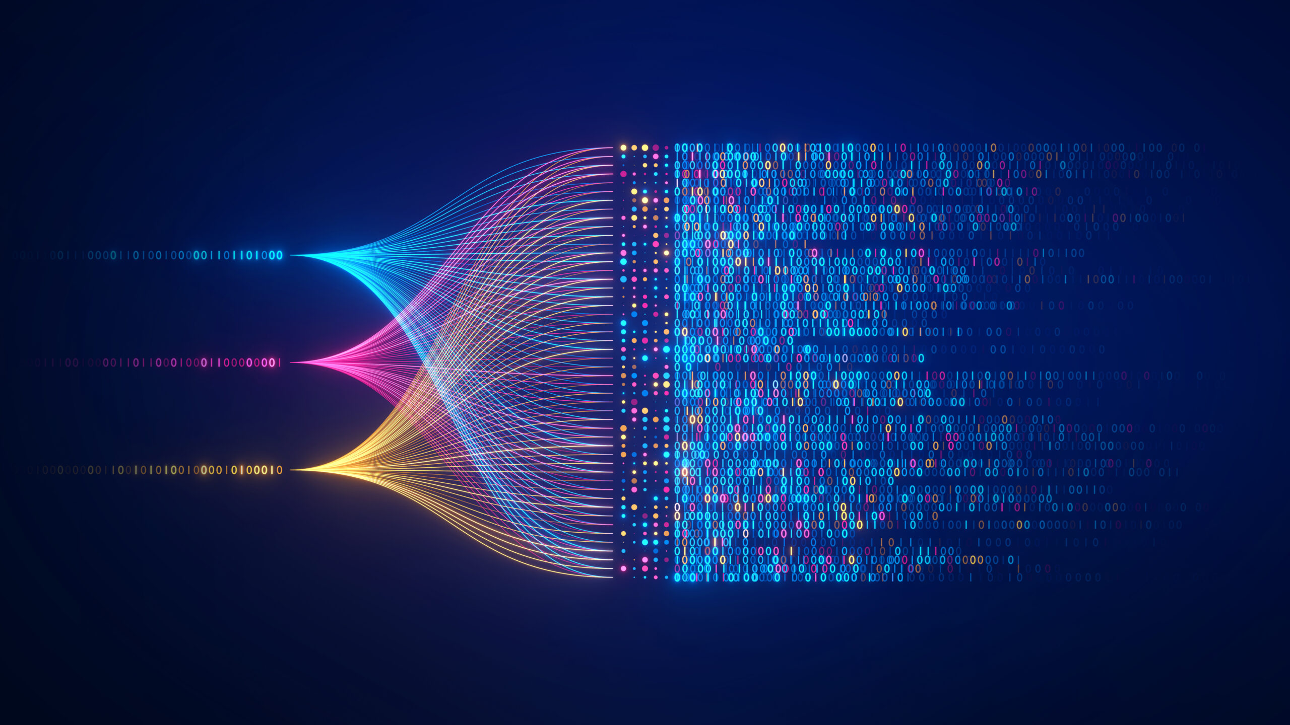
Building reliable and efficient ETL pipelines: Best practices for data wranglers
Ovais Naseem | April 11, 2024 at 3:26 pmData is crucial for your business—it helps with decisions and growth. But sometimes, it’s stuck in different pla...
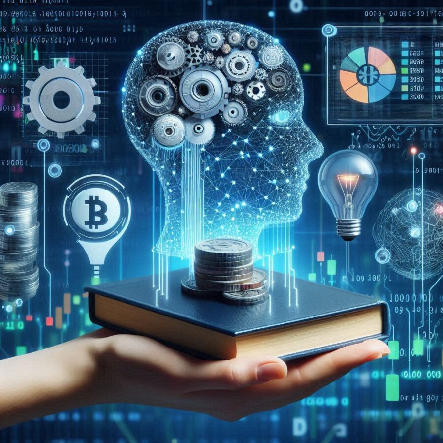
How is machine learning changing the landscape of FinTech?
Pritesh Patel | April 11, 2024 at 9:13 amMachine learning in FinTech is a critical enabler in tech-driven banking, where efficiency and innovation are key to sta...
The new era of data handling: Tools that transform business strategies
Ovais Naseem | April 10, 2024 at 1:48 pmData Automation Tools play a crucial role in transforming how businesses handle data. They offer advanced functionalitie...
DSC Weekly 9 April 2024
Scott Thompson | April 9, 2024 at 1:42 pmAnnouncements Top Stories In-Depth...
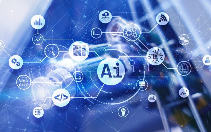
Growth of open-source AI technology and democratizing innovations
Tarique | April 9, 2024 at 10:45 amNot too long ago, Artificial Intelligence was a vague concept that mostly found its relevance in science fiction movies ...
How data impacts the digitalization of industries
Jane Marsh | April 9, 2024 at 9:03 amSince data varies from industry to industry, its impact on digitalization efforts differs widely — a utilization strat...
New Videos
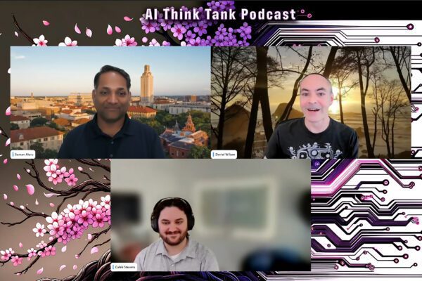
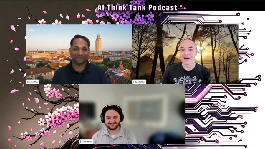
Retrieval augmented fine-tuning and data integrations
Presentation and discussion with Suman Aluru and Caleb Stevens In the latest episode of the “AI Think Tank Podcast,” I had the pleasure of hosting…
7 GenAI & ML Concepts Explained in 1-Min Data Videos
Not your typical videos: it’s not someone talking, it’s the data itself that “talks”. More precisely, data animations that serve as 60-seconds tutorials. I selected…
30 Python Libraries that I Often Use
This list covers well-known as well as specialized libraries that I use rather frequently. Applications include GenAI, data animations, LLM, synthetic data generation and evaluation,…