
Multiple numeric columns in data and even more techniques at hand to analyse the data, like histograms, ANOVA, mean/median, contingency tables, scatter plots, variance…what to choose for exploratory or descriptive analytics!
Sounds a bit geeky! Let me simplify
This is an everyday scenario faced by an analyst. There are too many numbers and challenge is to communicate the scenario to business folks. Whether its competitive analysis, internal sales analysis, process analysis, benchmarking..or any other analysis, every analysis starts with answering – what is happening?. Though there are many tools available to answer this question, but one tool stands out with its simplicity and ease to comprehend. Not only it combines multiple information points, it is visually attractive too. Welcome, the Box Plot.
Box plot is a visual representation of five-number summary of data.
- Minimum: the minimum number in the data set
- Maximum: the maximum number in the data set
- Median: If data set is arranged in ascending order, what is the middle number
- First quartile: If data set is arranged in ascending order, the 25% of data is below it
- Third Quartile: If data set is arranged in ascending order, the 75% of data is below it
Still confused, leave the math for an analyst, let me simplify.
Box Plot is an excellent analysis tool with which we can not only do a competitive positioning & bench-marking but also analyse the trends. Box Plots divides the data in quartiles based on any measure/variable of choice. Taking cue from the philosophy of ‘Divide & Rule’, once the data is divided; you can rule the analysis. Let us take an example to better understand the concept:
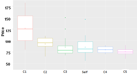
Consider a hypothetical scenario where we want to compare the competitive price position of our company, ‘Self’, with competitors ‘C1’, ‘C2’…’C5’. Box plots created with those prices are stacked against each other. This view clearly gives us a picture of how market is functioning.
C1 commands the highest prices which could be because of better products or better brand value. C1 also has the most expansive price range. C2 has a notch higher price whereas C3, C4 and C5 have similar median price but different range. C5 products are priced most closely. Insights like these are extremely critical for pricing, product development and branding strategy.
With this info at hand, we can answer multiple business questions like
- Where we want our company’s position to be?
- C1 is league apart from rest. Should we consider C1 as competition or not? (given our product range)
- If we have similar products as C1 then are we selling cheaper?
- If we should invest on product development or branding or maintain the status quo?
- Since C2 is priced higher, should we increase or undercut and for what products?
- It looks we are better placed vis-à-vis C3, C4 & C5 by providing a larger price range. Is it because of wider product range?
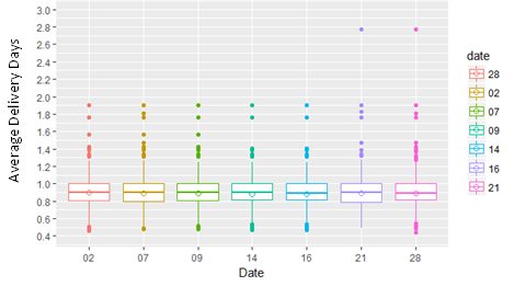
Replace the x-axis with any dimension like day, month, division of company, geographic region etc and Box plot can be used to answer questions from more diverse domains. To call out a few:
- How is the product delivery time changing every over the course of time
- Analyse the order size or revenue deals across regions
- Analyse the salaries across company division
- For an ecommerce company , pre & post Sale day analysis of portfolio
Point is, Box plots can be a great tool to do a comparative study. Only hiccup is making managers understand how to read, which is not so hard.
Happy analytics!!